The Toronto Public Library (q.v.) is running a test of checkout terminals using RFIDs. It’s not at all foolproof to use, and the system falls down completely in the four languages other than English that the system claims to offer.
Just a quick question before we begin, one that pretty much sums up the system’s care and competence in localization: When did “Check Out” become a word or phrase in French, Chinese, Tamil, or Urdu?
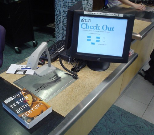
The system is apparently a Tech Logic ACS. At the new St. James Town Library in that overcrowded, poor, dilapidated, and troubled neighbourhood, the installation looks like this, with an RFID-reading pad, a clunky barcode scanner, and a touchscreen:
We are told, via Tech Logic’s atrocious Web site, that the ACS
was designed to be used on a touchscreen monitor. This easy-to-use interface allows for the patron to simply push prompted buttons on the screen to begin and end the self-check system. If there is a problem with an item loan, the system is configurable to instantly prompts [sic] the patron and shows which item is in question (as long as RIFD is present). e.g. Circulation Database [sic]
One of the best attributes of the Tech Logic ACS Terminal Self[‑]Check[‑]Out System is the fact that the library has full control on the graphical interface design. As a matter of fact, the library can offer different graphics, video screen designs to best suit the location of the self-check unit.
That’s a bug, not a feature.
Let me summarize only a few of the deficiencies in the TPL installation:
-
Fonts are terrible. Apparently Arial and MS Sans Serif roman and bold are deemed “legible,” especially from a standing distance. Characters are too small, there’s too much whitespace (indeed, the system should use reverse video), and the photos are atrocious. No care whatsoever has been taken in typography (i.e., the maximum care we associate with Windows users has been taken).
-
This is indeed a Windows system, but Continue and Cancel buttons are stolen wholesale from the Apple Store look (and are confusingly colour-coded). And our phrase of the day, “Check Out,” is gigantically rendered in Apple-candy Garamond.
-
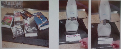
There’s no hierarchy of information flow. The instructions are presented so badly that they are difficult to follow even when there are only two steps involved. Tell me what I’m supposed to do here just from the pictures:
-
The system is inaccessible to a blind or mobility-impaired person. That’s OK for now, since using it is optional and there are some items (like audiobooks) that everyone must check out with the help of an actual librarian. However, the writing’s on the wall: These terminals are being installed so that librarians can be fired, and eventually a branch will open at which these terminals are your only checkout option. At that point, somebody’s going to file a human-rights complaint that the library will handily lose. Plan for accessibility early.
-
You’re supposed to be able to plunk down up to 16 items on the pad and have them all read at once, but:
-
If you press the Continue button twice, you get two sets of entries on your printed receipt.
-
Some items are never recognized. (Trying to explain that to a staff person was a task. She kept trying to round it up to the expected and “only possible” case, that the system recognized it and told me to see a librarian. No, the system failed to work.)
-
If one or more items goes unrecognized, you have to eyeball your pile of materials and compare it against the hard-to-read, spindly little list on the screen to figure out which one isn’t working. It took three of us to do that in one case. (I spotted the single item of nine; they couldn’t.)
-
This is no way to run an Urdu railroad
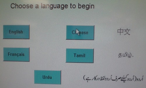
The biggest problem is localization. The system claims to work in English, Chinese, French (provided strictly for politics), Tamil, and Urdu, but it functions with bare adequacy in English and gets the other languages wrong.
Start with the language-selection screen, a failure in every respect:
-
Why is this three columns? Another of those failed attempt to be “classy” by using a centred layout? (Actually, it kind of looks like four columns, doesn’t it? The fact that even that is open to dispute indicates just how little care was exercised.)
-
Why are the fonts tiny yet also bold?
- Why are the buttons so small?
-
Why are only the English and Français buttons labeled correctly?
-
Why are Chinese‑, Tamil‑, and Urdu-language texts written alongside the button? (A librarian claims it’s a problem of fonts. I see fonts right there. What’s the problem?) Is this a way of warning English-speakers away from hitting those buttons? Sort of like listing Spanish-language programs in a TV directory with “S” instead of “E”?
-
Why does the Urdu text lead into the button while the Chinese and Tamil text follows from it?
-
Why does the Urdu read “For Urdu (only Urdu words are required),” according to my informant? The Chinese definitely and the Tamil probably only list the name of the language.
It gets much, much worse. Did you know that “Check Out” and “Scan the barcode on your library card” were actual Urdu words? (Same applies to the Tamil screen. French and Chinese use those languages all the way across, but all languages use the “Check Out” heading.)
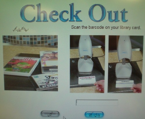
Did you notice that the instructions embodied in this entire screen read left to right? (And that the Urdu screen, but no others, is customized to show a photo of Indic books and CDs? Everybody else looks at a photo of English-language materials.)
These are just some of the things the library’s RFID system does wrong. Interestingly, I have solutions for most, if not all, of them.