I have here a curious paper by Parush et al., “Impact of Visual Layout Factors in Performance in Web Pages: A Cross-Language Study.” The researchers attempt to generalize from user-interface research on application software and what little research there is on Web sites. The latter will be familiar to standardistas: Grids are common; layout affects performance in actual usage; information design is applicable to Web sites; adding more graphics does not necessarily help; distracting graphics are harmful.
Fine. The strange thing is the methods Parush et al. used to test their hypothesis: “The basic research question was whether the visual factors that are known to play an important role in GUIs have the same impact and significance in Webpage visual layout.” They used English- and Hebrew-language Web-page mockups as a test of search speed (how fast could the subject locate a certain link on the page?).
It’s admirable that they used languages with different writing directions, though the effects of those writing systems (mixed-case vs. single-case; character height; type colour; serious confusability issues in Hebrew letters at low resolution) are confounding factors that were not addressed. It is a serious deficiency to simply assume that one kind of text is functionally equivalent to another.
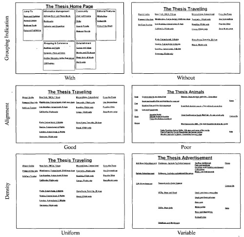
Design issues they tested were grouping, vertical alignment, density (uniform leading, at 1½ linespacing, or variable, at single to triple spacing), and number of links. The problem is that the resulting layouts (some excerpted below) would be ridiculous and amateur even by 1996 Geocities standards. You would simply never see these layouts in the wild. They would be difficult to reproduce using standards-compliant techniques, since list items (as many components would be marked up) would be perfectly aligned and uniformly spaced by default.
-
- Top row: Mockups with and without grouping indication (borders around groups).
- Middle row: Pages with good and poor alignment.
- Bottom row: Pages with uniform or variable density.
But worse yet, the Hebrew page that attempted to test alignment was not actually aligned:

For Hebrew pages, the only factor that affected search times was number of links, which stands to reason. Alignment did not have a significant effect. Then again, how could it? According to the article’s own illustration, the Hebrew pages were not aligned.
English-language pages used eye-tracking to test subjects’ physiological response. I don’t understand the results, except that the most important finding is a confirmation of the Hebrew results. (I suppose this is a further nail in the coffin of the nondesign of my “business” homepage.) For English test pages:
Few links and uniform density had a positive impact on performance in terms of eye movements…. However, good alignment had a surprising, opposite impact…. The combined impact of few links and uniform density resulted in either no improvement or even a degrading effect. In contrast, the combined impact of few links and good alignment on performance was positive – a decrease in search durations.
It seems that the more links you’ve got on a page, the harder it is to find the one you want. I suppose that is true if all the links are blue underlined, as all were in the study, but real-world Web pages don’t look like that, so the entire experiment is pretty much irrelevant, from what I can see. If I have to find a link on a page, I use type-ahead find.
Please test real-world conditions next time, if you wouldn’t mind.