
 Long-awaited development: An interview in Eye not conducted electronically. Feature not awaited by anyone: Complaint by Rick Poynor that graphic-design history picks and chooses its winners. And, as ever, I seem to be alone in noticing when the same topic comes up in more than one place in the magazine. Am I the only one who reads it cover to cover?
First, the ads
I would just like to ask the myriad typefoundries that take out quarter‑ to full-page ads in the front and back matter of every issue if it’s actually worth it. Certainly the ads from Vllg, which provide almost no information about typefaces and take up a whole page doing it, seem like a waste of money.
Are these advertisements mere positioning statements in the industry? An indication that you’ve arrived, that you’re for real, that you’re on an equal footing with artisanal shops of yore, like Carter & Cone? (It doesn’t seem reasonable to compare these foundries to the Linotype–Monotype axis, which, pace Patric[k] King, represents a degree of concentration that would be deemed illegal by regulators if anyone had the balls to file a complaint.)
This month’s panegyric
Each issue of Eye contains a retrospective portfolio of a designer who is either approaching the end of their career or is simply old. As with equivalent retrospectives in other magazines (especially CommArts), structurally what we’re doing is declaring these designers important in design history.
This issue’s winner? John McConnell, age 72.
-
Based on the pages and pages of sample work (solely the kind that reproduces well in miniature on the printed page), McConnell has been deemed important in two strata of design – populist and literary. He designed a way of designing packaging for the Boots pharmacy chain, but also formatted Faber & Faber book covers to create a brand identity out of whole pulp.
And he really doesn’t use computer, being, by his own admission, dyslexic. So this article is based on a journalistic exercise editor John L. Walters typically views as much too much trouble – an actual conversation.
But if you’re looking for lessons and aphorisms, McConnell is not your man. Of course I agree with him that “usually ‘creativity’ means showing off to your peer group.” But I don’t really know what he means when he says the solution is in the problem, except as a warning not to overthink things. My beloved Michael Bierut has a better formulation of this theory, and it involves actually listening to the client. (McConnell endorses that, too.)
I suspect there’s a solid, readily implementable philosophy of work residing in there somewhere, but this interview did not make that philosophy clear to anyone, least of all John McConnell. I view this as a failing for the simple reason that McConnell is presented as a successful commercial designer, which surely involved explaining design concepts to clients who were ignorant or resistant or both.
- How did you argue for that approach? You couldn’t have shown Boots anything to look at.
-
They had to believe it. They bought the logic and went along with it. I went on to became [sic] great friends with the whole business.
Why couldn’t he “argue for that approach” in the magazine that considers itself the pinnacle of his profession?
-
McConnell utters this gem:
When you have an in-house department, you have permanent enemies who are paid five days a week, seven hours a day, to snipe at you. You learn pretty early on you either get rid of them or make friends. You need someone on the inside.
-
A horrifically impenetrable clot of British English: “Fred Tow… invented an inflatable aeroplane, a plane you could blow up. So I was thinking of the Lilo, that squidgy shape.”
In-house designers
The value proposition, you could call it, of Issue 81 is an in-depth exploration of in-house designers, or more accurately in-house commissioners of design. But – again, structurally – this lengthy middle-of-book feature amounts to obsequious documentation of the design of multinational corporations, which, due to their reach, don’t need the coverage. Corporate is the 1% of design. (And every quote in the piece is a blandishment clearly polished up in advance and delivered by E-mail. I don’t think anyone spontaneously begins a sentence with “I am particularly interested in” or “Given that.”)
-
As if an overanthologized short story, IBM makes an appearance here. But Eye shows no awareness of what’s really going on in current-era ads – straight-up branding with type of a sort last seen in the fragrance business.
-
Nokia commissioned its own typeface (humbly named Nokia Pure), a vague bit of nothing by Dalton Maag. “Typefaces without serifs tend to look more streamlined and modern,” reads a headline in Nokia’s in-house magazine Uusi, whose editor must really have sleepwalked through the last century of sansserifs.
I suppose everything seems modern to a technology company bereft of memory, let alone cultural memory, particularly when that company is such a failure it became a de facto subsidiary of Microsoft.
-
Deutsche Bank is about as interesting as it sounds.
But the two measly pages on the U.K.’s National Maritime Museum dearly called out for a full-length feature. Nobody on staff at Eye seems to have noticed that a public museum has nothing in common with technology giants or a bank.
A designer with designers for clients?
There’s news you can use
Hed: “U.S. designer George Tscherny talks about his 56 years working with the School of Visual Arts.” In other words, a designer tells a design magazine about what it’s like to design for a design school – lessons surely applicable to any designer at work in today’s competitive globalized marketplace.
Soon enough, the pampered sinecurist drops the bombshell: “This was and is not the typical client-designer relationship.”
Incidentally, do you know anyone, especially any American, who actually talks like this?
I have been a witness to and participant in the transformation of a vocational school into an institution of higher learning. The course offerings listed on my first [Cartoonists & Illustrators School] poster of 1955 included TV Art, Paste-up and Mechanicals.
Hold on. Is that three courses or two?
Some 50 years later, the expansion in plant, equipment and programmes [sic] has been immense…. Paste-up and Mechanicals is not even a memory for today’s art student.
So two courses, then. (In other words, an E-mailed statement was so badly copy-edited that a missing and plus cap U changed the sense.)
Small-town designers
Here’s a goldmine of an idea, if by “goldmine” you consider basic journalistic coverage like this the exception rather than the rule: Run a piece about a small regional shop whose clients are almost exclusively small and regional. Then run a few more in a sequence.
-
A two-brother shop, Maddison Graphic, has yet to learn to minimize the number of arrows on its outdoor signage or to point arrows away from type. It’s a nice little piece – though, if any form of journalism had actually been at work here, writer John Ridpath would have asked about and published the firm’s billings. (100,000 quid a year? Don’t quit your day job. £350,000? Now you’re talking.)
I do, however, quite like the brothers’ etched-glass church window and Trajan-like chapel lettering. (Elsewhere: “ ‘I’m drawn to quite loose letterspacing,’ says Edward Maddison.”)
-
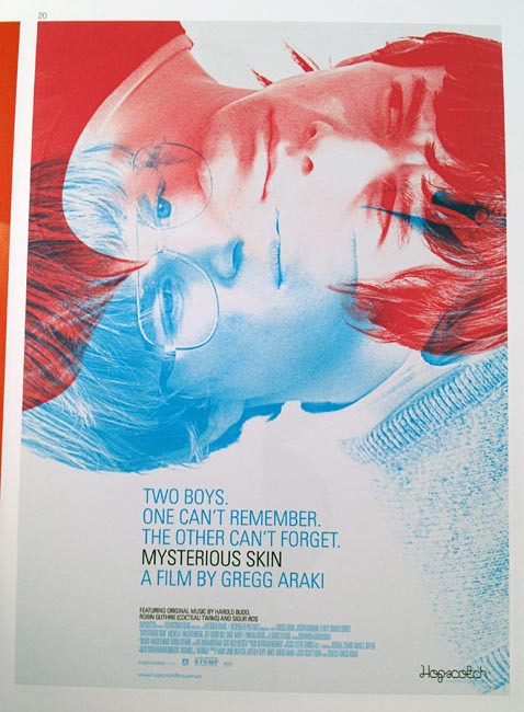
Mark Gowling in Sydney is doing nothing original whatsoever save for a smashing poster for Mysterious Skin.
-
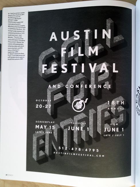
Bigger Than Giants in Austin, with its fondness for thin-stroke-width type and weathered paper backgrounds, has exactly the æsthetic to make itself popular with online designers. They relish any retro angle and shy away from actual expressiveness, except in the form of garish minimalism that works well in a thumbnail.
The firm’s poster for the Austin Film Festival looks nice enough if you like isometric letters made out of asbestos or felt, but the information architecture doesn’t sense. What do you read second after “Austin Film Festival”?
Chermayeff & Geismar
As a tie-in product for their new book Identify, a hefty illustrated feature invites Ivan Chermayeff and Tom Geismar to run us through a few of their most famous corporate wordmarks and trademarks.
-
Mobil, sure. Pan Am, absolutely. But Chase Manhattan Bank? To this day they simply can’t explain why it works. Maybe the reasons really are inexplicable, but if that were the case, why not say so? Why not admit that the symmetrical glyphic design has a magic or a gestalt?
-
I don’t see how you can rationally discuss the Time Warner eye/ear mark without reference to Egyptian symbolism or the occult, but this is the kind of nice easy interview (again clearly conducted in writing) usually afforded to closeted movie stars. This sort of thing forced serial polluter Procter & Gamble to change its century-old logo in 1985.
-
And there’s a great lesson with the sunburst Smithsonian logo: Meet with each department director separately so they can all feel as though the buy-in was theirs and they were the first to recognize the work’s brilliance.
Later in this issue, a separate full-page callout on a retrospective of Lufthansa design implies that the whole thing is a crashing bore because of the grotesk typography and grid system used.
Fuck Yeah(,) Brutalism
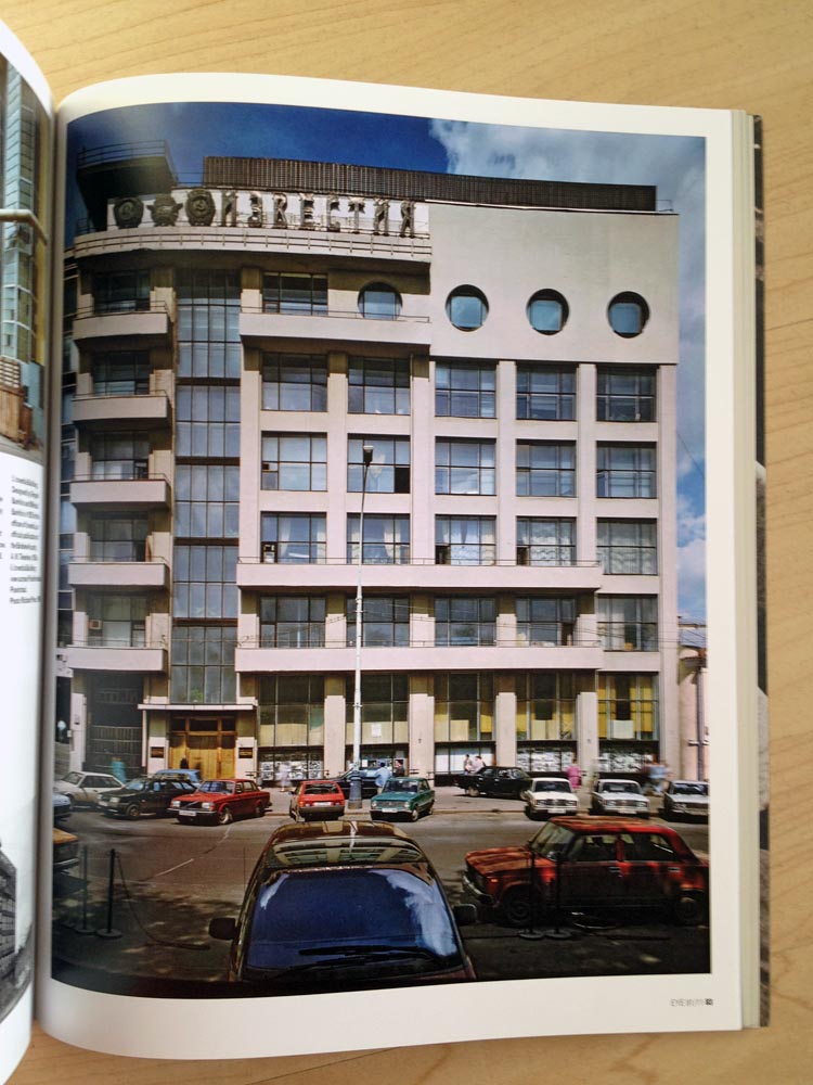
Now, this is Soviet design I can get behind. Richard Pare (interview) travelled around big-city and podunk Russia photographing what is inaccurately deemed Modernist architecture. (Half the buildings in question seem Brutalist.) A simply amazing series of buildings, with bizarre Russian typography de l’époque and Ladas by the dozen.

Oz Osmaston: My kinda guy
Except Oz Osmaston is apparently a woman. I stand by my sentiment.
Of course vicious reviews are more fun to read, and to write, than any other kind. And that’s often held out as a criticism of critics. But what if the work you’re reviewing really is a piece of shit? Here the victim is Ready to Print: Handbook for Media Designers by Kristina Nickel. (I’m just guessing the assault is deserved; I don’t have the book here.)
Much talk of RGB and CMYK, of gamuts and profiles, pages and pages of the kind of arcane detail only a repro department needs to know, just to end up with a final chapter on how to create “a normal print PDF without traps.” It is actually suggested that “[t]he PDF compatibility should be as low as possible for output” – imagine, to have gone through all of that to end up with an Acrobat 4 PDF. […]
There is a persistent hectoring tone – there’s no end to the things “one must do” – and it is full of odd translations of technical terms…. There are rather too many proofreading errors, and the diagrams and illustrations are small, not always well labelled, and sometimes understandable only when looked at with a glass (no clues as to how to use one, though). […]
As to the book itself? Double columns of justified text … with far too much hyphenation and rather ugly subheads; section-sewn complete with head and tail bands and black-ribbon bookmark, casebound with a limp – and smelly – PVC binding so floppy it won’t stand upright; printed in Hong Kong (but carbon offset, so that’s all right, yeah).
In short this book left me feeling both bullied and baffled – and I’m supposed to know about this stuff.
But who really likes this book? Spiekermann does. His son translated it.
And on the topic of overseas printing: Steve Hare writes about a book from Booth-Clibborn, quoting Edward Booth-Clibborn as stating “Books need to be tactile and exciting…. We’ve been doing this for a long time now, working with artists… to create unique books that go just that little bit further.” Hare: “However, ‘further’ also usually means a trip to the Far East, and this book is no exception: It is printed in China.”
Rick Poynor, more disingenuous than usual
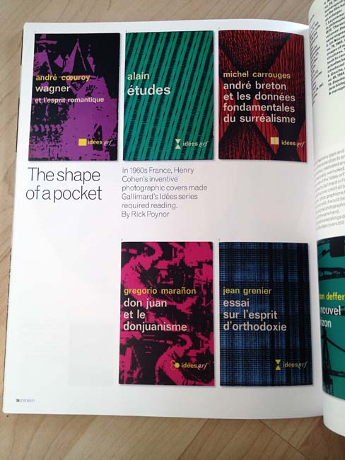
Rick Poynor’s piece about Henry Cohen’s book covers for Gallimard didn’t displace me from my instantaneous assessment that these things are no big deal. (Full marks for admitting Cohen “answered my questions by E-mail.”)
What we were expected to accept as a kind of retrospective on a forgotten designer of a bygone era turned out to be a vehicle for another of Poynor’s Freudian slips:
Design history has many gaps, and these can often be arbitrary. While some objects and episodes are repeatedly recalled, celebrated, and written up, others are inexplicably overlooked.
This is the lesson of Natalia Ilyin, the design writer design writers pretend never existed. As she has explained, historians of graphic design have written into existence a continuum of works and periods that never was. If anything, the history of graphic design is flow followed by chaos. Since the Machine Age and manifestly since the invention of xerography, there has never been a single graphic design – rather, innumerable competing graphic designs to most of which we remain oblivious.
Then there’s what design critics like Rick Poynor do, which is pick and choose winners. Poynor is positioned squarely inside the system. He is one of the writers who creates the gap in the record he now disingenuously decries as arbitrary. If you’ve been following along, you’ll recall that Eye did this exact thing to Barney Bubbles – first excoriating him, then canonizing him.
This clubhouse atmosphere, with its A-list and its outsiders, makes the contemporary-art world look like a meritocracy by comparison. It also serves as a nullification of what I continue to insist is the failed medium of design criticism. Of course a cœlecanth like Poynor is not about to admit that the world has evolved. An article in a design magazine today that is indistinguishable from an article in a design magazine three decades ago has a value approaching nil. But to concede that point would be to concede that Poynor’s profession has been superseded by events.
It has.
Other items
-
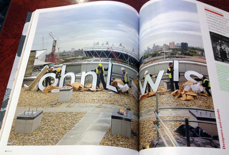
I pretty much skipped Jim Northover’s piece on the John Lewis Partnership, which seemed too British to be of remote interest.
But isn’t this the construction site you’ve always dreamed of working on?
-
I’d like to know where Walters or designer Simon Esterson got the idea that we write spaces around slashes.
-
Oh, for the love of God: Do we need any more coverage at all of “hipster axes”? (Particularly a full year after they were hot in Williamsburg? That’s well past the trend’s “sell-by date” even by the glacial timetables of print publishing.) I’m talking about an axe (i.e., an ax) gussied up and made palatable to ironic young men. Even more risible is the context expressed in the cutline below a loving photograph of four ostensibly desirable axes:
The curators of Graphic Design: Now in Production… include Ellen Lupton, Andrew Blauvelt, Ian Albinson, Jeremy Leslie, and Armin Vit and Bryony Gómez-Palacio….
Essentially, then, the Usual Suspects put on a museum show about manufactured objects. It’s not as though Andrew Blauvelt could even pick up an axe with both hands, let alone lob one. Somebody might break a nail.
Are you looking for another reason design criticism needs an axe through its skull? Here’s Ellen Lupton: “The exhibition revisits the idea of ‘designer as author,’ which galvanized independent designers in the 1990s [!], and shows how this impulse has morphed into a more collectivist, pragmatic vein of work…. The designer has become a producer–editor, publisher, toolmaker, and entrepreneur.”
Because nobody’s done any of those things since Dieter Rams or the Eameses.
If you’re a designer in your 30s or older, just how “galvanized” were you by “the idea of ‘designer as author’ ” in the era when Kurt Cobain still strode the earth?
-
Yet another tedious article about posters. This time it’s by Kerry William Purcell and it’s a review of an exhibit of posters in London that ended the day before my copy of Eye 81 was due back at the library. (Who needs the Web? A print publication really can bring you today’s news today.)
Is it a sign of the growing acceptance of graphic design as a legitimate subject for the traditional art gallery that [this exhibit] seems so conventional?
Or is it a sign that posters are so conventional they’re boring, and are examined mostly because they look great on a wall (QED) but also reduce to legible thumbnails in important organs of design criticism?
When somebody mounts a museum exhibition on genres that aren’t even accepted as design, like soles of shoes or favicons, then we’ll talk.
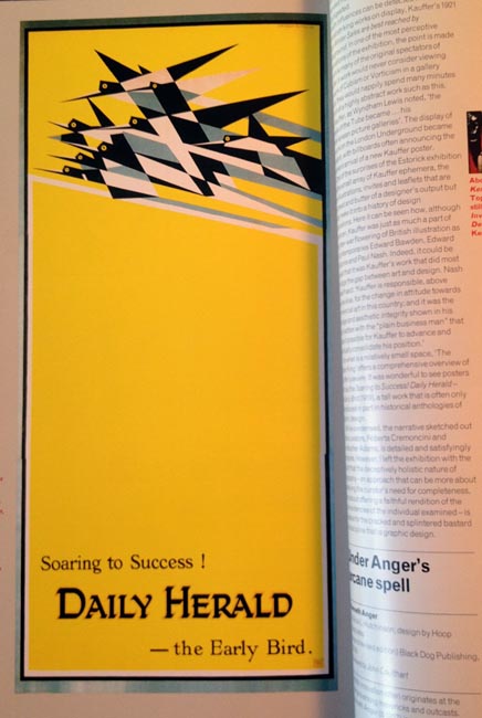
It was wonderful to see posters such as “Soaring to Success!” (1919), a tall work that is often only reproduced in part in historical anthologies of graphic design.
Maybe because nobody wants to print a five-foot-tall “anthology of graphic design”? And anyway, I see a scaled-down but full-height reproduction on the page facing Purcell’s statement.
-
John Coulthart does not actually seem to be reviewing a book about design when he reviews a book about Kenneth Anger. It was, however, a smart review, especially in its educational aspect: Who knew that Anger was such an influence on everyone who isn’t Bruce LaBruce? (Coulthart doesn’t mention him.)
-
The list of contributors is unreadable without hanging indents.
-
Nick Cave does Mandeville.
Why exactly am I doing this?
At some level, I don’t know why I put untold hours into the creation of 2,800-word takedowns of the most self-important organ of design criticism since Graphis. And I do this four times a year.
It’s not that I want to put Poynor and Heller out of business. I just want them to finally realize they already are out of business. Graphic design does not require their form of criticism, nor is it wanted, nor does it help. Graphic design – utilitarian, not artistic – can barely sustain any form of “criticism.” I’ve been through this countless times before.
I applaud the closure of a course that churns out design critics the same way I applaud the elimination of schools for travel agents and typewriter repair. The last thing graphic design needs is a professional critic where there is neither a profession for them to join nor a need they can fill.