(UPDATED) Mr. CHRISTIAN SCHWARTZ (q.v.) addressed magazine designers in Toronto yesterday (at MagNet 2012). (Notes forthcoming below.)
The happily married type designer enjoyed a macchiato and a custom TTC Type & Tile Tour. I noted his disbelieving smile at Museum station, which he claimed to like despite dismissing as kitsch the hieroglyphics embedded in the letters of MUSEUM.
Update and liveblog of sessions
(2012.06.11) I have finished spellchecking, paper-editing, and fact-checking my liveblog notes from Mr. SCHWARTZ’s two sessions. (For the first time, I tried banging shit out in iA Writer [yes] rather than handwriting in a notebook and transcribing later. It really isn’t better this way!) Live-twitting is not exactly the stupidest possible approach; live-twitting then collating everything in Storify is. My way is better, and, with all due respect to Adactio, nobody does this better.
Before we go on, I will tell you something about Mr. SCHWARTZ’s mien in the two sessions. He was up bright and early at 0900 for the first one and seemed distant and nervous, especially after I had the gall to ask him how much he billed the Grauniad for Commercial Type’s endless custom fonts. (He took a swig of water under my withering questioning, in fact.)
But in the afternoon session, I guess Mr. SCHWARTZ had had luncheon, hence was considerably less glucose-deprived, because he demonstrated what I could describe only as manly mastery of the subject, the room, and his presentation style. I am not gladhanding here. Mr. SCHWARTZ blossomed from an introverted nerd to a man who knows his shit, knows he knows it, and effortlessly imposes decisions on junior type designers (then makes sure those decisions stay made).
Manliest type designer: Steve Matteson or Christian Schwartz? Despite Mr. SCHWARTZ’s lack of hi-’n’-tite haircut, the comparison is nonridiculous.
“The Birth of a Typeface: Changing a Modern Classic”
Again with the untucked shirt. Rather more grey in his beard than I remember. Apart from that, he looks unchanged in the way John Waters does.
He seems to blush at the applause, but that turned out to be his natural colouration. And he pronounces all six Ts in “Toronto.” I rectified this with him later. (Also says “Shpiekermann” and pronounces basically every non-English word pluperfectly – Noordzij, Neuzeit, Haas [“house” the first three times], Stempel.)
Trained as a graphic designer. Worked for Spiekermann in “the corporate design German thing for a while,” then at Font Bureau. Shows Amplitude from nearly 10 years ago. Farnham. Neutraface (pronounced à l’allemande) was the only typeface I ever designed that had a music video done for it. FF Bau. Los Feliz for Emigre: An experiment in “taking everything I had leaned about type design and doing it all wrong.” It was tail-end-of-the-1990s grunge type.
2003: Got to know Paul Barnes, who has had a much more varied career – art-directing magazines; designing logotypes with Peter Saville, including Kate Moss, Givenchy. Designed one font, Pagan Poetry, for a Björk single (pronounced Germanically). Wallpaper. World Cup U.K. shirt. The brief was it had to be a white shirt, but also colourful, so it had tiny coloured crosses on it. People said “Why do you expect us to buy this bullshit shirt to support this disappointing team?”
An embarrassingly nerdy story: We met over a lowercase g. His was done from original, Paul’s from a copy. Paul asked where he got that g: Did he make it up?
Amplitude was “done enough” when Wallpaper needed it, so that magazine got a custom font without the expense or the time involved.
1998: David Hillman of Pentagram created what is really a modern classic – turning a newspaper, the Guardian, into “a piece of graphic design.” But he kept the text face as Nimrod, because the quickest way to piss people off is to change their newspaper’s body typeface.
ABC Lexicon of Love and New Order albums matched Garamond Italic and Helvetica. You could play those off each other. Doing that gave a distinct visual taste to the newspaper.
1999: New art director Simon Esterson replaced Garamond with Miller Text, added colour. Helvetica was switched to Neue Helvetica, so had more weights to work with.
By 2003, the design had been in use for 15 years. The idea was to design a tabloid, since other quality papers had gone tabloid. Tried Gulliver. But they wanted a better Helvetica. So Paul’s idea was for him to go back to the original hand-set metal Helvetica from 1957. “The curves are sweeter…. This was the perfect vanilla-flavoured typeface…. It’s a little bit of Switzerland.”
But most weights of Neue were actually interpolated, and those are the ones used most. Went through the laborious process of drawing all these weights as if it were 1957. But the font needed to have narrower set
width (a term he didn’t use).
But the editor thought the mock-ups were a miniature version of the Guardian. Plus the tabloid format pushes you toward tabloid presentation of information – one big story on the front page. The Guardian preferred many stories.
The lesson here is never to fall in love with your first idea. (Later, though, Richard Turley at BusinessWeek remembered the Neue Haas Grotesk he had. To be truly American, Schwartz told him, he should be using Franklin Gothic. “Yeah, but Helvetica is just the right amount of wrong,” said Turley.)
The obvious change would be a serif typeface. Either Paul or Mark Porter, the Guardian’s creative director (1996–2010), suggested Paul and Schwartz design it together, since the Guardian needed somebody in London anyway.
Should be a bit more Continental, quieter, and serious, because when all the other papers are shouting in their new smaller tabloid sizes, you go quieter and hope this means people take you more seriously.
But the editor went on vacation just before the relaunch. Then he decided tabloid sizes were too commonplace, choosing a Berliner instead – the width of a tabloid but the height of a broadsheet. (This is the first time, the first time, I have ever encountered a designer defining the term “Berliner,” which we were supposed to simply have known all along.)
Typeface called Stockholm was designed as a perfect match for Neue Haas Grotesk . Renamed Haçienda for the Manchester connection.
The paper did really a lot of dummies in-house. Almost producing two formats of paper each day.
Mark introduced ideas like “viewspaper,” where it’s as much about looking as reading. (Shows photo across a centre spread [unbeknownst to Schwartz, à la National Post].) That’s the biggest shift and the most enduring influence in the redesign.
Full weights plus italics were ordered. Also trying a text face, at least as efficient as News Miller.
And then nobody called for a week. Another. Five months later, they all independently came to the conclusion that maybe a sans was the right thing to do after all. (The competitors all have has serif typefaces.)
So a year after the Guardian launch, Publico in Lisbon reused both faces. BusinessWeek used it as serif face.
Legend holds that the first sans serifs were Egyptians with serifs cut cut off with a file. So let’ s try that, Paul said. Mark said “That’s it! We want the Egyptian!” All the seriousness of a serif, made delicate in lighter weights, but can have the impact of sans in heavier. It finally felt like something new, something fresh, like it was was finally reaching its own identity.
Convention is to name the font after designer or at least the art director. Initially called Porter, then Guardian Egyptian. Within a week, the old Guardian felt strangely outdated, as though it weren’t the Guardian anymore.
Needed wide range of weights. They liked a Hughes Egyptian from 1820, but Mark wanted an italic that was a cousin, not a sibling, to the roman – more like Renaissance italics from the 16th century. We thought that was a crazy, ridiculous idea. But never dismiss an idea till you draw it. I’m particularly fond of the black italic, though I think it’s been used in the paper twice.
“Inspired by Twen, the great German culture magazine if the 1960s” (extract) designed a Compact width. Then Mark said we’d already paid for the sans, so that had to be done, with a heavy Gill Sans influence.
By accident, the Egyptian was poured into a column of text and it worked, so the text face became an Egyptian with a quite simplified italic. “In the text face, it’s nice: I can I can suspend disbelief and just read the text and just enjoy it.”
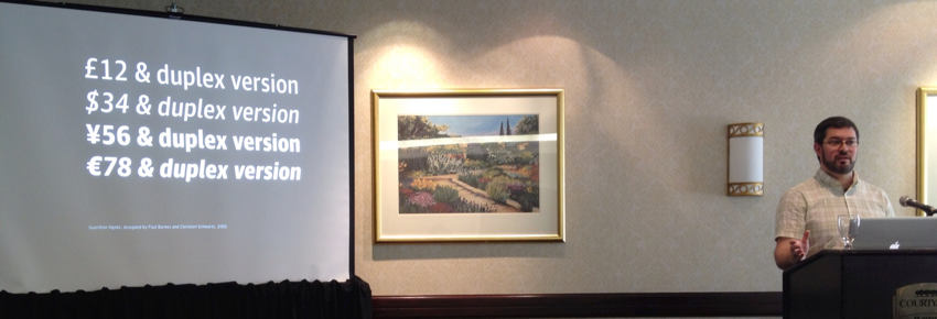
Needed an agate.
New presses in Germany made everything too light, but the presses in the U.K. made everything too dark. So they drew four different weights to enable the Guardian to decide at the last minute – three weeks before the launch – which one to use. Included agate, text, text sans, plus versions with different and identical set widths up and down weights.
Mark claims this is largest custom typeface project for a newspaper, especially with everything drawn to work together. They don’t ever use them all at once on one page. (Ran numerous slides with callouts to the type variants used: 10 on P. 1; seven on front section; eight, mostly lighter weights, in G2 magazine; five in Sport, with an incredible amount of agate; 11 in reviews section on Saturday, with italics; 11 in Travel, mostly sans.) The Magazine was redesigned recently.
So how does this stuff that starts out idealized play out over the years? Designing custom typefaces removes the mystery of how it’ll work on a press. But nobody had any idea about the iPad. But we got lucky. I can’t say enough good things about how Apple has figured out rendering on the iPad. We don’t have to do any of the incredible hard work (we do in print); on the iPad they just look good. Even though the iPad app doesn’t look like the Guardian in any real way, it feels like the Guardian with the colour palette and type.
And as a typeface is released to the public, people turn out to have different needs. We have added a few widths to Sans Headline, like extra condensed.
The Guardian redesign represents convergence between newspaper and magazine design. So we shouldn’t have been surprised the typography works well in magazine context.
Q&A
- Did you do anything for the Guardian Weekly tabloid?
-
No. (Nor the Monthly.) Main print product only.
- Were you viewed as a supplier or as a collaborator?
-
That evolved over time. For Neue Haas Grotesk, I was a hired pair of hands. (Took only one month.) It was a two-year process after that – collaborating with Paul on the phone and via iChat, but also with the highly visually literate Mark Porter.
- Is 15 or 20 years the lifespan for a newspaper even when we expect change at regular intervals nowadays?
-
Well, it’s how long the previous one lasted. The goal is to respond to what has already changed. At BusinessWeek, the journalism had improved tremendously, but the format was so far behind where the writing had evolved to.
- (My question on how much they billed for the whole project)
-
(Wouldn’t answer, looked nervous, took a swig of water. Claimed not to know the figure.) What’s the order of magnitude? (Wouldn’t answer that either. So you don’t remember it and you won’t tell us?) “I wouldn’t want to share anything that’s both incorrect and proprietary.”
- (Question about timeframes)
-
Six weeks on Neue Haas Grotesk, eight months for Stockholm. There was other client work going on, but not much. Esquire commissioned a slab – ultimately Stag – and “it was really hard to get out of Guardian Egyptian mode.”
- Did you go to an old Vandercook (proofing press) and run off metal type and digitize from that?
-
It’s hard to know how worn-out the type is when you’re looking at the actual metal, so I worked exclusively from specimen books. A book from 1960 had complete alphabets of romans. It wasn’t a redesign; it was a restoration.
- (Question about origin story)
-
It was the 1990s, and I wanted to be not just designer-as-author but also designer-as-author-as–type designer. That was the only thing he turned out to be good at. Sort of like an architect getting really distracted by designing bricks.
Has tried to leave type design a few times. Spent three weeks with Roger Black trying to become a magazine art director. He just told him to work on fonts.
Loves magazines, hence works with a lot of them.
- Who owns what you do?
-
“We retain ownership of the copyright of all of our data, and we often trademark the names, too.” Had to license Neue Haas Grotesk from Linotype. Exclusive for Guardian: Two years worldwide, four years in the U.K. Fast Company font was exclusive only for magazines in North America.
(What about buying all the rights wholesale?) That’s enormously more expensive. (He thinks the Microsoft C-fonts ran about $1 million each.)
- Customizing retail fonts, as with Farnham for Toronto Life?
-
(Lengthy answer that boils down to the fact it isn’t straightforward for third parties to alter an OpenType font because font compression means you can’t do a round-trip and have unchanged characters turn out the same. According to their licence, only Commercial Type may modify its fonts.)
- (Question about where a budding type designer could start out)
-
The Type@Cooper accelerated program. Gives you the tools of spacing and really how to look at things.
- (Books to read?)
-
(Was sort of stuck for a moment. I said Karen Cheng.) Karen Cheng is good for intermediates; all she does is look at letters in isolation.
A Tally of Types by Morison is a very erudite approach to that. He definitely has an agenda. Walter Tracy’s Letters of Credit. (I suggested Counterpunch.) The Stroke: I have to admit I’ve never read The Stroke, but everybody who works for me has. Very hand-based, since he came to it from calligraphy through type history.
Zapf doesn’t draw typefaces as much as he writes them. Frutiger cut things out of construction paper – a kind of systematic drawing. Handlettering is its own vernacular, and Ken Barber at House Industries knows 20th-century handlettering better than anyone.
- What software do you use?
-
At the outset, Fontographer let you do only a limited number of things, all of which were necessary for font design.
Used FontLab for many years. Possibly the world’s worst-designed piece of software. It’s almost a miracle there were typefaces designed in the last 10 years.
Glyphs is a good new program.
(He uses Robofont exclusively.)
- Any changes for the iPad app?
-
None! “I was shocked!” (Also did nothing to Lyon for Instapaper.)
- On your agate slide, what does “duplex” mean?
-
An old Linotype term. Two fonts that are the same width. (Comes from two typefaces stacked one on top of another on the same bar of metal.)
- (Dimly-remembered, untranscribed question about how he feels when the work gets used in radically unexpected, possibly unfavourable, ways)
-
We don’t take it personally or else wouldn’t be able to work. Changed the name of Haçienda to Publico because they were Portuguese and didn’t like the use of Spanish.
- (Question about national references)
-
Paul told him he needed to go to the V&A to see wrought iron, a pure black-and-white form; to see Georgian houses; to visit the St. Bride Library to see punches. What is Britishness, Paul forced him to investigate, not just typographically but in the environment?
Snippets from answers to other questions
-
I don’t want a typeface to be the sum total of everything I know about a topic. (Hence he doesn’t like drawing Cyrillic, since he doesn’t know enough about it.) It really is an act of translation. (Later, via E-mail: “Ilya Ruderman in Moscow has worked with us on several Cyrillic projects. Panos Haratzopoulos in Athens draws our Greeks.”)
-
Typeface naming is actually my least-favourite part of the process because the names you come up with always end up being taken.
-
Kerned Chalet for House Industries. Simian. (House Industries has enormous depth of knowledge of 20th-century American design.) Neutraface still actually pays my rent, which is kid of amazing because it’s 10 years old. If Neutraface hadn’t done well, it wouldn’t behave been possible to do Commercial Type, because I would have had nothing to live on.
“Understanding Type Design for Magazines”
Best way to understand type design for magazines is to discuss the motivations behind them.
He’s got two designers working for him in New York. Monica is their part-time admin in Brooklyn. They have a font technician working on Webfonts.
Austin, for Harpers & Queen. Nineteenth-century British type viewed through the lens of late 1970s New York advertising type.
Esquire would commission a typeface as a solution to whatever problem would come up. For the 75th anniversary, hey, how about a stencil? Then a sans, then a rounded?
(Las Vegas Weekly wanted something that feels like Vegas. Stag in lights!)
Original brief from Esquire was “create a typeface hat would fill a page with ink,” that was masculine, distinctive, interesting. (He had truly no trouble at all freely using “masculine” and “feminine” as descriptions of typeface feel.)
Serif bracketing on inside and outside are different. Gave more personality when a handful of characters were used at enormous size. But really, they use the Medium weight 80% of the time.
Compactness was suited to their distinctive cover style – a wallpaper of type behind a person.
Wanted to add a new typeface to add masculinity to the page. So they played it against Mercury, which was pretty and delicate, unlike Stag, which is essentially blocks smashed together.
Stag now has a life of its own. Time Warner Cable; Bank of Melbourne; CBC (“really nice on-air graphics using Stag,” and yes, he’s walked through the Corpse Atrium and all he sees are his mistakes).
Caponi
Font for Entertainment Weekly: Caponi was planned a bit more deliberately at the beginning, Paul said “It’s gotta be a Bodoni.” Yeah, but what about Cheltenham? It’s about time Cheltenham came back into style. Ball terminals mixed with Bookman. How about a high-contrast Baskerville? Tried all those things. Paul: “I keep telling you it’s gotta be a Bodoni.” Schwartz was thinking if sharp cold stiff Bauer Bodoni. Paul was thinking of Bodoni’s early influence, Fournier. Low crossbar on G, head serif of G. But the arches in R and ball terminals in s make it softer, friendlier.
Give a Modern appearance in light but an Egyptian appearance in bold. (But they have modern styles throughout the weights too.)
Lyon
We called ourselves Commercial Type so they could release type by other people. First up: Kai Bernau’s Lyon. Started as a degree project in the Hague. Roman, italic, bold, and a weird Civilité thing with the italic – which was stunning, but it didn’t really work with roman text. Ascenders and descenders had different heights; too narrow; more of a historical artifact.
His job was to help Kai make hard decisions, and ensure those decisions stay made. As you close into the end of a project, you reconsider old decisions.
It only got done because New York Times Magazine liked it and gave them three weeks to ship it.
Typography for Lawyers recommended Lyon. So now we have to deal with a lot of lawyers, many from Texas, calling them up and asking to be walked through the process of buying the “Lyin’ ” font.
Marian
Occasionally we do indulge ourselves in more (fanciful) things.
When he was in Stockholm, Paul saw a lot of neon there, plus Paul has a fixation on marble headstones. Both forms use single monoline or hairline strokes.
With historical revivals, we often have only pieces of the material. So our idea was: Just find the skeleton of it and see if these lovely French Renaissance italics would still be recognizable of rendered in thin single strokes.
Paul did a 1565 Granjon in hairline. You really learn something about the structure of these italics with the weight not getting in your way. They did basically every Granjons from 1554 to 1812. (His comparison is to Wendy Carlos – recognizable as classical music, but modernized and a little bit odd.)
Did Modern faces like Baskerville, Bodoni, Austin in monoline. Now we need a bonus track at the end of the album: A blackletter.
Now: What do you do with (personal work) like this? Let’s spend more money than we’ll ever make on it and have a show. (They rented a gallery for two weeks.) Let’s make a bunch of neon and use it to set the original designers’ names. (Also nails in the wall in a single line. Mirrors with type shining through.)


Graphik
Loved Swiss Modern graphic design in school. Plain typefaces, but incredibly expressive, structured work. Loved an old Renner face, Plak, available in wood only from Stempel. Folio and Neuzeit Grotesk don’t have the baggage of being the world’s most popular typeface. Round dots (on i and j) make friendly grotesks friendlier (sic).
Wanted something with geometric simplicity but the warmth of a Grotesk (again, sic). He and his friends love bold; magazine designers love thins. Then went back to this other feature of Swiss modernism, the ultra-condensed. Everyone knows Frutiger’s grid for Univers’s variations, but that grid leaves numerous holes. A modern typeface for modern uses really should have a lot of options. The XXXXCondensed width was one more beyond extreme.
Graphik means “graphic design” in German, and he saw no reason not to think big like that.
Each letter is a rectangle with the minimum amount of white carved out of it to make it a letter. (Missed his explanation of adding an axis.)
(Too mentally fatigued to continue scribing. But his presentation only got better from here. One of his art-director friends asked to borrow Chiswick for a hush-hush presentation, only to come back a couple of days later with “Oprah loves the italic!”)