My first Eye “rebuke” produced solely with computerized notes. This issue is all about Monotype.
The Arial Truth and Reconciliation Commission
Eye lobs a basket of softballs at the hired gun who committed the greatest crime against typography of the 20th century. Robin Nicholas, codesigner of Arial, admits in passing that he is “not really that up to date, to be honest,” with what Eye called “younger type designers.”
Nicholas is accustomed to softballs. Let me bring you back to MacUser (U.K.), 2005.07.08 (PDF), which interviewed Nicholas and took on the task of excusing the atrocity that is Arial all by itself.
First, let’s clear up a few Arial myths. The most virulent is that Arial is a straight ripoff of Helvetica…. Some even go so far as to suggest that Arial’s creators simply opened up Helvetica, pulled a few curves and adjusted a few baselines, and sold the result to Microsoft, an accusation which is, quite frankly, ridiculous. […]
It started life as a bitmap font developed for IBM around 1982, and was effectively redrawn towards the end of the decade to coincide with the emergence of the desktop-PC market sparked off by the Mac. Its forms are based on Monotype’s venerable Grotesque face, although there’s less difference between thick and thin.
Nearly Timesian in its pre-denials, this piece almost succeeds in obscuring the truth. Yes, the G, Q, and R all fail to be absolute clones of Helvetica’s. The angled terminals are like Univers’s. But the effective redrawing they’re talking about made Arial’s widths exactly the same as those of a Helvetica variant in common use. That way you could write a document on a platform whose developers weren’t too cheap to license Helvetica and reopen that document on a second platform whose developers were in fact too cheap to do so and your linebreaks wouldn’t change. (In principle.)
Nicholas has this to say about his bastard child in Eye:
I could do with seeing a little less of Arial. I don’t really see Arial as my typeface. It was a product of its time. It was a way of filling a company need.
Here, a need for a Helvetica clone that defenders could later pretend wasn’t.
But it’s good to see typefaces being well used. Arial can look quite nice. Most typefaces can if they’re used in the right way.
The giant pullquote on the break page may become Nicholas’s epitaph:
I don’t see myself as a typeface designer. Hermann Zapf is a typeface designer.
Arial in a nutshell, from that same paragraph: “What I have done is to develop typefaces: Pulling component parts of various typefaces that seem to work well and amalgamate those into a new design.”
And with this full-page “specimen,” Eye finally jumps the shark:
Whatever Rick Poynor writes about becomes graphic design
The first feature article in this issue is Poynor’s piece on “the eccentric collaboration between 1960s film-maker / designer John Sewell and artist Bruce Lacey.” (punctuation in headline sic). Screenshots show quite a few frames reminiscent of Constructivism and/or with visible, if unreadable, text. It would be a stretch to call these obscure films “graphic design.” I know how much of a stretch it is because I got a grant from the Ontario Arts Council to write an article for Emigre (1995!) about typographic music videos. I’ve done that stretching myself.
(Sewell later became an undisputed graphic designer at the BBC. It’s still a stretch.)
It’s Ultrasparky, not Ultrastilted
Yet another unendurable interview conducted by E-mail. This time it’s with a little scamp who, while erudite, simply is not this stilted, Dan “Ultrasparky” Rhatigan. Even Rhatigan’s bio, as given in a cutline, feels like corporate boilerplate: “Rhatigan’s work with Monotype currently centres around the development of Monotype’s intellectual property.” Hot-metal type is “intellectual property” now? (Try schlepping it up the stairs.)
-
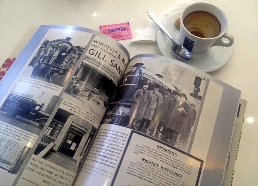
You can’t clean up Gill, whether typeface (as he tells us) or man (as he doesn’t).
Gill Sans takes a very “asystematic” approach to type…. We have been working on projects to update Gill and really it just becomes: “You can tweak a little bit, you can put in alternate 1s that have hooks or crossbars[.”]
Like this (p. 65)?
(Eye actually rendered that as “alternate ones,” which I suppose makes as much sense as “euros 55.”)
-
Here’s an arch but stupid question that makes me wonder if Eye interviewers – not bylined here! – fancy themselves Bringhurstian: “The range of quality between screen types, from retina displays through to e-print, is much bigger than any range that existed in print.” What the hell is “e-print”? (Technology: It’s what tweedy old chaps on boneshakers have their man take care of.)
-
Rhatigan’s closing statement just fails to make sense, mixing and matching concepts like “code” with concepts like getting “the right thing to the right person.” (He probably means custom-manufacturing a typeface for a specific device and resolution, which basically sounds like bitmaps or hinting to me, the latter being a subset of the former. A real editor would have asked what the hell he was talking about.)
Eye: We can make the self-imprinted publisher of Pink Mince sound as dull as a weekend at an English country estate.
“Draughtspeople”
In this issue, I kept seeing references to “draughtspeople,” or draftspeople as we would write it. I thought this was post-facto political correctness, like calling Frank Sinatra the Chairperson of the Board.
But the picture on p. 49 clearly shows most draftspeople were draftswomen (as of 1923). This does not quite follow the pattern of U.S. factories, which used women as labour in the Second World War and turfed them once their husbands came back. Or does it?
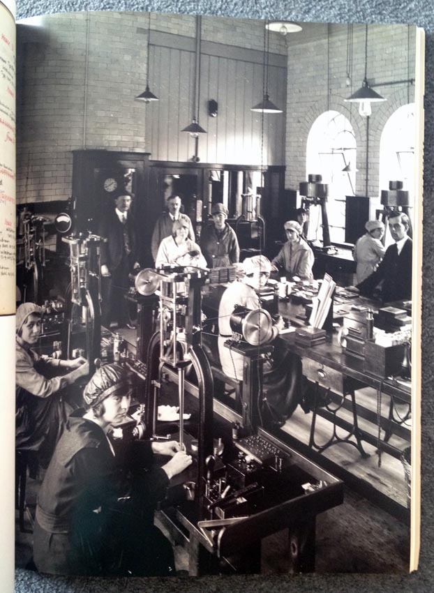
For once, I’m interested. I’m the person who reacts angrily to analyses of wymmyn in type design. I say to these activists what I say to contestantesses on Chopped and Top Chef who make a political play about being women: The typeface doesn’t know you’re a girl. Nor does the food. So just get to fucking work.
But this history needs documentation. (A blog post will do.) I especially want an explanation of how that photograph squares with Beatrice Warde’s flat pronouncement (1959; p. 80) that “the printing trade is barred to women, on the craftsman level.” Again Eye appears not to read its own magazine all the way through and cross-check.
Heller is back, of course
And he’s trying to make you feel stupid for not being au courant with some obscure so-called movement or period in graphic-design history about which he can extemporize at will, ideally for a speaker’s fee. Here it’s a review of Sex Press and I won’t bother with the book’s subtitle, because you already know what Heller’s going to do with it sight unseen.
Heller is elsewhere deemed a kind of critic or historian emeritus in Elizabeth Beidler’s review of Graphic Design: History in the Writing, a suspicious and tendentious-seeming volume about the construction of graphic-design history. (Right up Heller’s alley! He is, after all, the decider.)
As expected, many well-known critics, educators[,] and historians share in this discussion, including Philip B. Meggs, Rick Poynor, Ellen Lupton[,] and Steven Heller (who, perhaps in proportion to his considerable output, has the most entries).
So then: The man who dominates in determining what is and is not of historical import also dominates in talking about it. Everywhere, at all times, forever.
Miscellaneous
-
Sitting here in the 21st century, I could not stomach a reprint, with typesetting like a blog’s (omissions given by […] on own indented lines), of Stanley Morison’s design process for Times New Roman.
(The boilerplate biography of Morison, typeset as a cutline, was unreadable due to Eye’s ideological resistance to paragraph indents.)
-
The photograph of Times’s use in 1932 looks a lot like LaserWriter output, complete with fake small caps that not even Ličko could pass off as petite.
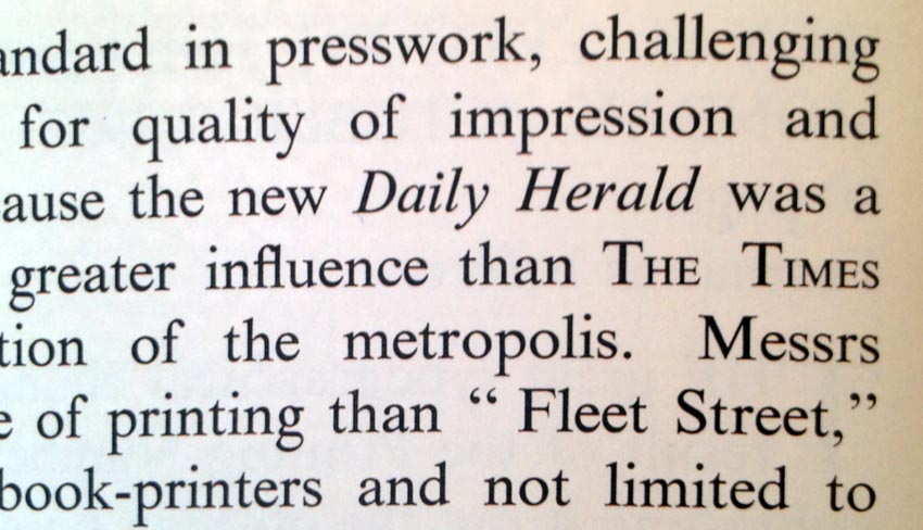
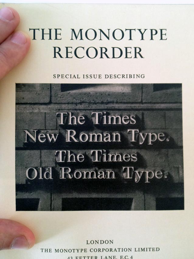
And this cover image seems brilliantly self-explanatory until you read that Times Old Roman wasn’t the predecessor typeface (Monotype Modern was).
-
Did your copy of this issue open itself before p. 93? It’s because of an obnoxious card-stock insert.
-
The bottom photo here is more interesting than the kind of detail-obscuring giant thumbnails (not an oxymoron) fatally preferred by the design press.
-
Contrary to Ellen Lupton’s review, The Book of Books is a rehash of greatest hits overfamiliar to any reader of the kind of criticism she peddles and positively does not have a “special gravity.”
Copy!
-
You don’t hyphenate “twenty-first century challenges” thus, and particularly not in 72-point type.
-
The short form of “matrices” is surely “mats,” but as a parenthetical it definitely is not [mats].
-
Here, asinine en-UK quotation-mark rules are taken to ridiculous extremes:
but also given the public at large a visual image of one “group personality”.’
Those rules never made sense in the first place, so I’m not acting surprised.
-
Did Eric Gill draw his typefaces originally in “Indian ink” (surely India) or just in “ink”?
-
Yes, I think a giant stela in a city wayfinding program is a great place for a glaring, typo like this, one.
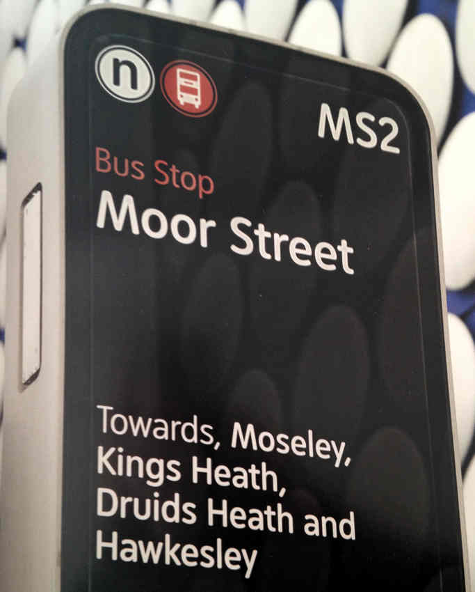
Nobody caught it, even at the level of publishing a photograph of it in the most prestigious design magazine that ever was.
-
Based on your knowledge of pantographs, which must surely be vast, is this how they really work?
The pencil outlines were traced and reduced with a pantograph, so that different letters that shared the same anatomy could be drawn on top of one another to prevent errors introduced by drawing a shape again from scratch.
-
Another gem from the Robin Nicholas interview: He actually is represented as having spontaneously uttered “2000+” extemporaneously (“I started in 1965 and the Salfords site had about 2000+ people”). Also, apparently the Type Drawing Office dealt with “customer’s orders,” which seems like a lot of infrastructure for a single solitary client.