If you need a new iPhone and you buy anything but the iPhone 5S, your wang might as well be a mangina as far as Silicon Valley nerds are concerned. If you don’t need a new phone but simply want one and the one you want is a “pink” iPhone 5C, you must be either a Japanese schoolgirl, or some other kind of girl, or some kind of homo.
It is just axiomatic and obvious to everyone who writes a technology blog (that’s the first problem right there) that features trump all else. The same nerds who snigger at Android, Wintel, and “FLOSS” apologists for their lame-ass arguments about superior clock speed walk right into the same open manhole with the 5S, except in this case it’s more like a portable hole with Touch ID functionality.
The tech specs of the 5S are used like a weapon. Conveniently, the 5S gives nerds the cover story of appreciating good design. (It’s an Apple product. Jony Ive designed it.) If we accept that people who buy “Android” phones either are befuddled, were swindled by a salesman, or simply have bad taste or no taste, let’s now finally accept that Apple supremacists can exhibit the wrong taste – a valourization of functionality and rationalism that is actually an Aspergerian deficit of emotional intelligence. Ten years after the Bondī-blue iMac, nerds’ rejection of colour comes off as asinine and immature.
Pink it is not
My esteemed colleague bought a 64-gig 5S. (Using every trick in the book, he got it for a song.) He has it loaded up with the same “content” his 4S had – birder apps, Grindr/Scruff and analogues, and hundreds of well-categorized fatso, bear, and musclebear nude selfies and dick pics. And many, many reptile and baby-animal photos. (As you do.) Because he isn’t a superstitious Chinese woman who scatters 8s everywhere, he didn’t buy the golden 5S. He has an excellent phone and uses the shit out of it.
Meanwhile, we moved up from two horrendous cellphone plans (inconceivable outside Canada) to a new one with unlimited everything and a shared 10 gigs of data for the price of 3 gigs. It was no trouble at all bartering down the Indian-call-centre salesmen – who have a much peppier style than long-suffering tech-support agents – to give me a free 5C on contract. I now have a phone I can actually use as a telephone and with which I can indiscriminately engage the Internet.
Obviously I got the pink one.

Saatchi is so disgusted with my holding the phone upside down that he can’t even look at me
Except it manifestly is not pink. I know that is how it is described in Apple’s own SKUs, but pink it is not.
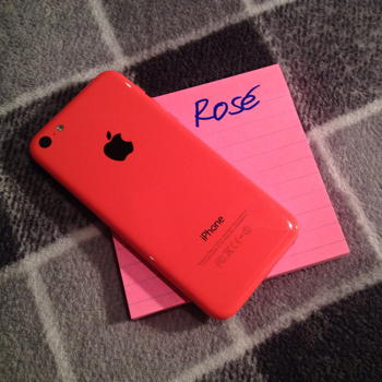 I saw and touched the 5S and 5C shortly after they went on sale. I fell victim to propaganda and examined the 5S first, especially the golden one. I felt nothing. They were all a complete blah. Viewed from the rear of the display case, the 5Cs looked awesome. Every colour was great even from a distance of six feet with a gold 5S in my hand. The pink colour is more coral or salmon; its defiance of categorization stands it in good stead. There is no way this hue was influenced by the Color Marketing Group and last year’s fad for tangerine cars.
The blue is OK; the white is not exactly nothing (the 3GS and 4S were always better in white); the green is quite nice. The banana yellow, difficult to hit without veering into greenish chartreuse, is excellent. But there was never a question which colour I wanted; “pink” is the winner. People forget that the best colour of the 5G iPod Nano was the purple.
Then I put down the 5S and picked up a 5C. Game over.
Typologies
The iPhone 4 and 4S typology is of a forbidding vitreous slab. I never felt comfortable holding that thing for one solitary instant. (That is not a post-facto rationalization.) I held on for dear life. I wasn’t just afraid of dropping it but of dropping it in what seemed the worst way – at an angle on a corner. I imagined that that was how all those young women you see on the streetcar broke their iPhone 4 screens. (Except the backside is the same material. Won’t it break too? Then that’s what you’re holding every time you use the phone.) Even laying it down on a flat surface I worried about a particle of grit scratching the backside.
When in hand, you are endlessly reminded of the Cartesian perfection of these models’ corners and angles, of which your hand has none. As such, all other iPhone models, from the 1g (which I own) to the 3 to the 5C, and all iPod Touches, were ergonomically designed because you can hold them. (Curved back beats squared back.) It was game over when I picked up the 5C because I immediately spun it around in my hand, which I was able to do. As with marble and granite countertops, I know what I’m touching is the clearcoat, but it feels great.
Later, I handed my own phone to my friend with the dick-pic-bedecked 5S. He felt it up and spun it around (two-handedly) and looked at me with wonderment. I thought this was what Apple did best – offering the joyous surprise of discovery. On a mass scale, no less.
Why do nerds trash-talk the 5C?
They act like it’s a design mistake. They act as though it is the second coming of the Flower Power iMac, one of which I own and which remains a beautiful object. (There the mistake was actually the Blue Dalmatian colour scheme.) These are the same nerds who LOLed at the “infamous” Palm Pre television commercials. In all these cases, technology manufacturers dared to depart from strict rationalism in favour of expressiveness and emotion, i.e., girliness.
The iPhone 5C appeals to nonwhites: Its deep saturated colours flatter their skin tones. (One of my Indian salesmen told me the “pink” 5C was extremely popular. We then had a conversation about how it must be so in India, an actually colourful land, but was stigmatized here.) If you have small hands or female hands or designer hands or just hands, the 5C feels better. It rests there; you are not holding on to it despite itself.
The Palm Pre commercials spoke to women, which Aspergerian nerds found intrinsically risible because emasculating; the 5C commercials speak to nonwhites, which those same nerds fail to notice even though it is right in front of them. (I ran a tally of the actors in the commercial: 25 vizmins [including Js and Latinos], 29 whites, six indeterminate.)
I know the materials are more wasteful, but the 5C packaging was fun to unwrap and puts the cardboard boxes of the 3GS through 4S to shame. The value proposition of the latter is the lid, which raises and lowers with air-cushioned damping (not “dampening”). The 5C package is like an iPod Touch’s and the delight starts with the tab you pull to unseal it, because that tab has a directional arrow in the same colour as your phone. (I checked: All tabs are actually “pink.”)
Jonathan Ive venerates Dieter Rams, but he also appreciates the soft preputial cocoon of British automotive interiors. The right-angled iPhone typology may come to be seen as excessively Ramsian, and apparently already has been. The new Mac Pro isn’t a forbidding slab of anything, so I believe my analysis is correct: The iPhone 4 and 5 will be looked upon as an errant design venture, even by the men of Apple design if not the deficient men who critique it.
I like men and I like manly things but I hate twee designer objects. I see now I also hate the opposite of that last. Nerds who oversell the 5S have never spent time among actual designers, a group dominated by heterosexualist males who embody the neatest, the tidiest form of masculinity. Not coincidentally, they have huge numbers of children, single-handedly outbreeding the Muslims. It is from this pool that Apple draws its designers, all but two of whom are reportedly male. Nerds – unmanned by anything soft, emotional, girly, gay – are ignorant of just how lacking they are. In fact yes, I question their manhood.
A squared-off iPhone 5S is a cudgel with which to one-up your unseen rivals. A rounded iPhone 5C is a beautiful object to have and to hold.