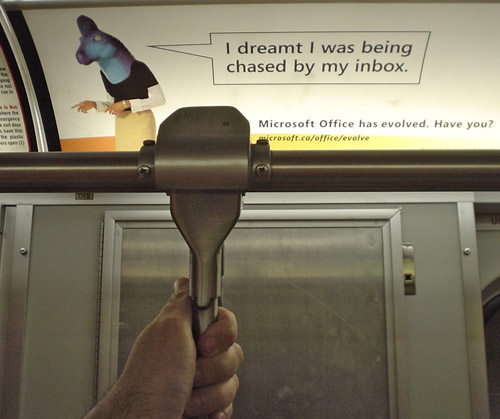
Ahem.
Two hours ago, I wrote:
Microsoft’s £7 million ad campaign for Office shows generic wage slaves, situated in generic internationalized office environments (or in unplaceable limbo), wearing baggy, ill-fitting clothing. (Except for the only identifiable woman. But what she’s wearing is similar to the guys’ clothes in another way: Long sleeves.)
More noticeably, they’ve got triceratops, stegosaurus, and T. Rex prostheses on their heads. They are wearing actual… dinosaur… heads. The campaign is justly reviled for calling its own customers dinosaurs. (Pot calling the kettle beige? Anyway, it looks better in Italian.)
Now: Here is my question. Is it a plus or a minus that they’re using a Microsoft Longhorn ClearType screenfont, Corbel by Jeremy Tank·árd, in the ads? It looks overbold and overregularized in print at those sizes. (Dead giveaways that the font is a late-20th/early-21st-century engineered typeface include uniform stroke widths and confusion-avoiding letter shapes, especially g and 1.)
Now my esteemed colleague Simon Daniels writes in and tells me it’s Segoe. Funny about that italic f.
I also wrote –
Did you know I still cannot tell apart the Longhorn fonts – all of which carry dyslexia-inducing names beginning with C – without checking my playbook? And now there’s a seventh, a pi font with the dumbest and least wholistic name since Frontiera: Cariadings. (Mariah Carey? Coriolanus? Hermione?)
– and that all hasn’t changed.
