T minus 14 days to ATypI Brighton 2007: TTC
Since my presentation on type in the Toronto subway is entitled “Inscribed in the Living Tile,” let’s take a look at those.
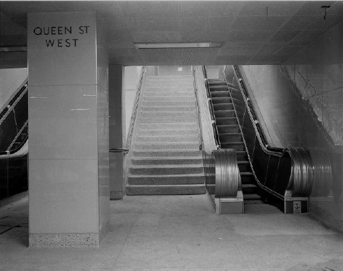
Transit fans adore the old, large-format, ultra-glossy Vitrolite tiles, as seen in this photo of Queen station from the Toronto archives (date untranscribed – it’s there, but even the archivist couldn’t find it again).

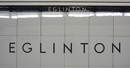
The only surviving usage is at Eglinton:

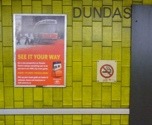
In the 1970s, the Yonge-line stations, all of which had original Vitrolite tiles, were renovated with new tiles, and rather awful ones at that. Everyone’s favourite: Dundas.

Yes, they really are chartreuse (not puce), and they’re simply vile.
He’s not being upfront about it, because he’s really incapable of being upfront about future plans, but TTC chair Adam Giambrone is among the elite who despise the TTC tile æsthetic. Giambrone has an undeclared war on TTC tiles.
- Pape station is to be redone in “artificial stone.” The TTC will always pick something fake over something real, from fonts to wall coverings.
- Giambrone essentially admitted that he wants to reënact the Museum station desecration on as many other stations as he can. Maybe one or two “heritage” stations would be retained in original condition.
This ethnic cleansing of Toronto’s actual transit heritage is what Giambrone calls “renovation.” He’s trying to slip all this in under the wire, and I don’t exactly see you up in arms about it.