I QUIT

T minus 9 days to ATypI Brighton 2007: TTC

Downsview station, located in the middle of nowhere, was a trial run for the Sheppard sign “standard.” Except it doesn’t look anything like Sheppard and is dominated by a continuous angled and illuminated strapline over either platform.
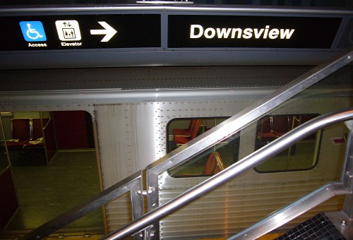
Sign over parked subway car has two pictographs, an arrow, and the word Downsview

That’s really the only information you get from the strapline. There isn’t even an indication of where to go to catch the bus. More on that tomorrow.

Now, let’s look at the same image with halation.
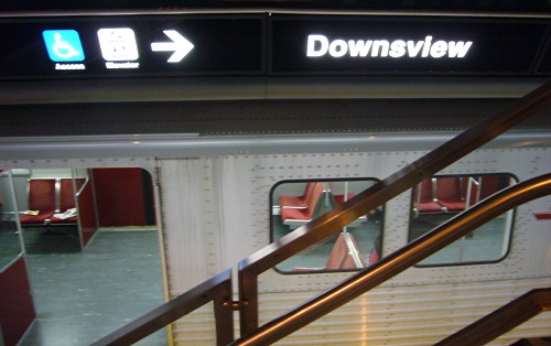
Sign over parked subway car has blurry pictographs and less-legible word Downsview

Still think fake Helvetica is “clear”?

The foregoing posting appeared on Joe Clark’s personal Weblog on 2007.09.06 20:20. This presentation was designed for printing and omits components that make sense only onscreen. (If you are seeing this on a screen, then the page stylesheet was not loaded or not loaded properly.) The permanent link is:
https://blog.fawny.org/2007/09/06/14atypi2f/

(Values you enter are stored and may be published)


Information

None. I quit.

Copyright © 2004–2024