UPDATE (2009.06.18): It’s just as bad as predicted.
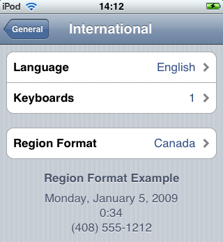
Leaked screenshots show that iPhone OS 3.0 will include Arabic and Hebrew.
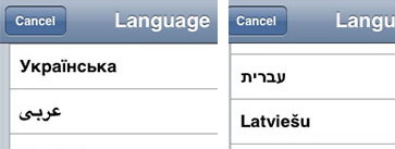
(Note the errant left-alignment of the two language names there. No, you can’t fudge it even in an otherwise-left-aligned list; it’s just wrong. The easiest fix is to switch to centred type.)
Right-to-left text direction is always, repeat, always more complicated than people think even when people walk into the job knowing it’s complicated. That’s how deep the left-to-right biases are among software and UI developers.
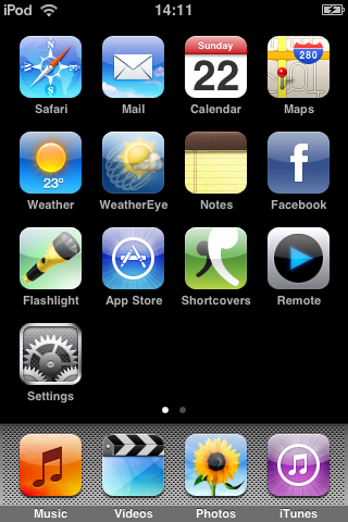
Think of all the directions that need to be changed on an iPhone or iTouch:
-
You’ll slide “backwards” to unlock (and for other uses).
-
Lines of menu items have to fill from the right, not the left.
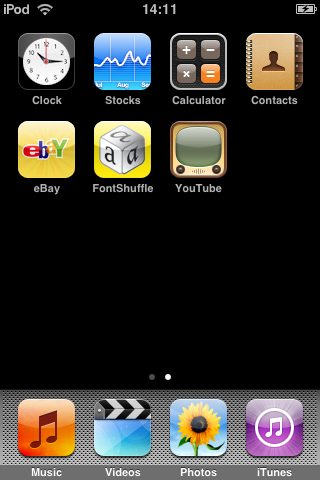
Additional screens of menu items must grow to the left. (Swipe right for the next screen.) Bright dots at bottom would be reversed.
-
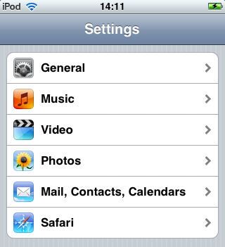
Menus and submenus must grow to the left. Thumbnails go on the other side.
-
Going back a level will happen rightward, not leftward.
-
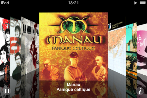
Coverflow grows from the right, not the left (not visible in static screenshot).
-
Even in unproblematic all-centred typography, as in song lyrics, the surrounding UI has to point the other way. Play points left, status-bar order is backwards, the zero point on a timeline is at far right, and fast-forward and rewind take on different meanings.
This last is a perpetual problem in Unicode, where it is confusing to learn that
<cannot always mean “less than.” It means that when reading left to right, but means the opposite in the other direction. Compare A<X and א<ש. That’s the same character between the letters in both cases (really).(Smart podcasters use the Lyrics field as a duplicate for podcast description to overcome the bug, still present in iPhone OS 2.0, that podcast descriptions just are not displayed.)
-
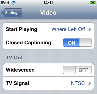
Toggle switches appear to have directionality, though in practice all you do is touch them, not drag them. Nonetheless, the apparent directionality must reverse.
-
Swipe-to-delete goes LTR, not RTL. Thumbnail has to swap edges, and order of metadata (minutes left, etc.) must reverse.
Since Thomas Milo, in various video podcasts (look him up on iTunes), has explained that the worst Arabic typography in the history of that script is the kind that computers have stuck us with, there would seem to be significant room for fiasco. Just getting decent Arabic- and Hebrew-script fonts onto these machines is gonna be tricky. (And you need more characters than are sufficient just for the Arabic language.)
Typographically, at least, things could be worse: Did you know that, according to an expert I talked to, Hebrew Windows users prefer the most atrocious old fonts, like scrunched Hebrew Tahoma, over the nice new well-designed faces?

