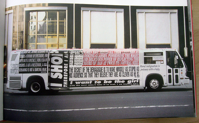
If you’re my kind of person from my generation, you have Barbara Kruger as an unshakable cultural leitmotif – so much so that you always call her Babs.
Her critiques of the advertising industry (she insists this is her actual theme, and complains when dumbass European curators claim it’s already been done) are expressed through typography. (Why Futura Extra Bold? “Futura cuts through the grease,” she said at a presentation at OCA 15 years ago.) What few seem willing or able to discuss is how phenomenally awful some of her typography actually is.
Nothing, nothing, is worse than these godforsaken buses and trucks she insists on wrapping in vinyl every decade and a half.


For the love of Christ, why can’t she see how atrocious these are? Dr. fucking Bonner wouldn’t let this sort of thing leave the factory.
(Cf. Jenny Holzer.)