That’s my interpretation of the mildly notorious new crest for the resuscitated Winnipeg Jets. Toronto Star, 2011.07.26:
The militaristic (one could easily say fascist) design is easy to criticize, and it has been.
-
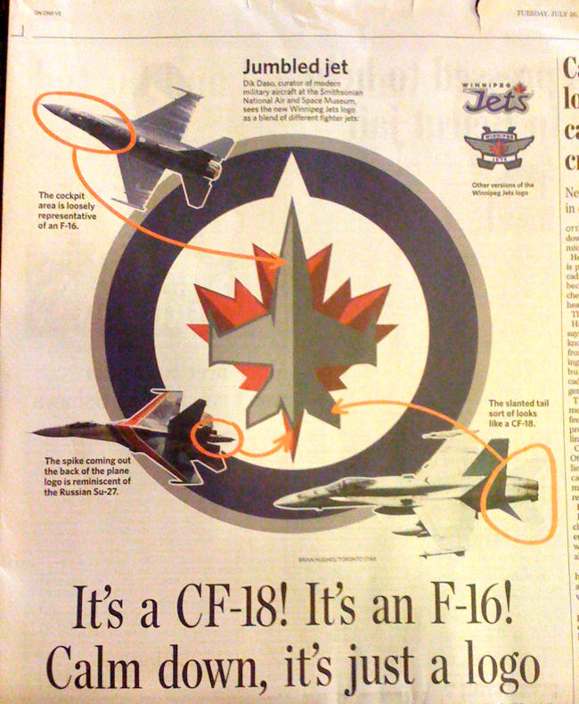
The logo looks like a CF-18 and in fact it was vetted by the Department of National Defence, which did not respond to a question about how much control it had over the design. (Admittedly, I gave them a long deadline and they are a government bureaucracy.) I assume nothing was allowed to happen without DND’s approval, but I can’t confirm that.
-
The design is overly literal. (CBC: “ ‘Our desire was to authenticate the name and make it as meaningful as we possibly could,’ Jets co-owner Mark Chipman [said,] ‘to draw a connection to the rich history that our city has enjoyed with the air force.’ ”)
-
The whole thing looks like it was drawn with vector tools, which it surely was. Nothing says cheap like Illustrator
gradientsshading.
Nobody has bothered to point out that this is yet another case of a corporation believing that a new logo improves the company. Only graphic-design ingénues are impressed by corporate logos as such. Where’s the rest of your graphic design? Where are your typography; your layouts; your letterhead; the typeface you print letters on letterhead in; your style bible; your matching Web site; your Twitter avatar; your favicon? A logo is one step in a process and a rather unimportant one at that. A logo isn’t the culmination of anything.
The Jets’ owners “worked with Reebok on the design,” we were told. This didn’t make any sense: Neither a hockey team nor an athleticwear conglomerate designs a logo. So I asked the Jets’ Dorian Morphy who the actual designer was. “There were literally a dozen or two designers at Reebok that designed various initial concepts,” he wrote back. “As the design became more focus[s]ed, I’m sure there were only a few. But, generically, ‘Reebok’ designed it. I could get names, but for what purpose do you need the info?”
To give the designer credit, I said. Even a design team has a leader. “If we wanted one designer to take credit it would have been launched that way. Agree to disagree.”
Actually, what Morphy was “agree[ing]” to do is conceal the identity of the designer, designers, or lead designer. I interpreted that as an indication the designers were ashamed of their work and didn’t want their names associated with it. More charitably, they are mere cogs in a corporate machine and are nameless, as individually irrelevant as the civilians whom CF-18s bomb.
Too harsh? Agree to disagree.
Who really designed the Jets logo?
A Reebok publicist told me “Dominique Fillion is our lead designer for NHL uniforms.” I mailed Fillion to ask if he actually worked on the Jets logo and in what capacity, then suddenly got a message back from the original publicist politely insisting everything go through him.
In interviews. Fillion has talked about his role in vague terms and, elsewhere, refused to say anything at all.