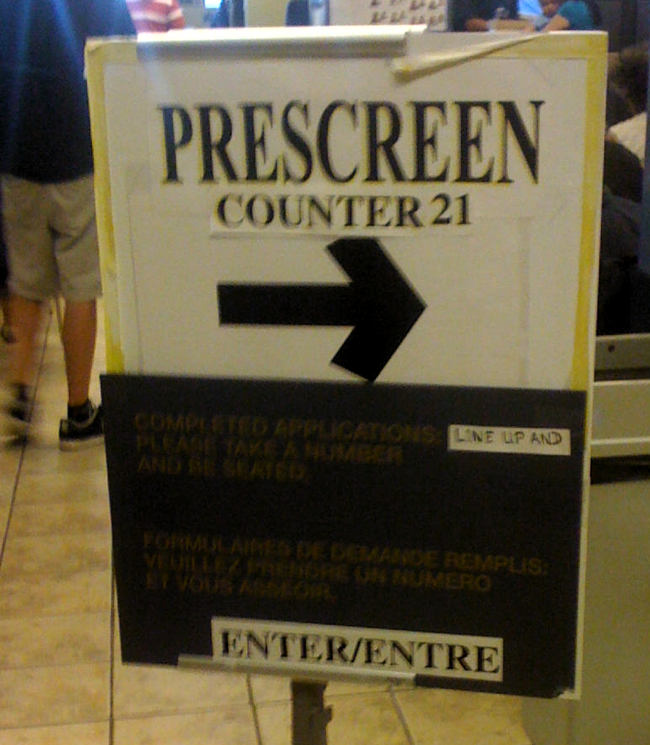
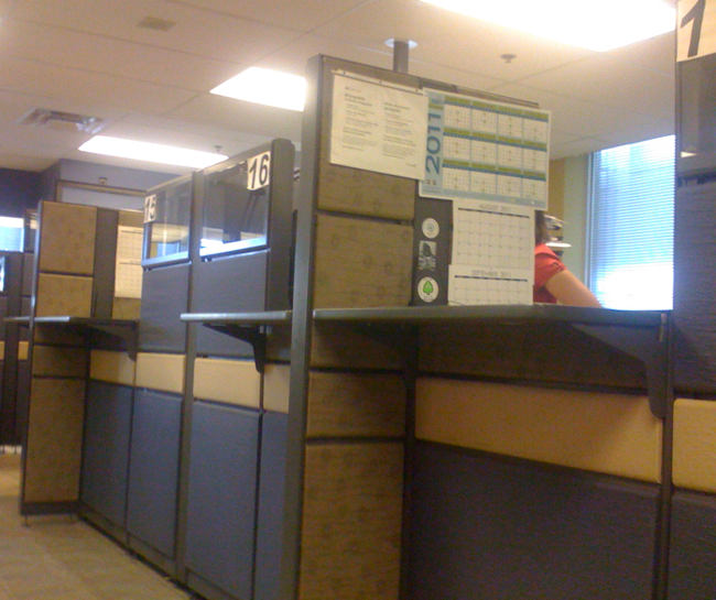
Here’s what confronts you in the purgatory known as the downtown Toronto passport office, where every seat is taken (and then some) and the atmosphere is positively Soviet:
I asked Passport Canada’s media office why the location’s typography and signage were so atrocious and in violation of the Government of Canada style guide, the Federal Identity Program. (I didn’t tell them I asked the “prescreen” agent more or less the same thing. “It is what it is,” he said, amid a lot of shrugging and rationalization.)
We thank you for bringing this to our attention. The signs you sent us in the photo were removed. We are actively working to replace all the signs across Canada to be compliant with Government of Canada and accessibility standards. Sometimes signs are created quickly in order to manage client flow when applicant volumes at an office surge unexpectedly. Though effective in helping point people in the right direction, these signs are not to be permanent solutions.
Well, that helps, but this organization knows full well its downtown office runs at 100% or more capacity every single day.
You know what else they don’t do? Verbally announce whose number comes up. Upon “prescreen,” you’re handed an auto-generated tag comprised of a letter and a number. But tags are not called in alphanumerical sequence, so you have to anxiously watch one of several identical LED boards for what actually seems like a near-random calling order.
Oh, but they do announce last call if you don’t hustle up to the cubicle in time.
A passport costs at least $87, you can’t pay in cash, and you have to pay extra to pick it up.

