Bristol Legible City was the influential work of Bristol City Council and a range of design firms, chief among them City ID. “Legible Bristol” (not what it’s really called) in every respect set the template for city “wayfinding” projects. (Bureaucrats love to use that term as a classy synonym for what it does not actually mean, signage. Wayfinding is a process of the mind that may or may not involve signage. This distinction is halfway lost, if not more so.)
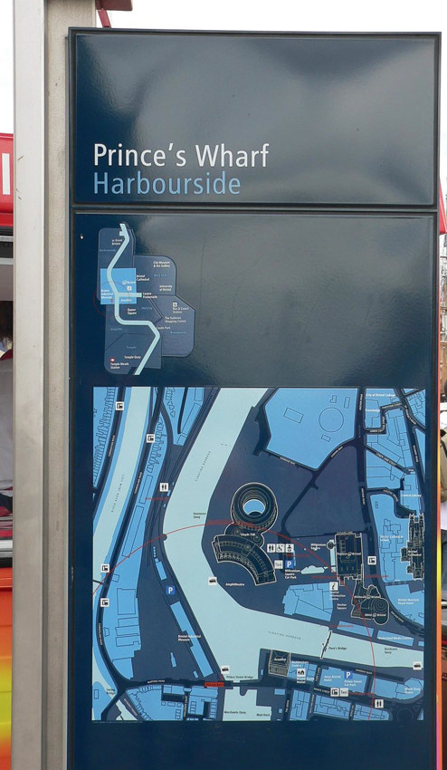
Here’s what Bristol’s signage looks like (adapting Laurence Penney’s photo): A 2001-like monolithic stela with heads-up directions and overhead diagrams.

It’s also what every city’s signage that came after it looks like. Basically every designer with an interest in “signage and wayfinding” or city informatics knows about Legible Bristol. And lo has it been replicated in city after city. We’re next.
Did you know Toronto has a wayfinding strategy? I didn’t, and I pay attention to these things. Anyway, we’ve been consulted as much as we’re ever going to be, so if, like me, you missed it, you missed it. What is going to happen now is the city will hire a contractor or a consortium of same and install Bristol-compliant stelæ in time for the Pan Am Games (i.e., the Parapan Games). One member of that consortium will be City ID or its competitor, AIG, which is Spiekermann in another guise.
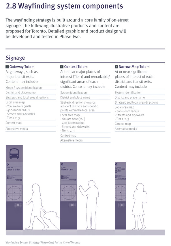
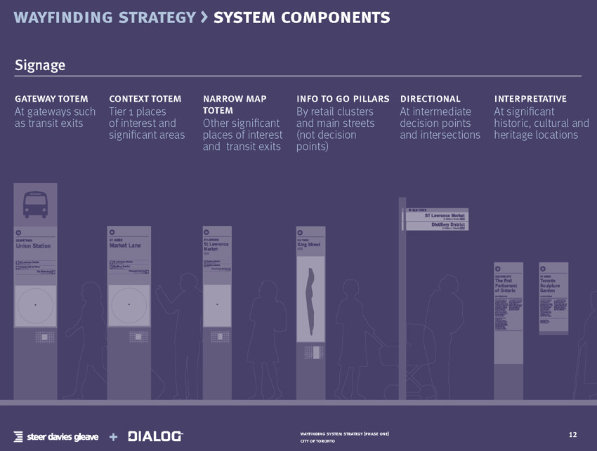
And the built form will be indistinguishable from Bristol’s. Why, the diagrams are already there in the documentation.


I asked the city manager involved and the lead contractor to comment on the inevitability of a Bristol-compliant design and was ignored. But it’s gonna happen. City wayfinding is now a product you assemble from a kit.
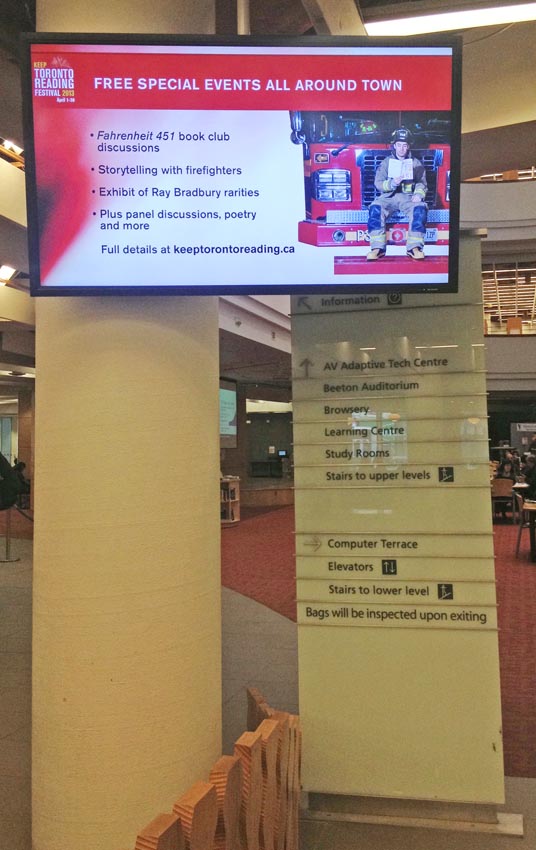
Incidentally, Toronto has exactly one of these stelæ already – at the entrance of the Reference Library, now obscured for months by a flatscreen display the library refuses to move and should never have installed in the first place.
