Sidebar to “iPhones are hard to use”
I use all the following on iOS, and I contend turning them all on seriously reduces annoyances of many kinds:
-
24-hour clock, as God intended.
-
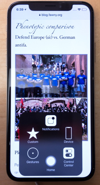
 AssistiveTouch (Lock Screen; Shake; Accessibility Shortcut; Screenshot; Home).
-
Text size third from largest. Always select text size with your glasses off – it’s for worst-case scenarios.
-
Bold type.
The exact need for “bold font” is hard to pin down. I think it began with the first Kindles’ atrocious screens and, before that, CRTs without nice smooth fonts. The actual issue is single-pixel stems and the difficulty of distinguishing those. (You can’t explain the concept of single-pixel stems to civilians who demand “bold font.” I’ve tried.)
But we don’t have screens like that anymore. The last time I saw one was an embedded Windows installation at a self-checkout machine.
Some theories are being developed about a sweet spot for a specific person using a specific device at a specific distance and what that person might prefer for stroke thickness and character width. Apparently at small viewing angles (up close looking at tiny fonts equates to a small viewing angle), thicker stroke width is more recognizable. (Video from ATypI 2018.)
-
Button shapes and on/off labels both turned on. You really want those, despite unintended consequences like lots of things suddenly becoming underlined.
-
Increase contrast on. Reduce transparency and reduce motion on. You will never go back to wildly animating home screens.
-
Vibration (also haptics) on but no sounds at all otherwise except for certain phone calls. I use a custom silent ringtone for all callers save for a select few.
-
Phone noise cancellation on.
See also: Evolution of homosexualist lock screens.