Esteemed colleague Jason Santa Maria has previously detailed the paucity of design in Web versions of print magazines. His example was the obvious one – the best-designed magazine there is, Wired. (Dapper design director Dadich explains why.)
The same effect holds true for newspapers. (Flickr versions.)
Structurelessness
The ill-designed, angry, bass-ackwards, antitypographic Globe and Mail site not only cannot typeset an italic without a space after it but cannot manage any kind of headings.

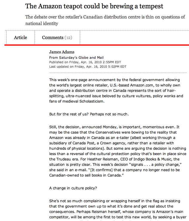
Redactions
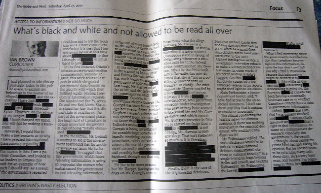
The blacked-out-text-as-indicator-of-heavy-handed-government-censorship effect finds itself transferred, as if skiamorphically, to coldly logical HTML. (Except the code sucks.)
-
We travel the bumpy road from Magic Marker® effect, itself a skiamorph –
– to the Web, where we just give up and embed a Flash movie, i.e., use Scribd.
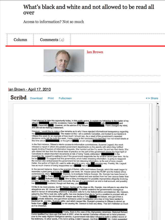
What happens to this article when Scribd goes under? Can you Google for the text of this article?
-
“Gagged”! (Again with the Magic Marker effect, the visual analogue of the carriage-return bell of a manual typewriter.)
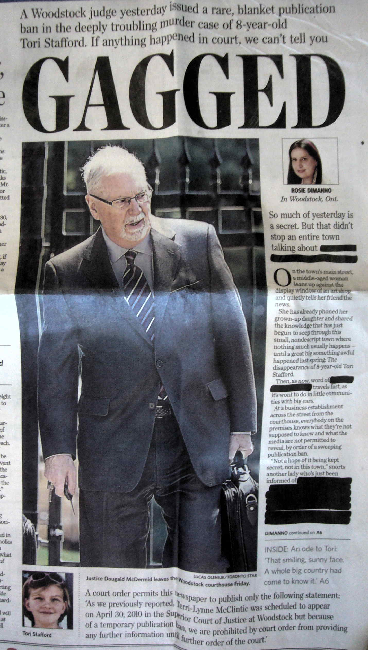
Superclassy Toronto Star Web developers at least dodge the bullet of actually publishing what was meant to be redacted. But they do so using the following Windows nightmare of “HTML”:
“Not a hope of it being kept secret, not in this town,” snorts another lady who’s just been informed of
<font style="background-color: black;">_______________________</font>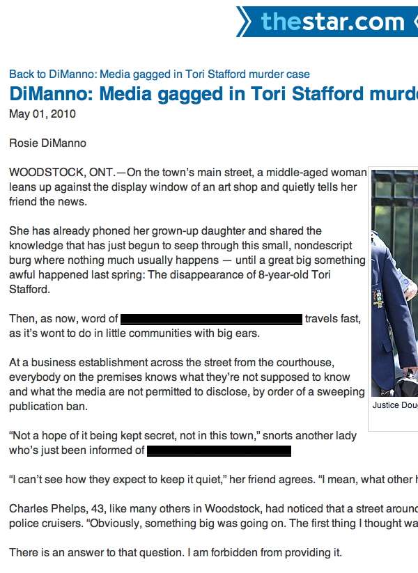
Despite numerous efforts, from the early multicolumn IHT site to multicolumn Helvetica collages to multicolumn Grey Lady iPad apps, nobody has managed to come up with a Web-native method of doing graphic design for news.