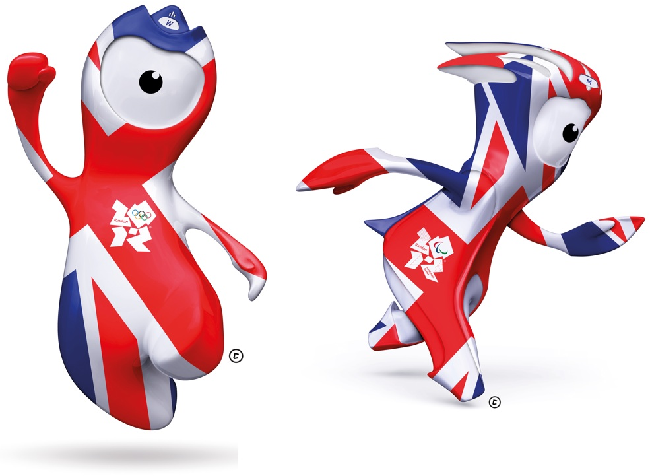
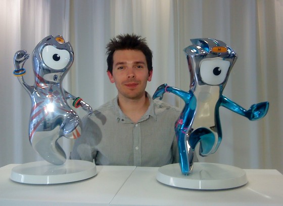
I’m the guy who really likes the new London 2010 mascots, Mandeville and Wenlock. Yes, I’m the one!

I liked them on sight. This is not a post-facto rationalization. I actually like these mascots; I do not “get” them, which is all one can do for the London 2012 logo. That design is the most advanced and recherché “logo” in human history. It was never meant to be “liked,” only used and reused and decomposed and recontextualized. It has abstract function intentionally decoupled from emotional connotation. You have to have an interest in graphic design to appreciate it, which suggests that Wolff Olins must have carried out the best client presentation in the history of advertising just to sell the London Olympics on the logo.
I was delighted the Paralympics got their own mascot. I understood the reference right away – Stoke-Mandeville is the birthplace of what later became the Paralympic games. So Mandeville is the perfect name for the little christer. (Wenlock’s name I had to look up. So did you.) The origin-story video for the two characters is actually kind of touching. Mandeville pops on a couple of wheels to race with, but the video kind of dodges the question of whether or not he’d run with a limp in the amputee race. Oddly, Wenlock is the one who seems to be missing feet.
So now if you want to root just for the Paralympics, and some of us do, well, hey: You’ve got your own critter. You can just ignore the other one.
Mandeville is actually better drawn than Wenlock, whose Olympic bangles make him look like a transgenderist hippie. (Why do the Paralympics have only three yins instead of five, you may be wondering? Because Dick Pound threatened to pull the IOC’s funding unless the Paralympics changed its logo from five yins arranged like the Olympic rings to something else, as Andrew Jennings documented from original Paralympic meeting minutes.)
They’re made of metal and they can bend to any shape, which I guess would only apply if they were still molten, but these are magical creatures. Like cuttlefish or squid, they can adopt any surface appearance they wish.
Now: Why do I like them? After the initial blush, what makes them work? They’re a beautiful amalgam of references. That doesn’t make them derivative; original art always starts from somewhere. There are so many references everybody is bound to latch on to one, which any psychologist will tell you triggers a process of “identification.” Just for starters:
- Kodos and Kang (yes! and that’s a plus!)
- Gumby
- London taxis (I got that reference right away) and iconic payphone callboxes
- Teletubbies and televisions (Mandeville’s eye is a true 4:3 television)
- Cyclops
- Daleks
- Pokémon
The whole is greater than the sum of its parts, a sure sign of triumph. They just look like mascots. Mascots are the only thing they “look like.”
Tremendous work by Iris. Tremendous. And if the London 2010 logo is secretly showing Lisa Simpson giving a blowjob, whom do I have to blow to get my hands on a trophy?

I’ll only be needing the one.