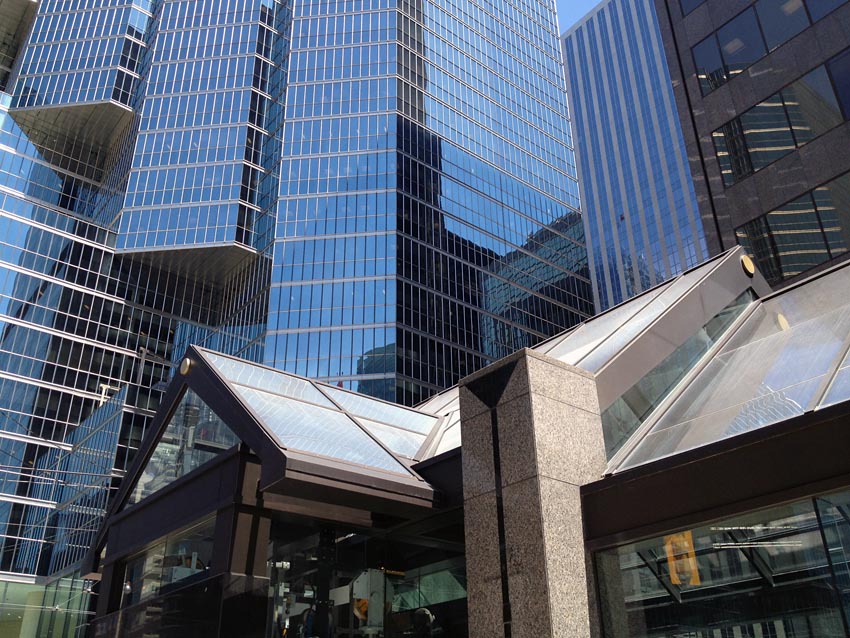
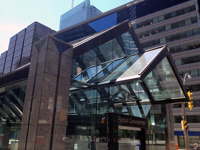
It’s the entrance to Metro Hall, the PATH, and, soon, St. Andrew station at King and University (145 King St. West).

It’s just an entrance! And it is easily the best-detailed postmodern structure in the city. It’s so postmodern it’s Spy-checklist-compliant.
- Does the building have pilasters or pediments or the same colour scheme as the 1984 Summer Olympics?
- Is it a cube with a peaked roof?
- For a building, is it funny?
- Is it funny but not a Las Vegas Hotel or a fast-food stand in Los Angeles?
- Is it easy to like?

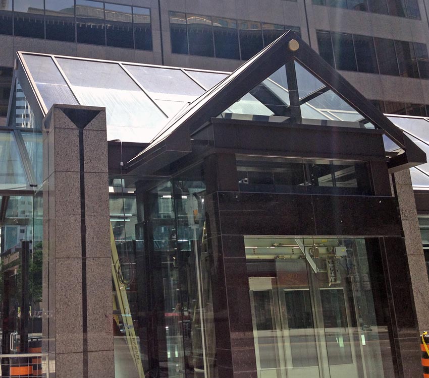
I noticed this vestibule only after it was suddenly surrounded by construction hoardings. This was to become the wheelchair-accessible entrance of the St. Andrew subway station. My heart sank, because the TTC is an organization that literally cannot match tiles on adjoining walls.
What a surprise: The new entrance has the same profile as the many other nested A-frames of the existing structure, but, in true postmodern form, it uses a different colour of granite to call attention to itself.

The only purpose for this structure is as an entrance to an underground complex. It is orders of magnitude better than it needs to be. It is amazeballs.