Helvetica type in iOS 7 will be darker than in early betas. Helvetica – still wrong for screen usage, as Spiekermann tried to explain to Ive – will not be replaced by another typeface; we’re stuck with it. The myriad adjustments you can make in iOS 7, including to contrast for low-vision readers, are desperate compensations for a font that shouldn’t have been used in the first place. (“What communication design looks like if you give the job to an industrial designer: Helvetica Thin, no diversity, just… style” [via].)
Later I will discuss non-Latin scripts in this context. (You wouldn’t believe the arguments I’ve had with people about the issue of matching, say, Arabic and Latin.) For today, though, let’s recap why designers love masses of grey text.
I covered this before in my now-forgotten posting on the International Compliant Style or IC-Style. I was building on an observation by Aycan Gulez that in turn is so forgotten I had to use the Internet Archive. (Segments reproduced here for posterity.)
Recently another Web-design annoyance has emerged in the form of low-contrast text…. It seems that more and more Web sites, and not just small personal Web sites, are switching from black to gray text. It sounds crazy, doesn’t it? Why would you willingly make your text less readable? After all, black on white is the maximum contrast you can get…. Then why do those Web sites use gray text? Have their designers never heard of contrast? […] Then what is the reason?
The reason is… gray text looks better and more coherent when seen from a distance or as an element of the overall design – but, and this is a big but, it is not meant to be read in these cases. […]
Unfortunately, some visual designers sacrifice readability for a slight increase in visual appeal because they do not really read the text on screen; they treat it as a large block of horizontal lines, and the darker those lines are the uglier they look. So decreasing the contrast a little makes the overall design look nicer but less readable. Poor readability is not the designer’s problem. After all, he will probably never try to use the site he designed. Come on – it is a boring supply-chain-management company Web site!
Designers like unreadable masses of grey text because they look great from a distance. Designers, being barely literate (ask Natalia Ilyin), do not actually read their own designs.
“It’s typography when it’s—
Both my posting and Gulez’s article are now ten years old. Designers never change.
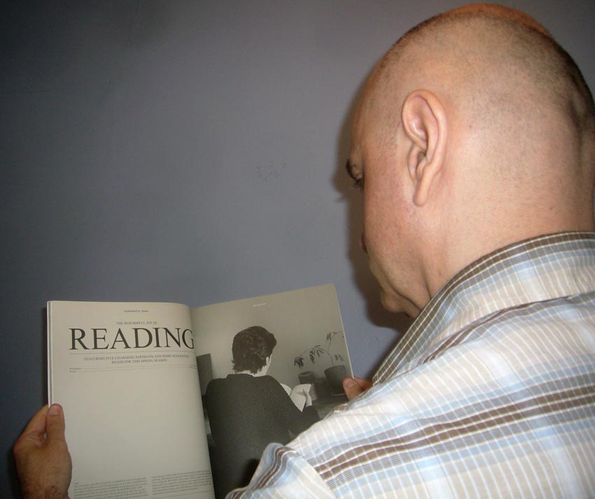
Here’s an aphorism that’s even older. I dug up, recharged, and posed for my busted digital camera (equipped with self-timer) to model these maxims just for you. (I’m wielding FANTASTIC MAN Nº 9, incidentally.)
“It’s graphic design when it’s this far away”

“It’s typography when it’s this far away”

“It’s typesetting when it’s this close”

You can easily reproduce these conditions with an iPad. In fact, isn’t it well accepted that there are three iPad viewing distances – breakfast RSS (propped up on table far away), Instapaper (in lap), and answering mail/iA Writer (head hovering over iPad on table)?