Bruce Gillespie, “Meet the Lexicographers,” Quill & Quire, May 2005, p. 28:
[Katherine] Barber [q.v.] admits that many of the team’s editorial tasks can become arduous. For example, it took about two months simply to proof the new Oxford Canadian Dictionary of Current English…. Tedium also set in when the team spent four weeks doing little else but inserting wordbreak dots – which show readers how to hyphenate each word properly – into each headword for the second edition of The Canadian Oxford Dictionary. “It can be hard on the eye and the brain,” says Barber.
Maybe it’s so hard to proof your dictionaries because the type needs serious improvement.
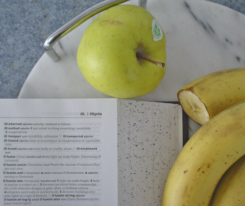
- Body copy (set flush left) uses Swift, which would seem to indicate somebody knew what they were doing and actually researched an engineered typeface suitable for use on thin paper. Actual small caps seem to be used. There the good news ends.
- The face seems about half a weight too light on the page, which might be remedied by increasing inkflow during printing or may require a custom interpolated weight.
- Headwords and entries are typeset in Arial Black. I shit you not! Who the hell picked that abomination? It’s seriously in dispute that a dictionary’s keywords and entries, where distinguishing every letter is important, should even use a grotesk typeface, given the confusable character shapes. But Arial? in a black weight? The contrast is excessive. Worse yet, we seem to be using default letterspacing, which is far too tight for this application. (That’s why wordbreak dots are so hard to add. And read.)
- And in fact, they really mean it when they use Arial, as all the headings in the “Guide to the Use of This Dictionary” are also set in that “typeface” (often in all caps). The first page for each letter shows cap and lower-case variants of that letter, including the dreaded Arial G, R, and t.
- There’s more: Little annotations like prefix assimilated form of are set in Arial Narrow Italic. I again shit you not. You couldn’t at least use the real condensed, to the extent that anything Arial is real?
- The IPA font appears to be Times. They can do better than that.
Now: Is there an alternative? Yes, and Mark Thompson of Collins proves it. Clare Dowdy, “Defining Redesign,” Print, January/February 2005, p. 57:
Most dictionaries are typeset with vertical feathering, a technique by which the tops and bottoms of columns are made to line up even though individual lines in adjacent columns may not be parallel. This process adds to the layout’s inconsistency, and, on such thin paper, the page becomes mottled with lines that are overlaid on different sides of a single page. To avoid this, Thompson introduced a fixed line grid with a set number of lines in each column. This means the entry words don’t have to be so big because they don’t have to fight against the type on the other side of the page.
Thompson wrote a large piece describing his design process (and using many of the same illos as the Print article, which I’m sure is a coïncidence).
If Canada is distinctive enough to merit its own Oxford English Dictionary, at least give us typography up to current standards.
