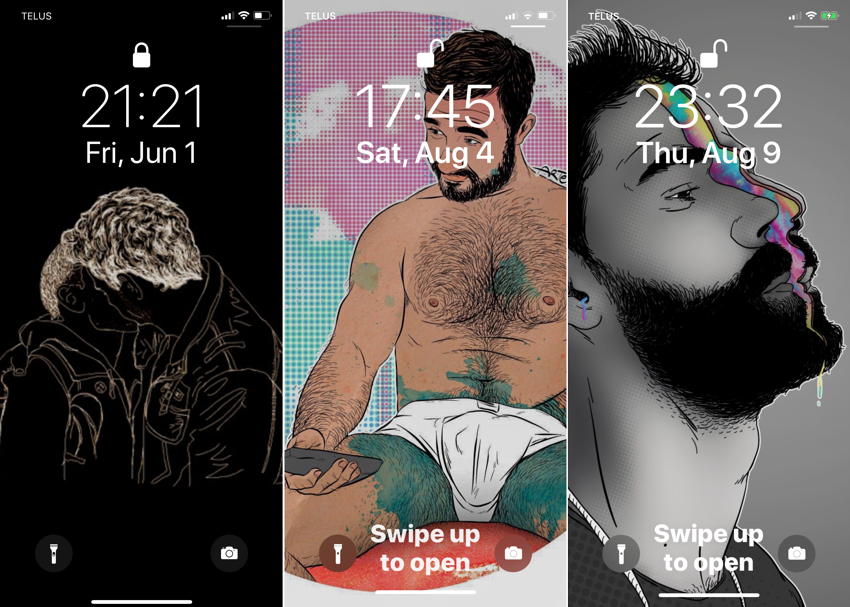
Just as the WordPerfect supplementary spellchecker dictionary was a window onto the soul circa 1988, one’s iPhone lock screen fills much the same function three decades later.
It goes without saying everybody else’s lock screen is awful, and, worse, entirely unconsidered. The system battles good taste on several fronts, offering deceptively named Move and Scale options that only allow the former in practice. Go the extra mile and save images in native resolutions (hard to look up and complicated by behind-the-scenes scaling and now parallax or perspective) and you encounter the fact that the two most difficult things to get onto or off of an iPhone are a photo and an URL.
-
I was trying for a minimalist design (later I noticed it made my phone entirely black) that anyone nearby would struggle to notice, let alone decode. I used Weekend fan art, inverting it successively in each of the modes GraphicConverter offers, of which the final sepia is one. It took easily a dozen tries to get image width right, add padding, and vertically position it correctly. And it is indeed a tracing of the iconic image of Russell and Glen’s final kiss.
-
For iPhone Eks, I disclosed to artist Topher McCulloch that I had been reusing his work all along, and asked for a version that would natively fit the new resolution. He sent one back, but, to my surprise, the original wallpaper transferred over perfectly with no intervention.
But that became too austere and ascetic. Plus I’d been looking at it for years, or had become banner-blind to it over time. Something with a bit more life was in order: This was a job for Edgar Murillo’s colour sense. Again very few illustrations could be crammed into the unyielding aspect ratio.
After I set up these beautiful and vibrant interfaces, two words that rarely go along with the third, I looked around at so-called gay lock screens and found nothing but banged-together “LGBT+” propaganda. We’re supposed to have taste.
Fundamentally, these are our personal phones, and we can put whatever we want on them, whether it be porn or inspiring male photography and illustration or (I’m thinking of my longtime friend’s lock screen here, which requires pages of scrolling through small-type notifications) cruising alerts from Grindère or Scruff.
Wangs and pup tails are up next.
