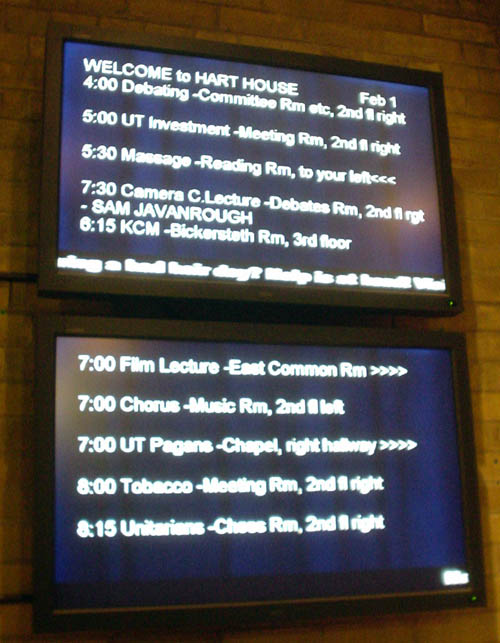
These plasma displays sit high on the wall behind the porters’ desk at Hart House, University of Toronto.

If you get the impression that the whole thing is “typeset” in Arial, with no attention paid to hierarchies of spacing, size, or alignment, with hyphens used for en or em dashes (among other hyphenation problems), with rows of greater-thans used as arrows, and with what appears to be a crawl visible on the bottom of the upper monitor, it’s because all of that is true. (And can you spot the misspelling?)
What you can’t see is that there is no antialiasing whatsoever and every individual jaggie is visible at large size. So I asked what gave. Why, this arrangement was specifically tested with visually-impaired people and is what they preferred, they volunteered.
Compared to what? A sign handwritten on loose leaf in ballpoint thumbtacked onto the wall? Seriously, this presentation could not scream “Windows type illiterate” any louder if you handed it a megaphone. How is it even possible to produce type this bad on monitors this expensive?
Quickie question for Hart House: What if you tested this presentation against something prepared by an actually competent designer? What if you tested it against other options that were not worse, if such is even conceivable?
And if this is truly the preferred presentation, why haven’t you published your methodology and evidence?