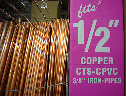
Author archive
- ½ʺ (2008.02.26)
-
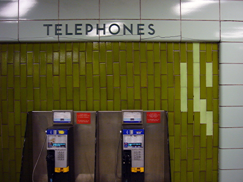
- Type treatments in TTC public art (2008.02.26)
-
Two TTC station artworks will include typography. So let’s not blow it
- Failed Redesign in microcosm: ‘Project X’ (2008.02.26)
-
Why is almost all of the CBC Project X microsite in Flash?
- Slow decay of St. George (2008.02.25)
-
- Carlå (2008.02.24)
-
Nobody writes carburettor here; it is as incorrect as tyre and kerb.
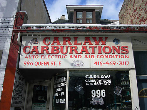
Carburations, however, is pan-anglophone.
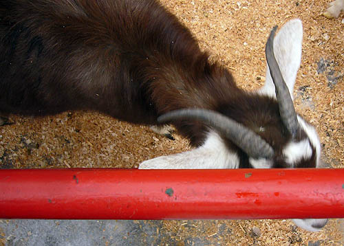
- Goat (2008.02.23)
-
- .arminvit { display: none } (2008.02.21)
-
“One of these days I’ll implement a print stylesheet”
- An apple can’t write like an orange (2008.02.19)
-
On what planet is the New Yorker the best magazine there is?
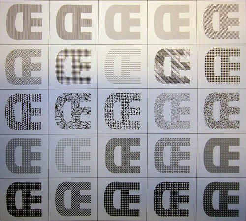
- Π(2008.02.18)
-
From Berthold Fototypes E1.