Archive for category: Type I Saw Today
Type samples from the real world
- Palatina’s (2007.03.17)
-
One of my snobberies concerns true and accurate Palatinos.
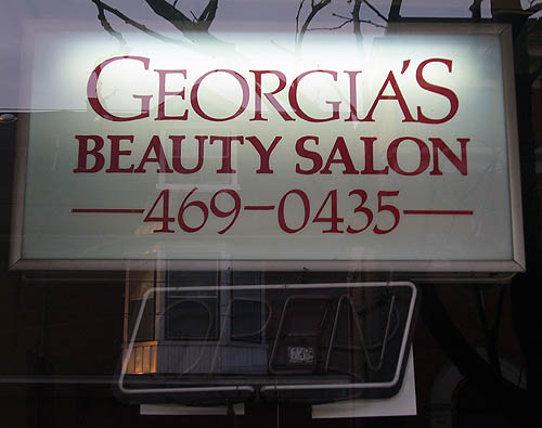
But really, Zapf has drawn or authorized so many variations that trueness and accuracy are relative terms. This does not mean I have to like the default versions installed on computers.
- Branding with type (St. James Town edition) (2007.03.16)
-
I don’t know where to begin with this one, given its mishmash of el-cheapo jumbo Arial, delicate Optima subheds, and extremely superklassy faux-marquee. (Do you really think parking is ever worth $20,000 anywhere outside Japan?)
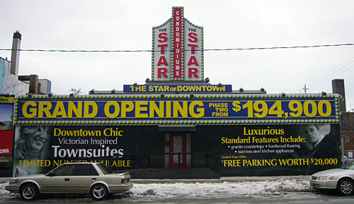
This development, by the way, is half a block down the street from the fantastically overdense and troubled St. James Town, and right across from the Food Basics.
- Not-necessarily-Arabic–Hindi–Tamil gift card (2007.03.10)
-
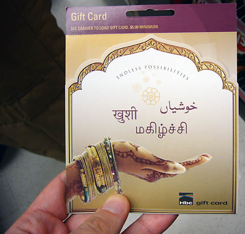
Apparently it’s actually Urdu.
- More-typical use of bank gothic in Riverside (2007.03.05)
-
And less pretentious than, say, the cheese shop’s.

- Doesn’t say anything about heads (2007.03.04)
-
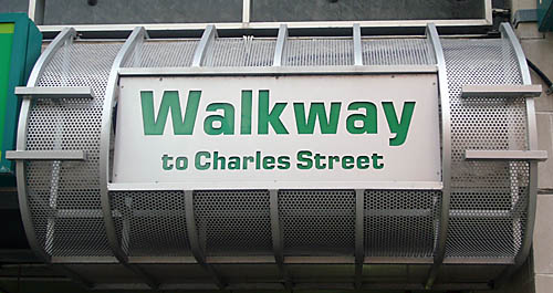
- Eurostyle walkway (2007.03.03)
-
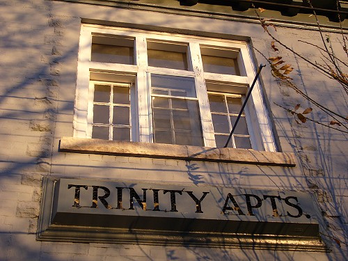
- The sign of the Trinity (2007.02.21)
-
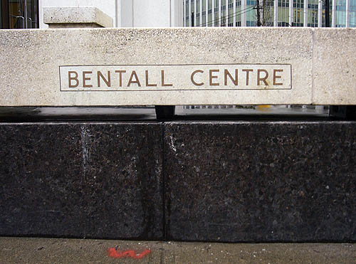
- Bentall (2007.02.15)
-
Doing good things with concrete here. (I don’t think the lower portion is granite.)
- Nerves of steel (2007.02.12)
-
Here I am at the Broadway stop of Vancouver’s SkyTrain, photographing an aberrant sign that uses Meta instead of the unaccountable and perplexing Plantin (also seen at Heathrow Airport, the obvious inspiration).
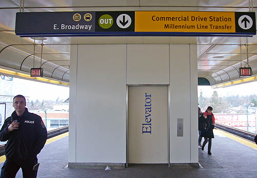
Just as I lifted my camera, four cops walked by, one of whom stared right at me, as seen here. I took my shot and, with nerves of steel, double-checked it on the LCD. I pocketed my camera and waited for the train.
Try this in Toronto and you get to endure a talking-to by Grandpa Moscoe.