Archive for category: Type I Saw Today
Type samples from the real world
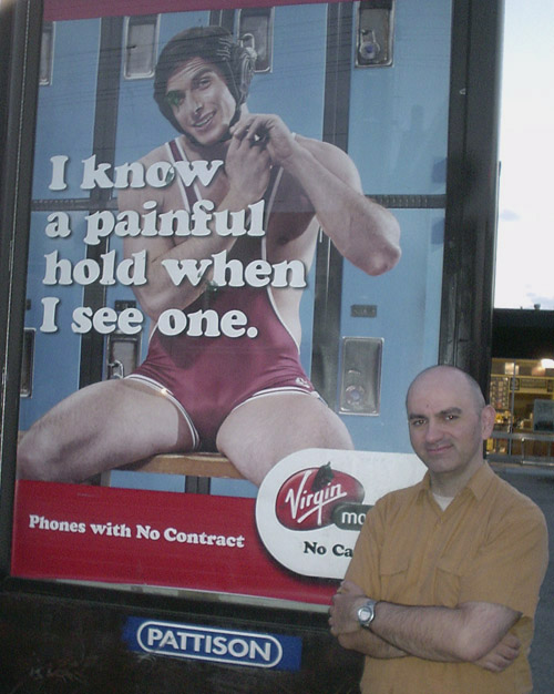
- Painful hold, painful shoot (2005.08.01)
-
It took two shoots at two locations to come up with a photo that’s only this good. That is indeed a fontmodded Cooper Black that attracts your immediate attention.
Somebody’s defaced it already. Here’s mud in your eye!
- Village of Le Griffe (2005.08.01)
-
The old-style (but not quite oldest-possible-style) Toronto street signs. Since Hollywood stars hang out there once a year (suburban Guidos the rest of the time), Village of Yorkville gets to use Le Griffe.
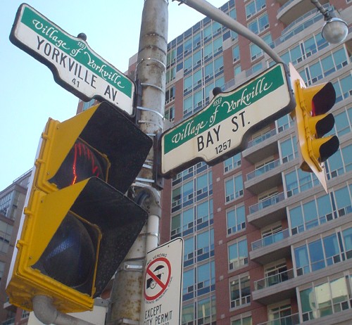
Because tacky people think script fonts are klassy.
- Bauhaus Helvetica Contour (2005.07.28)
-
I think homebrew fontmods like this – like this, not just any of them – are the greatest thing since sliced bread. I guess the criterion is: The more it looks like a hand-painted sign in a South American peasant village, the more I like it.

- 7′6″ (2005.07.28)
- The luck of the Swissish (2005.07.27)
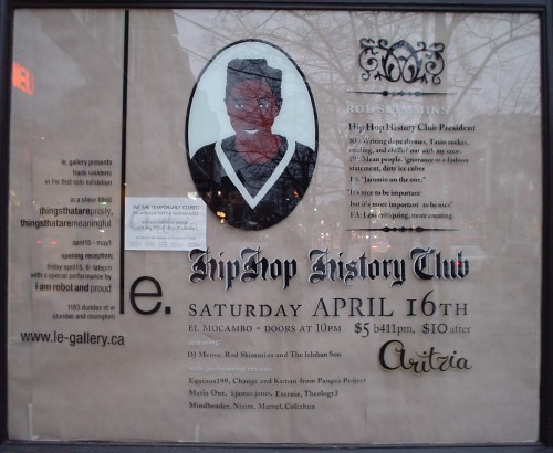
- That’s pretty ancient history for hip-hop (2005.07.26)
-
Even more blackletter.
And this whole layout is on a shop window!
- AK2K (2005.07.19)
-
It figures that Alaskans would be übersurvivalists and would still feel cheated! that Y2K didn’t result in apocalypse after all.
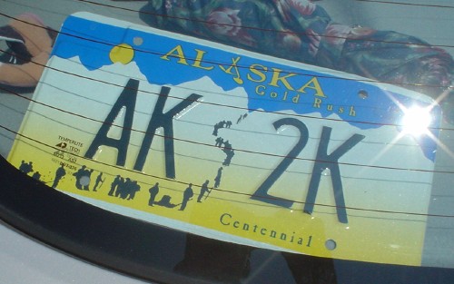
(If the notation really refers to the Alaska Gold Rush Centennial [Caslon Antique, anyone?], then why doesn’t it read AK 1K or AK K?)
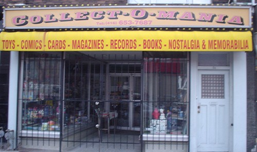
- Collect-o-Mania (2005.07.19)
-
I have a vague memory of Letraset faces like this one.
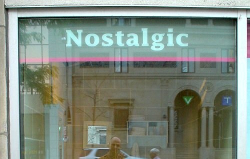
- ‘Nostalgic’ my arse (2005.07.18)
-
Lucida fucking Fax is not fucking “nostalgic,” unless you were born in the 1980s.
