Archive for category: Type I Saw Today
Type samples from the real world
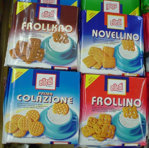
- My kind of dolce (2005.05.22)
-
…if I consumed dairy. An appropriately tacky use of the ITC Bauhaus typeface.
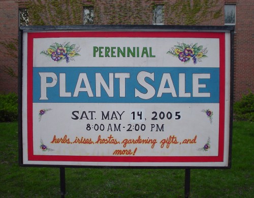
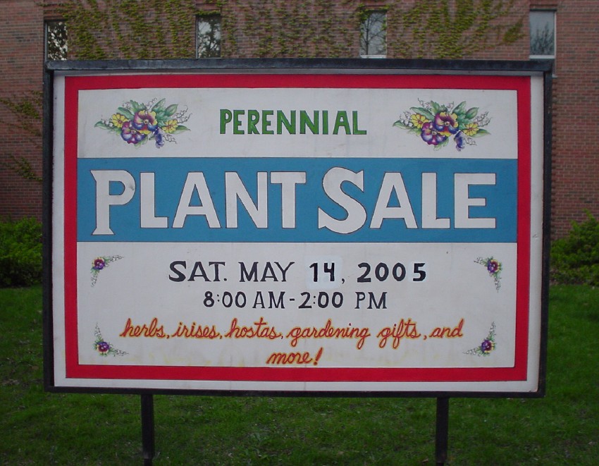
- Fine hand-lettering (2005.05.22)
-
It’s always a pleasure finding a nicely-hand-lettered sign in this day and age.
- 222–9–5 (2005.05.22)
-
You know your typeface is iconic when a single digit is recognizable.
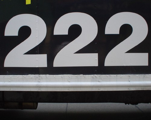
(You didn’t have to give it to us three times, though.)

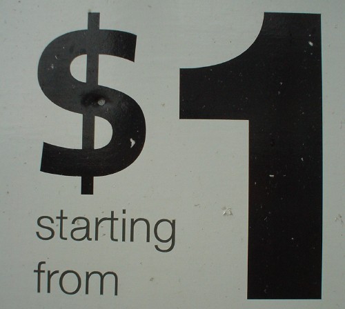
However, by the same token, we can tell when you’re using the wrong dollar sign. This one looks like Frutiger:
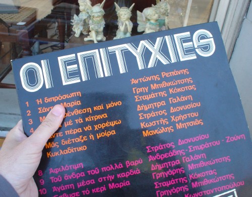
- ‘I feel a Greek record coming on’ (2005.05.22)
-
Note the occasionally-seen S used as capital word-ending sigma.
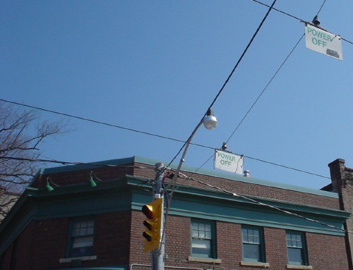
- Power off (2005.05.22)
-
Streetcars ignore these signs, you know. (Even in the Beach, currently being destroyed to “improve” the streetcar experience.)
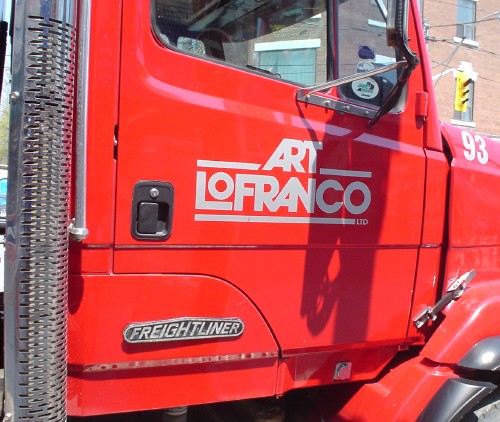
- Avant Garde Gothic truck (2005.05.22)
-
Who says those ligatures are “decorative”? (Actually, these are homemade.)
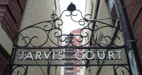
- Jarvis Court (2005.05.05)
-

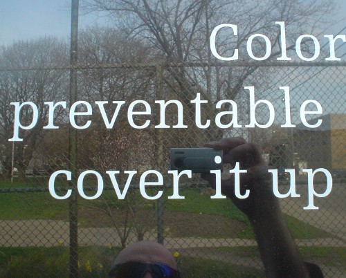
- Cover it up! (2005.05.05)
-
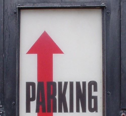
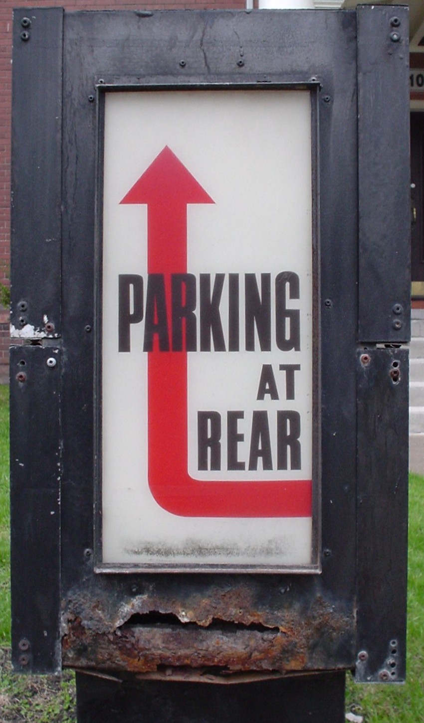
- Saul Bass Memorial Parking (2005.05.05)
-