Archive for category: Typography
- ‘A Very Happy Thursday’ (2014.05.09)
-
Dave Dawson’s single-serving site of sentimentality, good cheer, and Cocon
- Every city’s “wayfinding” is like Bristol’s (2013.08.17)
-
Every city’s “legible” signage is misnamed “wayfinding” and it all looks like Bristol’s. We’re next
- Designers love masses of unreadable grey text (2013.07.09)
-
Why do designers love unreadable masses of grey text? When viewed from a distance, it looks great, and they never actually read their designs
- Word that looks best in Zapf International (2013.06.12)
-
Afghanistan
- Pushing Twitter, and Unicode, beyond their limits (2013.06.06)
-
Crashtext and Glitcher kill Twitter dead with Unicode
- Desert Chrome (2013.05.23)
-
Desert Chrome type Tumblère
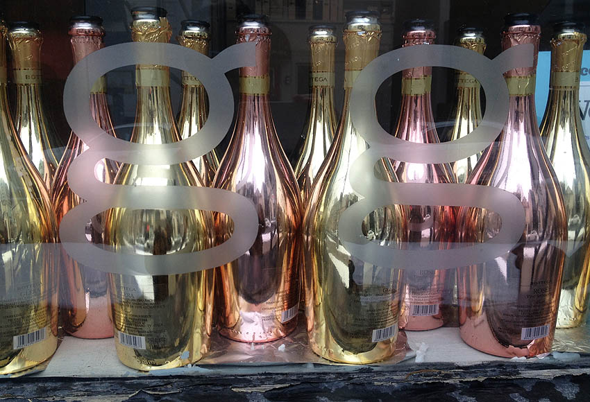
- gg (2013.03.01)
-

- New York City MTA Graphic Standards Manual (2013.02.19)
-
Presented in a manner you can actually understand and use: The New York City MTA Graphic Standards Manual (1970)
- Courier Prime: Continuing to solve the wrong problem with screenplay typography (2013.02.08)
-
John August’s Courier Prime typeface gets its problems exactly backward