I was an early supporter of Thesis by Luc(as) de Groot (no relation). I use TheSans Mono everywhere on my machines where a monospaced font is required. (Some people take that to extremes.)
- The semiranging numerals are killer.
- The sans, serif, and semiserif families, named, curiously, TheSans, TheMix, and TheSerif, are reminiscent of Cæcilia and have become overused in recent years. (The family is ten years old. It is now possible to speak of “recent years” in the context of Thesis usage.)
- There are at least 304 variants of Thesis (probably 320, if we include TheSerif Mono). Type queens shrug that off. It’s monumental.
But:
- I have come to consider that Thesis sets very wide and that the g in roman and italic is too noticeable.
- We almost used Luc(as)’s TheAntiqua, a kind of TheSerif Book remix, for body copy in my book. (My first book.)
- My old FrameMaker for OS 9 could not handle Thesis’s myriad weights.
Those are pretty much my only objections to Thesis, even now. I remain a Luc(as) adherent, because he was an early adherent of mine.
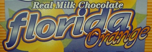
It’s a mainstream face, so much so that dime-store candy display packaging uses it:
And it’s so very minty-fresh in orange!
