Second in an ongoing series. And I rarely use that last syllable.
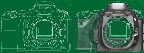
Cutaway diagrams!
I adore these things. Who needs the actual camera?
Arthur’s error page
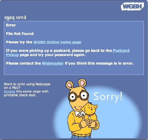
OK, first, I lay claim to the idea of running the page header backwards on an error page, and what’s this business about a special page to print in Netscape? Print stylesheets and @import, anyone?
That’s exactly the kind of Diwali celebration I was looking for!

So the Japanese are really going to respond to a black guy in a banner ad?

I checked other Microsoft sites and found the same photo with different-language copy. Is this localization without internationalization or vice-versa?
Friends don’t let friends let smart quotes run amok
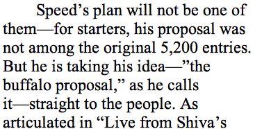
Just give up and don’t use Word for HTML. And the <nospace><em dash><nospace> typography simply does not work online.
CAPTCHA gone mad?

Here we have an off-colour bar sinister through the word and a gridded background straight out of a Cherry Blossom commercial. Do those not render any OCR device functionally blind? Bit of an irony there?
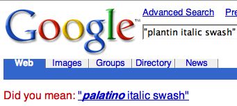
No, I bloody well did not mean Palatino Italic swash
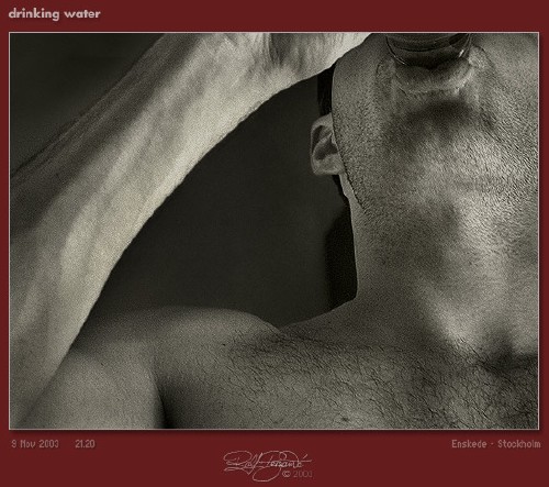
A typical high-contrast photo
It’s from the site that’s hardest to make accessible of any I know. It would have been easy enough to do from scratch, but a retrofit borders on the impossible.
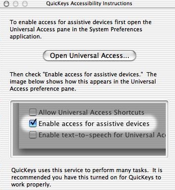
Universal Access used by key macros
Who would have thought?
It’s now at the stage where the NBA itself promotes basketball with white guys
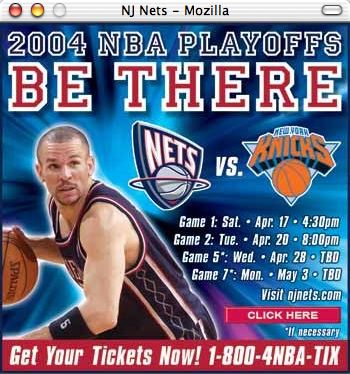
Now, am I wrong about this?
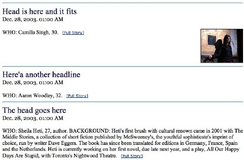
Yet another quality Web site from the Toronto Star
Curiously anthropomorphic display typography
Reminiscent of Isbell, actually.
And how am I supposed to find those seven needles in the 22,269 haystacks?
![‘Acrobat was able to make this document accessible but... [s]ome unknown font encodings encoutered [7 of 22269 glyphs]’](https://fawny.org/blog/images/TAPDFoddity.jpg)
There is more than one “executive woman of colour”?

And back in the olden days, Eudora would declare “You might as well stop typing. Nobody’s listening”

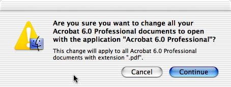
Yes, I bloody well am sure I want to open Acrobat documents with Acrobat
