Archive for the year 2004
- Marshall McLuhan on go-go dancers (2004.11.08)
-
‘Sound, in the new world, of dance and song is not for listening. It’s for making’
- Worst redesign of the year (2004.11.08)
-
The new Chapters.ca: Could it possibly have been worse?
- Oznotes (2004.11.07)
-
Oz notes (unsurprisingly)
- Don’t go back to Rockville (2004.11.06)
-
How to deal with writing slowly. In my case, not altogether well
- Unimaginable, potentially-best-ever unsolicited response to invert ‘dating’ advertisement (2004.11.06)
-
FURBIJACK (body by Jake?)
- ‘House’ (2004.11.05)
-
Review: ‘House’ by House Industries
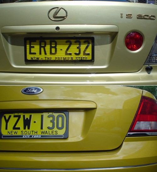
- Why is every car in Australia chartreuse? (2004.11.05)
-

- Tasteful swash capitals (2004.11.03)
-
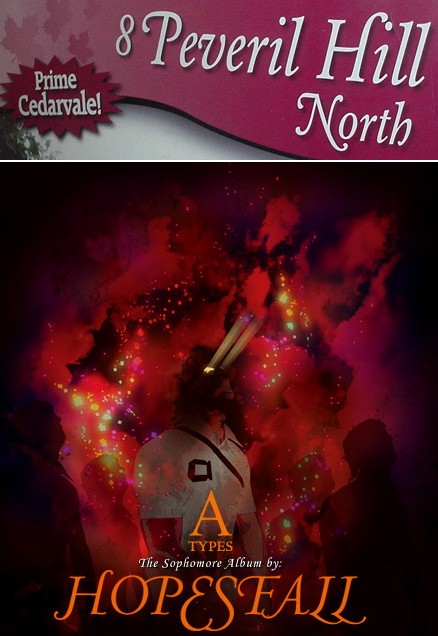
Twice in two weeks, no less. You usually find tasteful swash capitals maybe twice a decade. I think the HOPESFALL logotype could stand some better optical spacing, but it’s an unexpectedly successful use of all-(swash-)caps.

- Free chromostereopsis with every help session! (2004.11.02)
-
Talk about orange. You shouldn’t put blue on orange or vice-versa because the wavelengths resolve at different points on the retina, making the colours look like they’re different distances away. Plus the colours can throb. Not a question of colour deficiency, merely of human vision in general. It’s even worse against a bright blue sky, so lucky you that we have just that kind of background here!
