Archive for August 2005
- Joe does London (again) (2005.08.29)
-
In London for September 1. Tea, anyone?
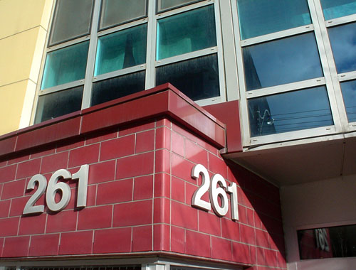
- My Modernist Helvetica building identification is better than yours (2005.08.27)
-
Would this not have been better in Akzidenz?
(What wouldn’t be?)
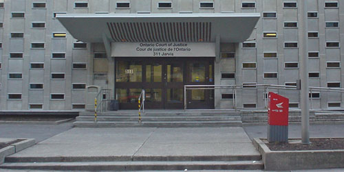
- Modern justice (2005.08.27)
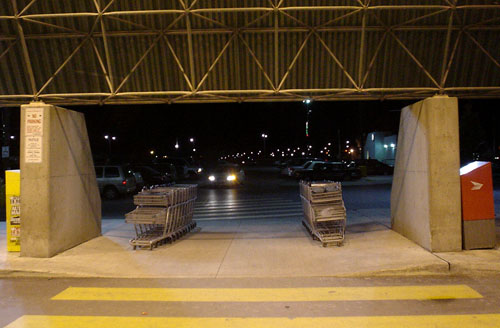
- The loneliest shopping carts (2005.08.27)
-
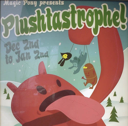
- Plushtastrophe! (2005.08.24)
-
I still regret missing most of the plushies episode of CSI (complete with description!).
- Welcome to Roy’s Font Basics (2005.08.24)
-
I don’t know how they could possibly have made this tackier.
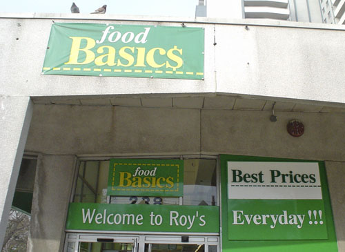
The Clearface Gothic was a nice touch.
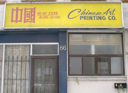
- Multiple scripts (2005.08.24)
-
From what I can tell, this sign uses upright and cursive type in two scripts.
- Staying positive about tabindex (2005.08.22)
-
tabindex="-1". Discuss
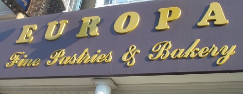
- Floor wax, dessert topping (2005.08.20)
-
The 2005 Matching Tartan and Paisley Award for typographic miscegenation goes to Europa Fine Pastries & Bakery for the unforeseeable achievement of uniting Cooper Black with a “klassy” script face.
