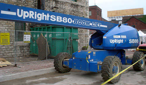
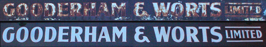
Toronto’s much-photographed Distillery District has a giant overhead member with the following signs on its north and south faces, respectively:
Also, they put in a clock:
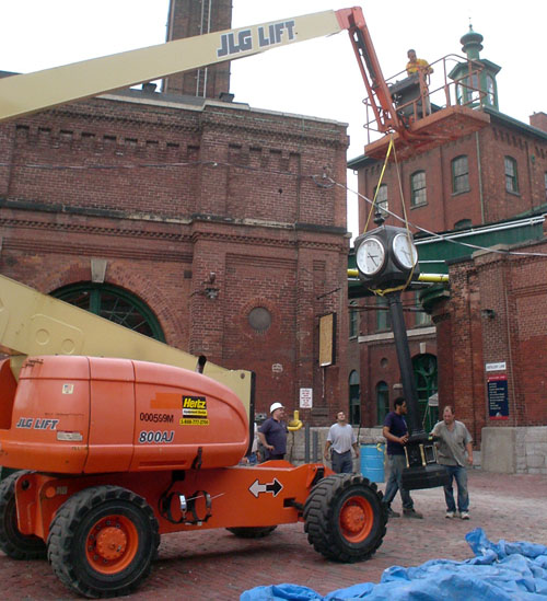
Sadly, it’s directly ahead of the end of the sidewalk, meaning a blind person who keeps walking in a straight line will bump right into it.
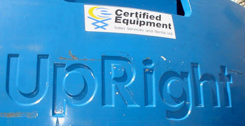
Plus of course the cranes that hang around the Distillery like juvenile delinquents at a variety store are inexplicably labeled with newspaper agate type that I can’t be arsed to look up. Why not just use Futura Maxi?