Not.
I agree with Michael Brady et al. (subscription required, but adequately excerpted below):
I loathe Arial. I think it’s a crappy variant of Helvetica, flying just below the radar surveillance of the copyright-infringement patrol. I get involuntary glottal stoppages when I see the terminals of the round letters, the doofus dormer at the top of the lowercase t, and other infelicities.
So I am amazed that I have fallen in love with Arial Rounded. I do
like the face, her alluring curves, the seductive way her parts join
together […]She’s also a very legible typeface under awkward conditions. Stuff like telephone pole signage that has to be read from passing cars works very well in Arial Rounded…. Arial Rounded’s lack of sharp corners may be the reason it works better: these suppress diffraction effects at greater distances.
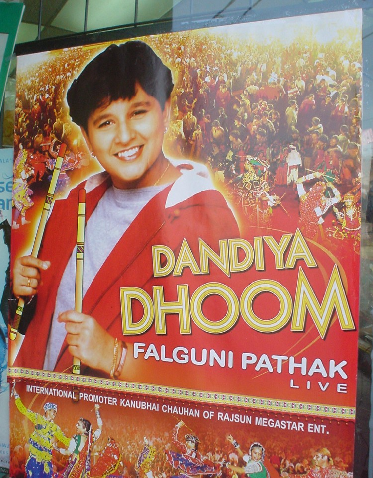
Indeed. It works surprisingly well on this Indian-music poster.
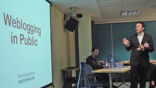
Adorable Tom Coates used it, too, and quite adequately, in an adorable presentation at the E-Government seminar that the Andy Budd and others attended (me too):