Earlier, my policy of retaining nearly every single computer file indefinitely paid off when I was able to do a comparison between 1999-era wymmynx hockey players and NHL players, and another comparision between male and female 2006 winter Olympics hockey players. In this, my first foray into freakonomics, I used body-mass index to estimate that a small number of female players are of a size similar to some NHL players, meaning that size itself is not a reason to categorically exclude women from playing in the NHL.
This was the first research in living memory that was debated vigorously (over at the Freakonomics Weblog) yet also respectfully. Even people who called bullshit on my analysis did it in the nicest possible way. My detractors may use this as a model for future disagreements.
En tout cas, I took the comments to heart and, with the help of Gail Lucas of SPSS, I did a few more comparisons. (That is, Gail ran them for me and I struggled to understand them.) What we did:
- We compared height and weight of male and female players rather than BMI. We plotted height and weight to see if any findings overlapped between the sexes.
- We graphed BMI and other measurements.
- We did a correlation analysis to see how well BMI correlates between male and female players.
Torino Olympics results
Let’s have a look at some graphs derived from the Torino 2006 (or, if you wish, the Turin) Olympics data.
Distribution of BMI by sex
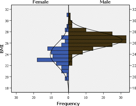
This bar graph with added bell-curve trend shows that BMI of male players is more uniformly distributed than that of female players. Male BMI is a nearly-uniform distribution that peaks at 27 or 28, while female BMI has two peaks, at 23 and 25, with irregular frequency of other values.
The graph also illustrates what my research had uncovered – that there are a couple of women with the same very high BMI values as men (29 and above). It is these outliers that are the strongest reason to doubt BMI as an indicator of size compatibility in hockey, since everyday knowledge tells us that male professional athletes with high BMI are likely to be immensely stronger than women with comparable BMI, though not necessarily faster or more agile.
The graph also illustrates that very low BMI is overrepresented by women. There are small guys in the NHL and there could easily be grrrlz who are just as small, but all the players smaller than this group are grrlz.
Height vs. weight
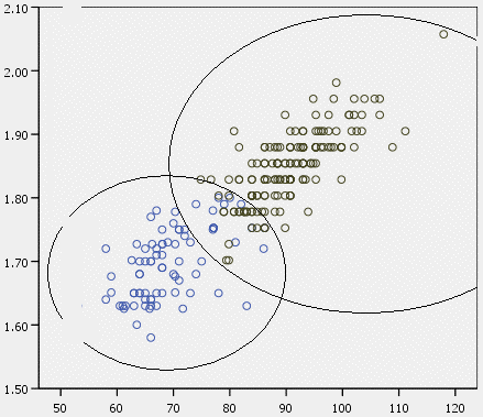
Here we graphed weight in kilograms versus height in metres. (We also have all data in Imperial units, but I think inches vs. pounds makes much less sense. In any event, units could be removed from the graph, which relies on proportions, and it would still make sense.) Female players use blue circles (all in lower left and centre), male players black circles (all in upper right and centre).
There are indeed a number of players whose height/weight ratios overlap – by my count, 10 females and 13 males. If I had done a more careful job of notating names, I could tell you exactly who those players are. (If you really care, I can hand you my data and sources.)
This analysis is consistent with crunching the BMI numbers. There are only a small number of NHL-sized women. That is because there are almost exactly the same number of (small) NHL-sized men. The majority of NHL players are significantly larger than the majority of female elite players. But the data show that, if these dozen or so small guys are large enough to play in the NHL, the same number of women are large enough. (This would be a good time to restate the major qualification of this analysis: The only criterion I’m talking about here is size, not aptitude, speed, agility, or anything else. All those criteria and more could be used to exclude or include individual female players, or some or all of them. It’s just that size cannot be used to categorically exclude all female players.)
Cluster analyses
Gail writes:
I… did a cluster analysis to see if the software could ferret out two groups of people, based only on their height and weight. It did a good job. The “Average Linkage” columns are the two clusters that the software found – mainly, it miscategorized 16 women as male, and perfectly identified the men.
A cluster analysis attempts to place data into categories. Average-linkage clustering uses an average of distances between all pairs of objects. I don’t entirely understand the underlying math, but I also don’t think that’s necessary.
You can read the table below starting with the left column. The software called 65 females female (it got that right) but called 16 females male (getting that wrong). In the next row, the software called zero males female and 160 males male (right on both counts).
You could draw the inference from this analysis that 16 females are male-sized when viewed by height and weight. This result is consistent with the graphs shown above.
| Average linkage between groups | Total | |||
|---|---|---|---|---|
| Female | Male | |||
| Sex | Female | 65 | 16 | 81 |
| Male | 0 | 160 | 160 | |
| Total | 65 | 176 | 241 | |
Running the same cluster analysis but using BMI, Gail writes “It actually categorized more women correctly, but guessed wrong on 28 of the men.”
| Average linkage between groups | Total | |||
|---|---|---|---|---|
| Female | Male | |||
| Sex | Female | 67 | 14 | 81 |
| Male | 28 | 132 | 160 | |
| Total | 95 | 146 | 241 | |
This correlation gives us further evidence that BMI is a weak predictor of women’s size suitability for male hockey teams. A combination of height and weight is a stronger predictor. The critics, it seems were right, and I thank them for participating.