Last night was the film event of the year, and it was also the culmination of a very busy week of stealthful preparations. You can’t possibly imagine I’m going to just stand in line like a commoner at the Canadian premiere of Helvetica.
Oh, no-no-no.
-
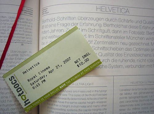
I distributed handbills to the proletariat. They required untold hours of preparation and fine-tuning.
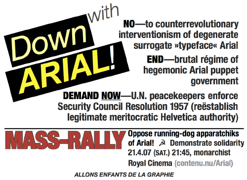
Peace-loving loyalists of Helvetica received some 140 of the handbills, with only one or two guys acting like total dicks, the generally accepted minimum number in a crowd that size. (As this is a film concerning typography, we were almost the only inverts in attendance, although I did detect, and took care to distribute extra handbills to, several clusters of dykes.) Exactly the desired outcome occurred as I stood with my confrères afterward and heard the group right behind us describing how “a guy was handing out like flyers against like Arial [laughter].”
-
I have maintained a leadership position as the globe’s foremost opponent of Arial, so much so that I made it into the paper last week. However, this role has had all the effect of, say, opposing hydrogen atoms in the water molecule, so I have wound up my Sisyphean documentation effort, A Hate-On for Arial, by adding my last 88 more photos yesterday.
-
I wore an especial garment for the occasion.
I had high expectations for Helvetica: le film and I was surprised to find them exceeded.
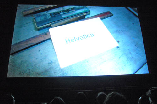
It’s a beautiful combination of talking heads and something that is itself a beautiful combination, non-narrative documentation of words in the environment. The selection, ordering, editing of interview segments was spot-on. But the insterstitial sequences of Helvetica in situ were devastating. They’re little dreamscapes. You thought Koyaanisqatsi was a masterpiece of wordless filmmaking? You ain’t seen nothing yet – and these segments are filled with words, merely the kind one reads.
They run just long enough – seemingly all the same length, though after I congratulated myself for spotting that, suddenly there appeared extra-short and extra-long segments that were still perfectly timed. The lighting and accompanying music are well-chosen. (Director Gary Hustwit proved to us later that he really was picking the music for its appropriateness rather than anything else, since, after days of effort, he could not find a way to include acoustic segments from his favourite band, Sonic Youth. As with the segments themselves, he went where the material took him.)
I couldn’t get over the filmmakers’ luck at shooting so many architectural usages of Helvetica against travelling clouds, giving a sort of Gattaca feel of futuristic timelessness. A metaphor for Helvetica itself, really.

Yes, Michael Bierut really does steal the show. I forgive him now for Design Observer, though not, of course, for its underlying code. (And check his segment on Studio 360 [iT(M)S] on redesigning Christmas to X.mas.) I swear, though, every time I heard a deep offscreen voice, I thought this would be the end of the line and Steven Heller would show up. (Overexposed, the Wal-Mart of design criticism, out of touch – a sure sign a design publication, of any form, is stuck in the past.) But no, it was Bierut every time. I do have the minor quibble that his pantalons ride a bit too high. (And actually, the high-definition photography cruelly exposed imperfections of skin, hair, and teeth.)
Vignelli is every bit the ideologue I expected. The film commits a factual error in its loving segments on the signage in the New York subway, originally specified in Standard Medium (viz Akzidenz), which the MTA later bastardized into Helvetica. Even in books on the subject (like Subway Style), you see Akzidenz and Helvetica signs side-by-side, just as you do in the subway.
As Arial is the idiot’s version of Helvetica, so too is New York–subway Helvetica the idiot’s version of New York–subway Akzidenz. There is a bit of malarkey in the film about how, in the midst of confusion, the mere act of seeing Helvetica reassures you that the information it conveys must be correct. Tell that to someone who can’t differentiate the Helvetica Il1!, the cl d, the rn m, the comma and period, the numerals (568). As a functional typeface for legibility applications, Helvetica fails. Not only can one prove that, I have.
(And if you look closely, you’ll see a copy of the cherished and rare New York City Transit Authority Graphics Standards Manual on Vignelli’s desk.)
I was greatly surprised to see overblown design critic Rick Poynor actually making sense. He sure doesn’t in print, unless he’s reviewing the cover treatments of different print runs of Crash.
I don’t know where bitter twit Vit gets off claiming Helvetica is merely “okay.” All his points are either extraneous or flatly wrong. This is not a film about the range of Helvetica weights and widths, and anyway, those are all depicted. (A curious thing for a visual designer not to notice: You don’t have to talk about it for it to exist.) By no means are the interview subjects all old white guys, though one would rather expect that given that the typeface is 50 years old. Vit, whose blog has even worse code than Bierut’s, is easy to dismiss, particularly since that blog eventually placed him in a conflict of interest his review didn’t bother to disclose – he works at Pentagram alongside Bierut and Paula Scher, also in the movie.
In point of fact, Helvetica really is as good as everyone says it is. Believe the hype.
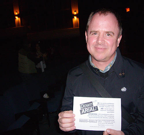
I had to have a quick chat with Hustwit on the way out. Pleasingly, he’d already seen my handbill, but I gave him a spare.
We chatted a bit, to his annoyance, about captioning and description of the ultimate DVD. The filmmakers have an advantage here, in that an expert on the topic also has expertise in typography. I’ll be providing whatever help I can.
On the way out, another exactly-desired outcome occurred as passersby, and Hustwit, noticed me as I modelled my superexclusive HEL·Fucking·VETICA T-shirt.
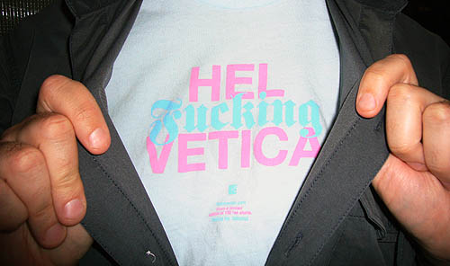
Like I wouldn’t have one of those. “Only 148 other people do,” I said.
Ways in which one feels unappreciated
I’m not a designer of any kind, let alone a type designer. And while I am not paid to sit around FontShop and memorize typefaces by sight, I am pretty knowledgeable. In any typography or graphic-design quiz show at a conference, I’d at least come in second.
But since I haven’t been writing for the magazines in ages, it may seem like I don’t really have any bonafides in the field. This really hurts me, since, when you get right down to it, I have only two main interests in life, accessibility and typography. (And not enough hobbies.) I know my limitations, but I have been labouring to make a contribution nonetheless. It’s happening so slowly it’s killing me, but then again, so is the lack of recognition that I’m even trying. I’ve done original research on legibility. I’ve debunked junk science. I’m unusual in that I’m really interested in functional typography, and I’m very empirical. I have a screenfont-development project – one that combines accessibility and typography to benefit real people – that’s been underway approximately forever.
It hasn’t been going well, but just the other week, one of my genuine-type-designer friends came through with a set of designs that will be discussed on Screenfont shortly. (One of the designers featured in Helvetica owes me at least a Hamburgefonts for that same project.)
I’m trying as hard as I can, which apparently isn’t hard enough. It really troubles me how I am not regarded as being inside any defined group of type experts or aficionados or researchers or anything. I really, really hope ATypI approves at least one of my two proposed sessions at this year’s conference in Brighton, a location that, for once (unlike Helsinki or Prague), I can actually afford to get to.