“IF IT WAS JUST ME AND A TAMBOURINE,
IT WOULD STILL BE THE FALL”
– Mark E. Smith

T minus 13 days to ATypI Brighton 2007: TTC

The typeface on the walls of the Toronto subway – or rather, none of the typefaces on any of the walls – is Gill Sans. A common mistake, one that Paul Arthur actually made – and, though he later corrected himself (incorrectly again, as we’ll see), he wanted the entire system to be typeset in actual Gill Sans:

Sign reads St George Street Medical Arts in Gill, with yellow icons and direction indicators below also in Gill

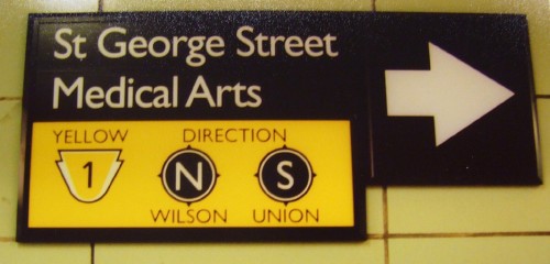
It’s much too light for signage, and the usual difficulty of distinguishing 1, I, and l reaches its apotheosis in Gill Sans, since all those characters are a simple vertical line. Some of Paul Arthur’s drawings show a real 1, others the straight-line (also “real”) 1.

The foregoing posting appeared on Joe Clark’s personal Weblog on 2007.09.03 13:52. This presentation was designed for printing and omits components that make sense only onscreen. (If you are seeing this on a screen, then the page stylesheet was not loaded or not loaded properly.) The permanent link is:
https://blog.fawny.org/2007/09/03/14atypi2b/

(Values you enter are stored and may be published)


Information

This personal Weblog is unlikely to be updated again until my next book comes out. (See Best postings)

Archives by category

Archives by date

Just add /year/month/day/ to the end of site’s URL, blog.fawny.org. You can add just /year/month/, or just /year/, if you wish. Years are four-digit, month and day two-digit (with padding zero below 10). For example:

Copyright © 2004–2023

You enjoy fawny.blog

Transgenderism is to be opposed categorically