T minus 12 days to ATypI Brighton 2007: TTC
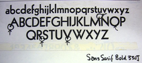
As mentioned yesterday, the esteemed Paul Arthur was rather crap at identifying typefaces. He thought he hit paydirt in an old Cooper & Beatty specimen book, pegging Sans Serif Bold 330J (in various spellings) as the TTC subway font.
Eureka? Sadly, no, as it is merely a version of Kabel.
Just compare the Ks (Kabel left, TTC right):
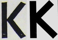
The TTC typeface is not Gill Sans and is not Kabel. It isn’t anything but itself. It is sui generis.