T minus 10 days to ATypI Brighton 2007: TTC
Lance Wyman, a pioneer of signage and wayfinding who worked on the Mexico City Olympics and the subway in that city, worked with Paul Arthur to gin up about 15 candidate pictographs in the 1993-era TTC redesign. It started out as an arduous task, and everyone assumed that a lot of research would be involved, but it turned out that local historian Mike Filey already had all the histories of each station mapped out. Nonetheless, some of the stations were difficult to epitomize.
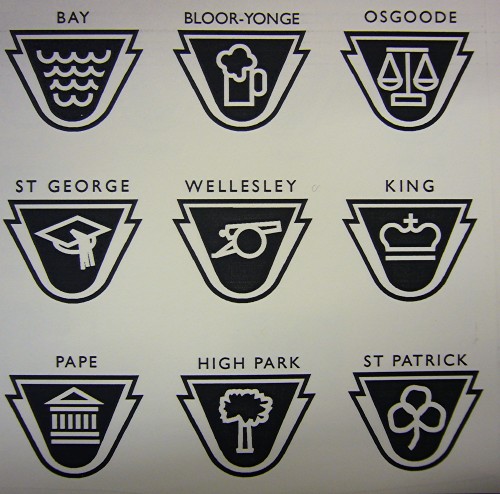
- Bay: Waves
- Bloor-Yonge: Beer stein (for some reason)
- Osgoode: The scales of justice
- St. George: A mortarboard (also a lion)
- Wellesley: A cannon (historical reference)
- King: A crown
- Pape: Acropolis
- High Park: A tree
- St. Patrick: An extremely ill-rendered three-leaf clover
Skeptics should keep in mind that the icon does not have to perfectly epitomize the station. It merely has to be memorably associated with the station, particularly for illiterates, children, or people with cognitive disabilities. Such performance was never explicitly tested.