Tiffany Wardle Memorial Liveblogging™ of a presentation at ATypI Brighton 2007 (q.v.)
HOST: If you didn’t know who Matthew Carter was (applause) – well, even if you didn’t applaud, you use his fonts. Probably one of the last people to learn handcutting fonts professionally to designing font professionally. This is his 31st ATypI conference, so keep coming! And of course Bruce Rogers is one of our greatest historic sources for type and book design that I’ve admired.
CARTER: So we’re about “hands on” this time. (Had been talking about April Greiman.) Neville Brody said: “But she’s not hands-on,” and he said it in a very damning way. Bruce Rogers was very hands-on, a real meddler in everything he did. Born 1870, contemporary of Fred Goudy and Morris Benton and, in this country, of Edward Johnston, whose name comes up at this conference. From Indiana. Went to Purdue. Drew beautifully. First job after graduation was as illustrator for Indianapolis newspaper. Then Modern Art, where he saw a William Morris book, changing his interest away form pictorial illustration to the design of typography. Was hired by Riverside Press in Cambridge at only 26 to replace Berkeley Updike. Was the printing arm of Houghton Mifflin.
Persuaded George Mifflin to start Mifflin Editions, for limited editions. Designed 60 of them. The characteristic style is generally described as “allusive,” a term he even used. If the author were from 16th-century France, he’d try to design a 16th-century quality. Were very different from the English private presses, dominated by the personality of their owners. But 60 books all different in style was rather novel. (Shows books, one of which has an arabesque cover unrelated to the topic.) And he’s the same with his type designs: Yes, the historical origins are obvious, but he engaged in a lot of derivation. He’s the first freelance book designer, you could say.
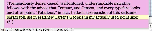
(Tremendously dense, casual, well-intoned, understandable narrative follows, with the advice that Centaur, and Jenson, and every typeface looks best at 16 point. “Fabulous,” in fact. I attach a screenshot of this selfsame paragraph, set in Matthew Carter’s Georgia in my actually used point size: 16.)
(During Q&A, I said that we all grew up reading books about these lovely metal typefaces, and running our fingers over the old letterpress pages. But when we digitized them, we lost the ink spread. The same thing happened with another letterpress face, Courier. These versions are too spindly – aren’t they? And we can’t really use them – can we? Carter said that the actual culprit was phototypesetting, where there was a great rush to convert metal typefaces to photographic. He was working for Linotype at the time and it would have been fatal to wait for a better-drawn version. But he speculates, without inside information, that Monotype might come out with a new Centaur.)