While methodically reading every plausible book on typography and graphic design in the library, I also request dozens of books via interlibrary loan. Only a few of them actually come through. Here’s what I’ve been looking at lately. (See my full reading list, continuously updated.)
- Living by Design: The Partners of Pentagram, edited by Peter Gorb (1979)
-
I had no idea that Pentagram did so very much in the ’70s. The range is shocking, it was mostly for blue-chip clients, and it was all over the map.
A custom typeface (by Matthew Carter!) for Lucas. (The book does not quite define which Lucas it is. The one that supplied faulty electricals for every British car for decades? In other words, “Lucas, the prince of darkness”?) Livery for 50 models of motor vehicle in the Lucas fleet.
An entire logo study for British Petroleum. Reuters, Clark(’)s shoes (no relation), Cunard. The Conference for Islamic Solidarity, as tough a job then as it would be today (the work showed seriously mismatched colour of Latin and Arabic scripts). Redesigning 10,000 forms for Kodak. The book A Sign Systems Manual, now a $300 collector’s item. Helvetica everywhere.
And, incredibly, office interiors. (Ad agency: “Though the double-volume entrance is nearly 6m high, the design arrangement makes the climb not unpalatable, and there is a fat red handrail to cling to” – for dear life, presumably.) Everything here is chrome, it’s leather, it’s carpeting, it’s steel.
And even more incredibly, product design, like a space-age digital clock (the Clark Alto [no relation]) and a huge line of Kenwood countertop appliances, complete with bean-slicer attachment. A design investigation into a 110-format camera stated “[I]t was found that smallness is not the optimum criterion. The great need… is for a camera that can be sturdily held, and this implies that a larger, rather than a minimal, size is what people want.” The lessons of the iPhone three decades before its birth.
The book was, however, a bit of a slog due to physical discomfort. It weighs a ton; the body copy, set in Rockwell Light in a size just small enough to be too small, bordered on illegible. Nor was there really any correspondence between illustrations and cutlines, some of which were on different spreads.
- Communicate: Independent British Graphic Design Since the Sixties by Rick Poynor
-
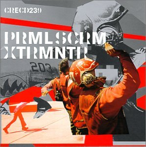 Yeah, him. Anyway, I got this one out again to reread of the genesis of one of my leitmotifs, XTRMNTR. Julian House was the designer.
The two things on XTRMNTR were an obsession with the military-industrial[-entertainment] complex and, for the time, [Primal Scream’s] quite political statements…. I’m sure it is an unconscious thing that led me to make it so angular and aggressive. It was done in Quark Xpress rather than Photoshop, and it is quite a limited, clumsy tool to cut things out with…. Sometimes it is the fact that you cannot do something very well with a program that gives the design its feel.
Note the complete absence of apology for using strictly digital tools, and the realization that such is all they are.