(UPDATED) It’s great that Al Gore noticed a ranging-figure 1 in Brioni was hard to read.
-
It’s hard to read because of the fake bullshit rule that acronyms have to be typeset in small caps, even if they’re 21st-century acronyms that also include numbers. (Or subscripts.)
-
This nonsense, promulgated by snobs like that bore Bringhurst who have not read anything written after Jane Austen croaked, ostensibly improves typographic colour. What it actually does is inhibit reading: Acronyms are not regular words. All-small-caps setting fools the reader into thinking an acronym is a real world. That discomfort you feel is a reverse fixation you underwent trying to reread the word.
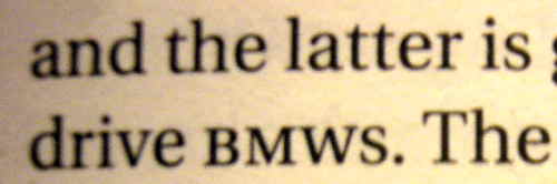
This was always a bad idea, but it’s much worse with abbreviations that mix case (ATypI) and, indeed, with alphanumeric abbreviations (H1N1). Then what happens when you pluralize one of those? Plural s is almost exactly the height of the small caps.
(The foregoing is the work of a reliable producer of typographic mishmash, Mark Fram.)
-
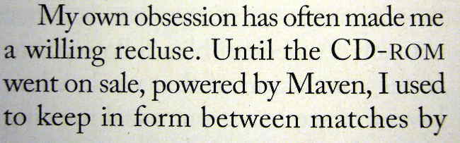
Or there’s the equally nonsensical habit of using small caps solely for word-pronounceable acronyms, some of which are mated to acronyms you read letter by letter.
(Still think it makes sense?)
-
If you’re even more half-assed and are using fake small caps, as all the major American houses do, you don’t have a leg to stand on.
What works nicely, though? Knock the size down a point (UPDATE: As in Actium), add a few units of tracking, and equalize spacing. Or don’t do anything. Typesetting a postal code? You have no choice but to use capitals and lining figures, unless you want people to try to pronounce “M5W 1E6” or “FIQQ 1ZZ” as a word.
Use of small caps for acronyms and abbreviations is a surefire indication your compositor is a snob who should stop acting like acronyms are dirt to sweep under the rug.
An oldstyle 1 that looks like an I is a mistake. Let’s not propagate it into the digital future, shall we? It’s like mangling a surname at Ellis Island.
I call for a cabinet shuffle
This addition will come much too late for the 7,000 of you who visited via links from important Web sites. You will never see this correction; the last word you will have read is Ministry of Type’s. You’ll think he gave me one hell of a zinger, and with such class, too. (Save for one point: Ægir Hallmundur has the audacity to accuse me, a stalwart defender of online civility, of “trolling,” which itself demands an apology when I am next in Brighton.)
Substantively, though, he insists that
Clark provides some examples which at first glance seem to support his argument, but a little thought reveals them to be mere examples of ill-considered typography rather than a crushing blow on the use of small caps.
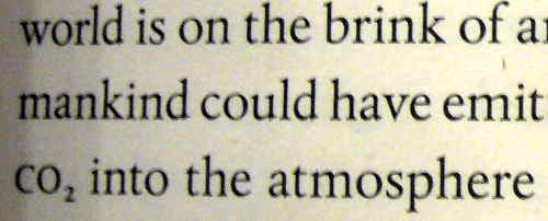
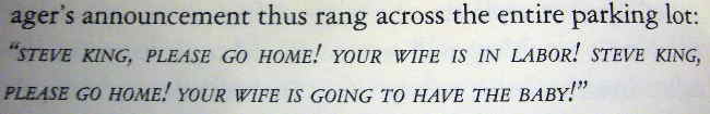
I proved – with pictures, no less – that small caps for acronyms do not work for acronyms that aren’t pronounceable words or that contain nonalphabetic characters. Everything save for NATO and AIDS, I guess, though I expect Hallmundur is under the influence of the British tradition of writing same as Nato and Aids. (Hence for British English, small caps for the categorized acronyms never work.)
I don’t know my esteemed detractor from Adam, but I know Bringhurst better than he does. I’ve read his books, including that asinine volume of aboriginal apologia that claimed oral histories are books. I’ve seen him lecture. Robert Bringhurst is a crashing bore, and his advice is often plainly wrong when not also outdated. Seriously: Not every snippet of typography is all about the golden ratio.
Here is what happens with Bringhurst’s readers
It is more or less what happens with Ayn Rand’s readers. At a vulnerable age, the picked-upon nerd discovers the sacred text of the philosopher-king. It provides a transformative view of the world: So this is how typography (or civilization) should have worked all along!
The nerd, still a 98-pound weakling in other respects, now feels he has an intellectual head of steam with which to take on the world. He feels better than everybody else. Henceforth his acronyms shall be small-capped and his economics selfish.
There are a couple of differences to point out here.
- One is that Randroids tend to grow out of it in their late 20s, right around the time they stop smoking pot and start accumulating credit-card debt.
- The other is that I too went through a stage indistinguishable from this Bringhurstian indoctrination. Except I got over it when I was 17. This is what happens when you’ve been reading about typography for thirty years. What’s new to you whippersnappers I know has been done to death already.
Bringhurst brings a chamber-orchestra sensibility to typography. Any musical form that came along afterward is mere noise against which the shutters must be drawn. Bringhurst’s advice takes its lineage from the typography of serious literature and scholarly nonfiction – but it is hot-metal typography, now more than a century old and no longer in use. I should know: I was the teenager who lugged home Methods of Book Design so many times the library should have just given it to me. (Its advice was functionally Bringhurstian.) But since then, some of us have upgraded. You should too.
Shall we return to the Minister?
Setting acronyms in small caps does work well in a large number of cases, and it does indeed improve page colour, thereby reducing distractions to the reader,
who is not reading the colour of the page.
Ever notice how skimpy the examples are in these Bringhurstian tomes? One or two acronyms in one or two lines of text? Or a reduced image of a full page? The small-caps-for-acronyms theory is about graphic design (page layout) and is not about typography (type for reading).
It also hasn’t been battle-tested. Being a standardista assists in typography; we can use markup to count structural elements (without recourse to difficult regex). My first book contained almost 300 marked-up acronyms and abbreviations. Typical, you might say, for a technical book, but people read technical books; Jane Austen ain’t everything. My WordPress blog posts have used 270 abbreviations and acronyms. And that’s just part of what I write – even my second book, manifestly nontechnical, used such structures.
Alongside this output are the 200 books (and countless periodicals) I read every year, and my 1,659 RSS feeds. Put all this together and what I’ve got is evidence, not theory. And I back it up with pictures.
So: Bringhurst and his Randroid-like acolytes may insist small caps for acronyms makes pages look better. Let’s say they do (but so does gold leaf). Those pages read worse in real-world cases. I have informed reason to say so. I’m right and Bringhurst is wrong. (Or just irrelevant.)
Articles like this promote a dichotomy, an idea that this way is right and that way is wrong[.]
Taken to its conclusion, all this means is “Do whatever you feel like.” How about “Don’t do what we know doesn’t work”?
Too obvious?
Ministry of Type, I call for a cabinet shuffle.