The other book by Bryony Gomez-Palacio and Armin Vit (again in that order) is Graphic Design, Referenced. I don’t have a clue who it’s meant for, unless it’s meant for functionally illiterate graphic-design students who need everything explained to them in pictures.
 The book isn’t so terrible for such a designer. Nor is an illustrated guide a bad idea for a design book; it sure beats turgid, self-important, completely unillustrated art-history monographs masquerading as graphic-design “criticism.”
But really: Who is this book for? And will they be able to use it? It’s supposed to be practical – the subtitle is “A Visual Guide to the Language, Applications, and History of Graphic Design” (Oxford comma in original). But as someone who has read a hundred graphic-design books over 30 years and every English-language history of graphic design, this book is so disorganized as to be incomprehensible. The confounding fact is that it is teeming with “organization,” with sections and chapters straplined thus:
- Principles
- of design
- of typography
- of print production
- Knowledge
- on paper
- online
- in halls
- in classrooms
- Representatives (this doesn’t mean what the Spanish-speaking authors think it does)
- of design
- of letterforms
- of writing
- of designers
- Practice
- on walls (surely halls?)
- on shelves
- on newsstands
- on identity (practice “on” identity?)
- on letterforms (practice “on” letterforms till you get them right?)
Did that make any sense to you? It doesn’t in the book, either.
Intertextuality with other design histories
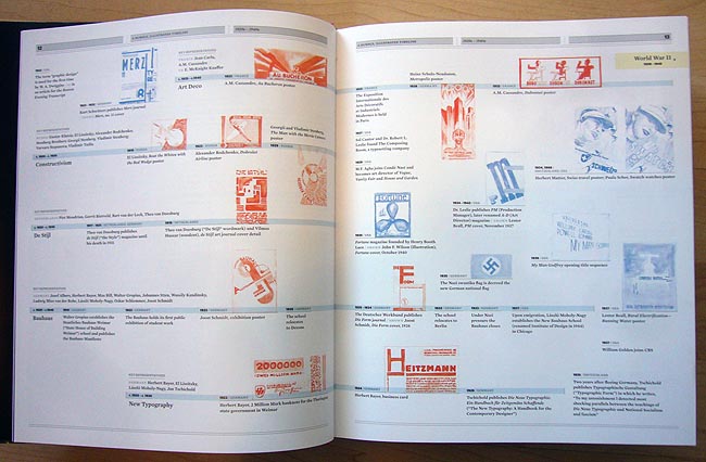
The Campaign for Nuclear Disarmament (U.K.) gets its own double-truck spread. The subject must really be special because Stag Stencil is the especial headline font.
The illustrations show a lot of horrifically undesigned hippie peace signs, but the feeling with which I associate this topic is one of unending frustration. In the Wozencroft books on Neville Brody, pages and pages of copy and illos discussed “the CND” and Brody’s work for it. The acronym was never expanded or explained, which told me two things: Nobody imagined anybody outside the British Isles would ever read the book and every reader was expected to be so left-wing they could rattle off the acronym in their sleep.
For the young kids out there and those with short memories, these books predated the Web and it bordered on impossible to look up a foreign acronym at the time.
Why does “the CND” appear in Graphic Design, Referenced? The same reason most entries do: Because other graphic-design histories included them. Again, pace Natalia Ilyin, graphic-design history is always presented as a kind of number line with only a finite set of points.
Innovation
The book does a few new things, most of them welcome.
-
The introduction warns us thus: “To our dismay, design projects dating to the 1950s and earlier” – one can use “dating” in that sentence only if going backward in time, but dysfluencies are something you quickly get used to here – “are painfully expensive to acquire from universities, museums, and special collections.” But nobody said they had to be acquired. They just need to be photographed or scanned, either of which is clearly covered by U.S. fair use. Since these “projects” would invariably be Greatest Hits of Design, which we’ve all seen a hundred times before anyway, some publisher somewhere is gonna have hi-res scans they could use.
But they didn’t bother, and the results were better. For a design timeline and one or two spots elsewhere, the authors sketched the original works by hand and ran those sketches in miniature. It’s been done before in other art books, and it’s fabulous. Who needs the originals?
(Meanwhile, a design triumph like this is obviously the place to typeset a honking copy error, “coporate identity redesigns.”)
-
This book provides the first convincing presentation of the Walker Art Center’s adhesive-tape-and-custom-slugfont design apparatus.
I take issue with the design
-
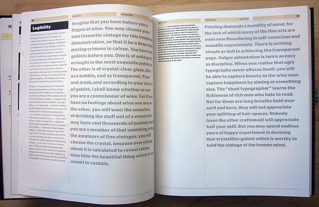
The book uses H&FJ- and Christian Schwartz–compliant typefaces, including a Stag Stencil drawn just for the book. The whole thing is at least legible, save for this spread about legibility:
-
This is the first time I’ve found parens to sit too high in all-caps text. I guess we really do need lowered parens after all.
-
The authors continue to operate under the delusion they’re typing out a blog post in Movable Type. I don’t know how many times I have to tell people that we don’t print a blank line between paragraphs in books. (Nor do we fail to indent any paragraph following another paragraph.) The saving grace is there are so few sections with more than one paragraph you barely notice it, unless of course you do. And if we excluded any detail people “barely notice,” what’d we’d end up with are the default settings of Microsoft Word.
-
The real problem is structural demarcation. What would in newspapers be called the skybox of most inside pages is divided into three twee little ruled boxes each the width of the column below. The inside two reiterate the heds and subheds I listed above. It might have been a useful way of telling you which section you’re in if it weren’t universally understood that an enclosed box on top of a column is a heading for that column. Every page makes you think each column is a different item, except for the fact columns are mostly continuous, one out of three boxes is blank, and the other two never change throughout a chapter.
To put this in the Movable Type terms the authors would understand, don’t write blue underlined text on your blog if it isn’t a link.
-
There’s a giant river down the second column of p. 303.
-
Two piles of New York Times Magazine back issues look just like Michael Johnson’s British postal stamps meant to resemble “the jumbled shape of… piles of Beatles albums.”
Errors
-
Who’s Raymond “Lowey”? (Helpfully replicated in the index, too.)
-
What’s a skirt-shaped bottle that’s also a hobble? Is that the Coke bottle? (Is it a hobble-skirt-shaped bottle?) Anyway, there are too many articles on Coke.
-
Optima is not a serif typeface. Unlike Copperplate Gothic illustrated alongside it (p. 71), it has no “flared serifs attached to sansserif structures.” (The book’s insistence on writing the term as “sans serif” promotes the faux-French hypercorrect mispronunciation “sã sereef.”)
-
Bembo does not have “transitional curves.” Baskerville is a Transitional typeface, but I’m not sure what they’re trying to say there.
-
Neutral quotation mark and apostrophe are not “prime marks” any more than Ñ has a “squiggle” on top of it. The illustrated phrase I am 5′6″ tall is correctly typeset thus. (Actual book copy, as on p. 80, uses a correct inch mark, i.e. double prime, so somebody knows the difference.)
-
The authors commit the single dumbest error in typography, claiming that em and en dashes are “the width of an m” and “the width of an n,” respectively (and lower case at that).
-
The publications named How and Step Inside Design are no more named HOW and STEP Inside Design than Kiss is KISS and K.D. Lang is kd lang.
-
Actually, no, Daniel Eatock did not leave “a complete set of Letraset Tria Pantone markers… under a stack of 500 sheets for a month.”
-
Did you know that Deborah Adler’s Clear℞ pill bottle for Target comes in “cherry or grape flavouring”? (Solid polyethylene has never tasted so good!)
Irrelevancies
-
How many times have you read about “screw and post binding” and other oddball one-off binding methods? Now answer this question: How often have you encountered a book bound via screw and post? Why do design books endlessly reiterate useless production methods like these? Next they’ll be telling us about PMTs.
-
Were you ever even remotely curious about the corporate ownership history of Baseline? It’s all there on p. 99.
-
I think the Columbia GSAPP Lecture Series did not merit three full pages. The colour blocks and Univers usage are not “all that,” as nobody says anymore.
-
We get a full page on the Adobe Creative Suite CS1 and CS2 packaging without ever encountering a mention of the fact the icons for each application were impossible to distinguish. (Then the replacements went too far in the other direction.)
-
Full-page treatments of Rolling Stone and New York discuss “Oxford (or Scotch) rules” and “the Oxford Rule” without ever showing them in any of the 14 illustrations provided.
-
Scanning CD versions of records instead of LPs is a cop-out, despite the blandishment at the head of the relevant section. When you’re illustrating original artwork, you have to illustrate original artwork, not the “slightly different” CD version. Seriously: The only example of Sticky Fingers you can show is the LP version with zipper. (But those structurally identical early Peter Gabriel albums look great with “peter gabriel” written along the front spine of the CD.)
I’m sure it read better in the original Spanish
Again: These are non-native speakers of English (though Gomez-Palacio speaks in an American accent) and sometimes it shows. I thought this is why we had editors, but I dispute there actually were editors at work.
-
“[C]ollateral design offers infinite communicative and expressive possibilities – maybe too many.” Does this sound like ad copy to you? That is, self-contradictory ad copy?
-
A section begins: “Imperative as it is to stay abreast of world news, cognizant of other disciplines, and interested in a variety of topics, delving fully into the world of graphic design is essential.” I’d like to buy a subject, verb, and object, Pat.
-
An entry begins: “After the dim financial results of the 1976 Games in Montreal and the lowest country attendance at the 1980 Games since 1956” and goes on from there.
-
How did Otl Aicher meet his end? Something about a bisected lawn mower: “In 1991, tragically, a car struck Aicher as he crossed the highway that divided his property on his lawn mower.” (The victim was shot in the bathtub!)
-
Did you know Vaughan Oliver “began his career almost gnawingly”? Now you see why Europe banned leghold traps.
-
One’s “determination” cannot be “dampened,” even with a garden hose. Presumably Ralph Ginzburg’s determination was damped. (It’s what a shock absorber does to impact.)
-
Fabien Baron could not possibly be “reeling from successful turns” at fashion magazines. One does not reel from success.
-
Fred Woodward did not “gingerly” rise to the position of art director of Rolling Stone. (That makes it sound like neurosurgery. “We now gingerly transect the amygdala….”)
-
How would you describe Martha Stewart Living’s success? Wouldn’t you call it “irresistably successful”? (You wouldn’t?)
Plugola
As a proportion of the total copy of the book they’re trivial, but the two mentions of the authors’ Web sites on pages 113 and 116 manage to state the full names of the authors without actually stating that the authors run those sites. I would have just been more honest and designed a double-page spread at the back of the book showcasing the authors’ online presence. (Why the hell not? It’s their book. Go big or go home.)
Kooky fun fact
The doubled-over variant of the Penguin logo (1937) is called the “appendicitis penguin.”
Another one: The very last topic discussed is… Cooper Black.
Can’t we just give Michael Bierut a podcast instead?
The authors seem to think so: “His interest in all things graphic design is so legendary that an alternative to this book could have been an audiobook where Bierut recites everything he knows.”
Where would I buy that?