From May 3 to 5, the Ontario College of Art (or as it now insists on being called, “& Design”) held its annual graduates’ show. I somehow missed last year’s show and that of the year before, but in ’07 the experience was marked by constant harassment by ill-informed docents making the false claim that I couldn’t shoot pictures. I expected the same problem this year, but OCA publicistrix Sarah Mulholland dissuaded those fears with James Bondian smoothness: “OCAD does not have a no-photography policy at the graduate exhibition or otherwise. Our students are briefed on the rights provided within the Copyright Act.”
I managed to get there in the last three hours of the last day when everybody was fed up and tired. While there was occasional C-calibre work I won’t bother talking about, I was stunned at the quality of presentations – and the prevailing trend. And nobody hassled me for taking pictures.
Photos
I have about 80 pictures up on Flickr (also from 2007).
Escape from Flatland
None of the students knew the phrase, but most of them had Escaped from Flatland in one way or another: They had not limited themselves to two-dimensional “graphic design” laid out on a page or screen, but had used graphic design as the kernel around which to crystallize things in the real world, from apparel lines to an educational product to jewelry to beer to a museum in a geodesic dome.
We usually associate this kind of “entrepreneurialism” with Jeff Jarvis’s indoctrinated journalism students, who can’t just write stories but have to start entire businesses surrounding those stories, an arrangement that inverts the roles of shark and remora.
I have to be fair here and note that the School of Visual Arts Designer as Author program, which I pilloried after its announcement, has actually churned out exactly what the OCA kids did this year – designers with real-world products. (Videos; they’re also on iTunes.)
In the absence of prompting or encouragement from their teachers (according to all but one of them), these OCA students used graphic design as a conduit to the creation of physical objects.
This is a startling and welcome development, even if it is accompanied by a near-complete ignorance of graphic-design history. Only two of the students I talked to knew any of my historical references or indeed appeared to know anything about design history. (Even the gold-medal winner couldn’t see the antecedents in his own work.)
So these kids will surely plunge headlong into the marketplace of designed ideas with no hesitation or bashfulness. They just won’t know the first thing about what came before them. While they have bright prospects, on the latter count alone I adjudge their education a failure. You don’t need a design education to start your own product line. If you sign up for a design education and leave the place uneducated, your professors have failed you.
Advertising students
I took a detour through the rooms allotted to advertising students. Old farts in the industry have nothing to fear, as the work here is middling at best and betrays millennials’ signature weaknesses – ignorance of history, shallow type knowledge, illiteracy of many kinds.
-
Alicia Gunning cooked up an ad campaign for Hardys Riesling Gewurtztrminer (sic). “Hardys” is not misspelled, but pretty much every important word in her campaign is, including the URL (“
www. Hardys.com/au” won’t get you where you want to go). -
I don’t know what Evan Spergel’s brief was, but it reads like a self-initiated project addressing one of his personal hobbyhorses. (What better time and place than university to try that sort of thing?) And here the hobbyhorse is homophobia in sports. I associate the topic with the mid-1990s for the simple reason that I wrote something like half the stories on the topic in that era. It’s clearly an ongoing issue, but this kind of overly academic ad copy doesn’t cut it.
And if you’re trying to persuade straight guys not to be homophobic, lapsing into cliché photographs of androgynous Aberzombies smooching isn’t gonna do it.
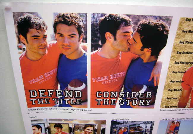
The success stories of young athletes of the Aughties competing out of the closet have a common theme – your teammates knew you before you came out and, as they say, had your back. Walking onto the team with dense copy from a women’s-studies course and colour snapshots of tweezed dudes macking each other isn’t going to make things easier. How ’bout just playing the sport and not hiding anything? I thought that’s what being out of the closet meant. Unless, I guess, you’re young.
-
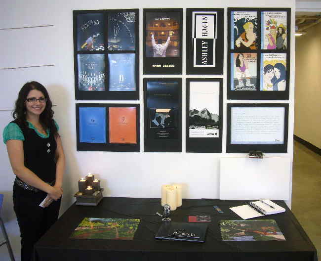
Ashley Hagen had something much more credible going on in her campaign for those darling design objets by Alessi. A bit recherché and rarefied and clubby? Yes, because what the world actually doesn’t need is another campaign for luxury goods. Luxury-goods campaigns are self-perpetuating and will take care of themselves. Nonetheless, her clever anthropomorphism of these bizarre design pieces worked nicely. Ashley was unaware there actually is, or was, an Alessi dealer downtown (actually the Artemide store on Camden St.).
-
Junoh Kim was stupid enough to design and print a placard reading PLEASE DO NOT TAKE PHOTOS, so his work will be deservedly ignored.
-
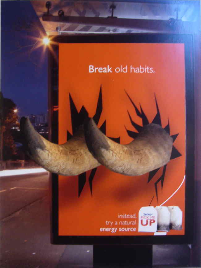
Inga Berzinia had a nice conceptual transit-shelter billboard that couldn’t actually ever be used. That’s what makes it conceptual, and pleasing.
Graphic-design students
Christopher Landry
Actually, I don’t know if Christopher really is a graphic-design student. His massive wall hanging “Half/Half-Not” (part of “Mixed Blessing: A Personal Exploration of Métis History & Culture”) replicated plastic lenticular effects in paper. Angle of incidence makes a big difference in the apparent success of this work, but if you’re at the right angle it’s a winner. Chris made no effort to use durable or tough materials; it’s just folded paper. Letterforms are made up of illustrations of woven belts.
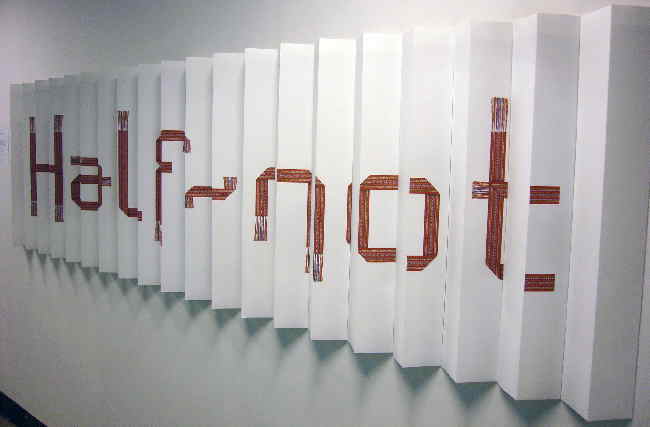
Artists can make a good living churning out marginally different variations of the same theme over and over, so I would like to see a V2.0 of “Half/Half-Not” that uses actual woven belts and some kind of material impervious to folding. Perhaps belts frozen in zigzagging acrylic, with the whole thing suspended from the ceiling and anchored to the floor by microfilament. (I guess I’ve just written the first half of his Canada Council grant application.) Charge $10K for it in a gallery located in a city drowning in white guilt about natives.
Christopher lives in that rarefied astral plane where design meets art. It’s been working out pretty well for Babs Kruger and Jenny Holzer, but the model he should be following is that of Bureau Inc. in New York. He can look it, and them, up.
Gordon Yu
Not exactly the Mike Rowe or bobsleigh brakeman of this exhibition, wee, epicene Gordon stays true to what I imagine, having talked to him for all of five minutes, is his true nature – graphics and performance art with Pet Shop Boys references.
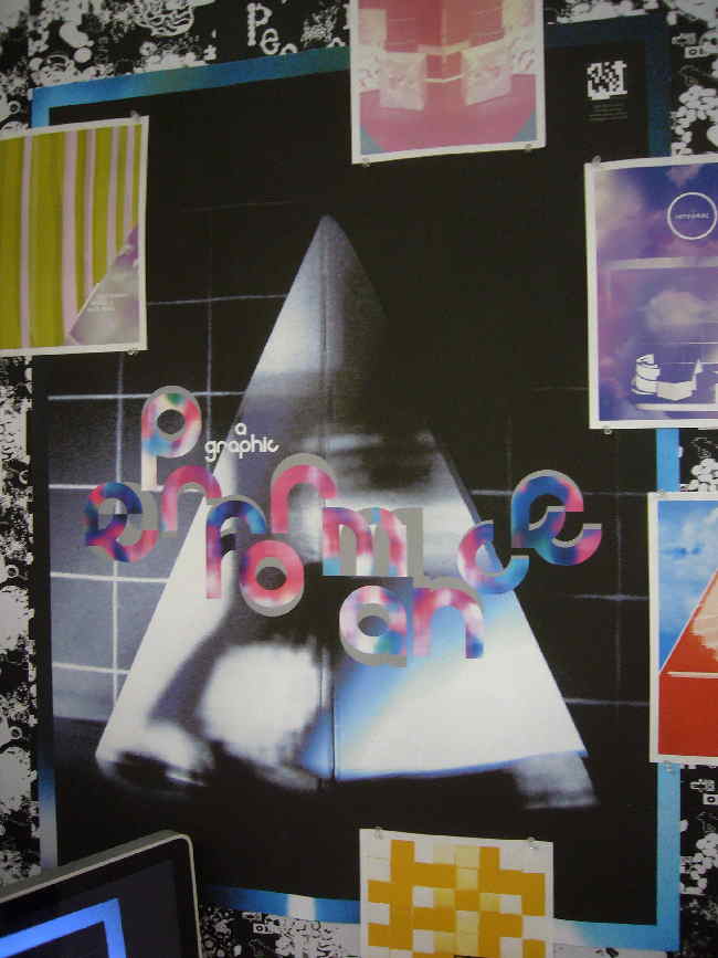
But apart from this quite smashing poster, Gordon doesn’t have much work to show. He doesn’t have a performance-art collaboration he can point to. It’s all hypothetical. A poster advertising an imaginary event is a legitimate work; vague plans for hypothetical events are not. Were I his instructor, I would have marked him as incomplete, but I’m a hardass.
Nonetheless, this is an almost-untapped area, and performance artists are notoriously open to cross-disciplinary collaboration. Plus I told him all about how Mr. JAMES FRANCO adores performance art (Cf. Carter, General Hospital), and suggested Gordon recruit Mr. FRANCO when he finally gets his act together.
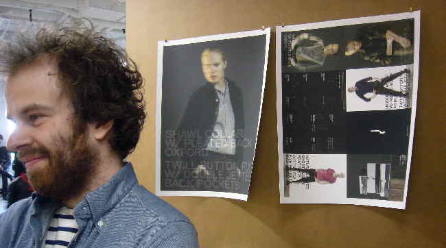
Matteo Sgaramella
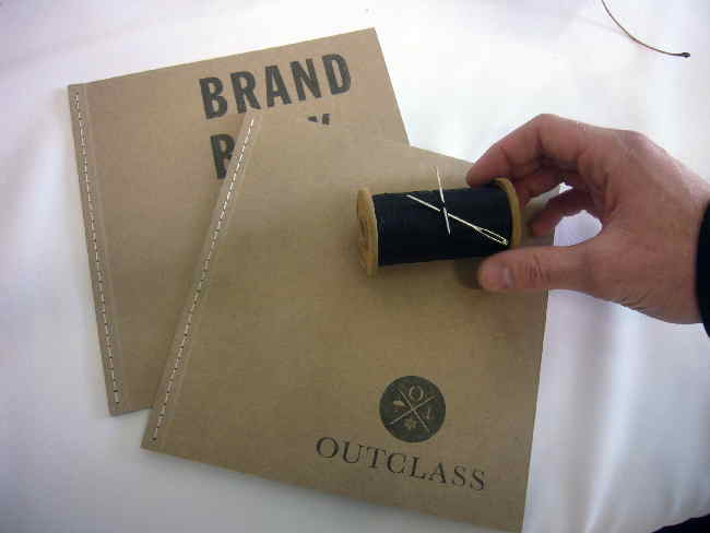
For God’s sake don’t call him Matt. This rough, tough, jolly sort of fellow was the first student I met with an entire apparel line, an outdoorsy selection for urban guys called Outclass. Matteo denied up and down, on repeated questioning, that his line had anything in common with other outdoorsy lines that are bought mostly by city slickers, like Timberland, Roots, Urban Outfitters, Carhartt. (Half my pantalons are Carhartts.) I didn’t even have to finish my question before Matteo made it clear he knew about a long-gone competitor in that field, Beaver Canoe. (But he’s too young to remember the self-referential radio spot: “When you wear Castor canadensis Canoe [loon call]… you wear the wilderness.”) He certainly didn’t know the true story of Timberland and how it finally decided to go with the flow when African-Americans and hiphop fans colonized the brand.
Matteo put together a superb hand-saddle-stitched brief book, complete with custom photography shot in the west end (and apparently the Junction). This guy has the entire genre of retail apparel collateral down pat and could immediately work in that field.
But if we’re talking about clothing, let’s actually talk about clothing. His line really is aimed at vaguely hip downtown guys who know all the right coffee joints, drive a car but it’s a Mini or an Escape hybrid, have lots of facial hair and a ballcap for every occasion, and almost smugly hold down creative-industry jobs just an increment or two above entry level. A lot of them work in advertising. Standing there, I kept hearing Madonna in Truth or Dare complaining about “industry people” hogging the front row of a concert.
It’s an established market sector. (I’m part of it, though an outlier.) Outclass is not novel. It’s another set of taffy-brown dungarees and canvas vestons and workboots. That doesn’t peg the line for failure, but pretending it’s something it isn’t is a stage I hope Matteo outgrows.
We discussed at some length how his logotype is almost there – though the O sticks out as the only letter in the iconography, and readability at small sizes remains unproven. (If your logo doesn’t work as a Twitter avatar or favicon, you need a version that does.)
Яна Степченко
Or Yana Stepchenko, as she writes it for anglos. I’m not evaluating her work here (on “Re:Branding Highschools” [sic]), rather her presentation. Yana surely must have the best-organized display short of a Las Vegas trade convention. Every piece of collateral on the desk had its own labelled space, all lovingly typeset in a palette that works well on the black background. We’re not talking adhesive labels here – each zone of the table was mapped out on a single large-scale printout with blank rectangles reserved for each piece.
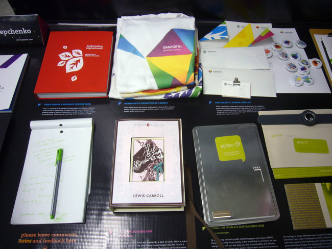
If there’s something Toronto lacks, other than a distaste for mediocrity, it’s rigour. Yana has it in spades. Too good for Toronto? Or too good to get hired here? I have some worries in that regard.
Vinson Man
Let me introduce you to the next Deborah Adler. Vinson Man showed up at the OCAD grad with three entire product lines ready to roll.
I need to interrupt my description to beat a drum here. As there is actually no such thing as universal or inclusive design, merely explicit design for people with disabilities, Vinson’s rubric “Inclusive Packaging” is a misnomer from the start. That doesn’t mean he has failed to create a packaging system that people with poor dexterity or hand strength can use. It seems he has quite startlingly succeeded at this task.
His design for an easy-open toothbrush package is a stunner, and obviously manufacturable.
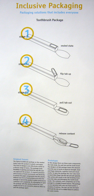
You flip a tab over and pull the tab out, which drags the toothbrush along. If the first thing that hits you is “Why didn’t I think of that?” then you know it’s a winner of an idea. With minor modifications you could rig this up so you don’t even need fingers – you could just drag the tab with a nail or a coathook on the wall, or a butter knife. And I guarantee you the cliché about accessible design will apply here: Nondisabled people will be the chief beneficiaries. Always a nice side-effect, but not why we’re in this business.
Vinson seems like one of those “junior” designers who already has so many well-formed ideas he merits a pro-sports-style bidding war. Just don’t get dragged into a maw like Ideo, kiddo, or we’ll never hear from you again. Stay independent, and hold out for the big bucks.
Josh Derksen
At the other end of the practicality spectrum is Josh Derksen. I was looking over his booth from about three feet (1 m) away and I was sure what he had to offer he had were some prototypes and storyboards for a video game. Nope: Josh created his own board game, Astral Vanguard, set – it goes without saying – in space.
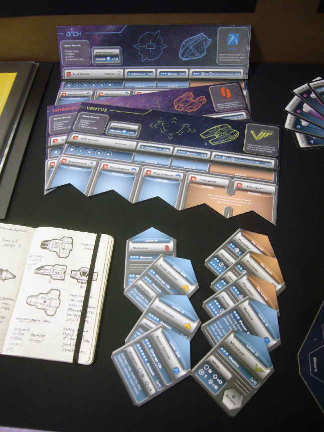
Now, what are these? Interchangeable Coleco- or 8-track-style video-game cartridges? Again nope: They’re plug-in cards that allocate different features to different ships. He’s set the game up so you can’t do a D&D and keep rolling D12s until you get a million hit points and maximum charisma; you always start with some kind of disadvantage.
Now, this thing too is immediately “monetizable,” and Josh and I agreed he doesn’t have to wait for some multinational to come calling with a shitty deal. He can just sell the damned thing himself. Bonus points for the mid-century Italian-futurist typographic reference – that’s wall-to-wall Eurostile he’s using. (I led him astray about Star Trek’s use of it. Fortunately he knew better.)
Rebecca Caswell
I have an objection to Rebecca’s project, though it’s a great idea beautifully executed. She brings native elders into schools to retell aboriginal legends. Kids then illustrate the stories, which illustrations are used in the collateral for the whole program.
Obviously having kids illustrate for other kids is a proven technique. But even though they’re underage, their illustrations are their own work. Neither Rebecca nor anyone else has the right to simply reproduce the artworks in the manner suggested.
We also had quite the discussion about the diacritics used in the name of her project, which, bizarrely, I didn’t take a picture of.
Kenny Li
Or, to use all his (presumably baptismal) names, Kenny Li Kam Cheung. This kid’s got a million ideas, so let’s look at two polar opposites.
-
Practical. I distinctly recall reading of various proposed packaging redesigns for lightbulbs when I was half Kenny’s age. It comes up at ten-year intervals, and I guess since the current year ends in 10 it only stands to reason Kenny devised his own solution, which resembles dog bones and could be stamped out on a single machine. (If I’ve learned anything from How It’s Made, it is that the packaging step is usually dead last and always involves separate robots and production lines or repetitive manual labour.)
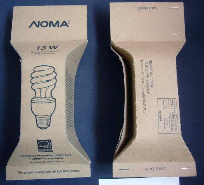
I do think kraft paper is trite at this point. Why not try something krazy like kraft paper with a dye, perhaps fluorescent? These are fluorescent lightbulbs we’re selling.
-
Whimsical. If Moleskines are for fops and æsthetes and Field Notes are for Wes Anderson fans and
OutclassCarhartt aficionados, Kenny’s Fox & Hedgehog notebooks are for mad hatters and nerds who use M.C. Escher sketches as iPhone wallpaper. These are ruled notepads whose lines go in every direction but horizontal. They’re perfect Reginald Perrin Grot products; buy them with a matched set of ladders with no rungs and a Dutch–Dutch dictionary (“consisting of every word in the Dutch language alongside its equivalent in Dutch”).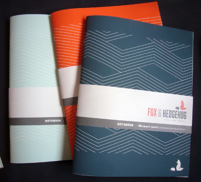
Kenny had fully printed and manufactured notebooks – plural – on his table to be flipped through, which is exactly what I did. A notebook you can’t take notes in is just the kind of designery objet I can get behind. (This topic will come up shortly.)
Susanna Cheung
Here we have the exhibition’s most dramatic Escape from Flatland: Susanna wants to open her own museum. For endangered salamanders.
She envisions a large Fulleresque geodesic dome to house this collection, which would educate kids that salamanders are not fish (they’re amphibians) and are in trouble due to pollution, habitat loss, and global warming. Quite a grand idea in several senses, though the execution left something to be desired. I guess we were expected to be so blown over by the two salamanders on display in tiny, pristine tanks that we wouldn’t notice the paucity of collateral materials, the poor copy-editing (to the point of unintelligibility), and the inadequate planning of the exhibit experience. (As drawn, everything is positioned too low to be observed, let alone by kids, a man standing 6-foot-4, or somebody in a wheelchair.)
Susanna has a peppy and informed personality that wins you over to her cause in no time flat. I applaud every attempted Escape from Flatland, but this is nominally a graphic-design program and I would expect a more elaborate foundation in actual graphics.
Thomas Albrighton
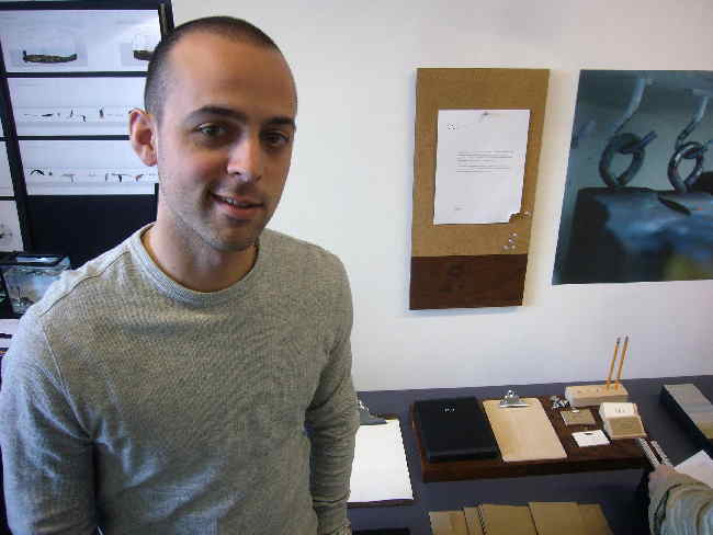
For God’s sake don’t call him Tom. Thomas produced a tidy desk set that I thought was his actual “product.” It isn’t; some kind of league is the actual product. (My photos are lousy, I can’t remember the details, and Thomas didn’t respond to two requests for clarification.) Nonetheless, while his notional club or lodge is itself an Escape from Flatland, his desk set is working more in the model of House Industries’ collectible artifacts. The desk set should stop being a symbol of his work and become his actual work.
It was while I was in this room with Susanna and Cheung that I started hearing about Markus. Who? The guy who won the gold medal. There was a gold medal?
Stephanie Gorman
In an overlap with the engineer/designers of years past, though without the face-to-face and online threats from a suspected son of the Russian mob, Stephanie dealt with a classic of the graphic-design genre, hospital signage. Hospital signs are to graphic design what wheelchairs are to industrial design – a phase every student goes through.
If her work looks familiar, it’s because it is no different from any other competently-handled, if middling, “wayfinding” work. (“Wayfinding,” a process of the mind, does not actually mean “signage,” but that’s how people use it.) Light type, dark background, strict grid structure, pictographs. A few things need fixing: Arrows thankfully point away from type, but they have to hang outside all text and pictos; blank lines or separators are needed between segments of different directions.
But the bigger problem is this: Stephanie ignored her own research and her own preferences. Her project book lists fonts like Helvetica and Akzidenz as “typefaces currently defaulted too” (sic). She states that “I personally find hard to read signs set in sansserif faces with very enclosed counters such as Helvetica.” So she turns around and uses Akzidenz “Grotesque” in her mockups.
The entire grotesk family of typefaces is to be avoided for signage because the letterspacing is too tight and too many characters are confusable. After all that research, surely Stephanie should have known that.
Plus she loses points for buying the total bullshit about Tiresias, and for typesetting mile-long plain-text URLs (two in a single graf) to back up the bullshit.
Now, while I was taking a look at her booth, I kept hearing a very strong voice from the adjacent corner. Eventually I poked my head around and said “I haven’t even met you yet and I already know you’re the winner.” “What?” asked…
Markus Uran
Right there on the corner of his table was the sticker: Markus Uran, Graphic Design Medal Winner. For what? For being Markus, but also for a clothing line. (Yes, another one.) Sportswear for the kind of tidy, intelligent fellas who work at design offices. Sportswear not quite for Markus, whose Rasputin dishevelment has obviously impeded his rocketing to the top not one whit.
There was this tall skinny dude with a DSLR around his neck standing right by Markus. He got all angry and loud when I talked to Markus about how of course his work is good enough for a medal because in form and content it looks like advertising for an apparel brand. Swap out the background and alter the grid a bit and choose a different grotesk typeface and what you’ve got is a Gap campaign. (His innovation is double exposure.) This isn’t a criticism, I told him. Operating within traditions is how designers design. (Not everything needs a Jonathan Barnbrook deconstruction.)
The tall guy kept arguing and I just kept telling him Markus didn’t need a defender. In fact he sparred like a champ, which I guess he is. Did he design his own apparel? Not really; he hired somebody. (Sure sign of a winner.) How about cutting and sewing? Same deal. The faster you switch to managing, the more money you stand to make.
What’s he doing now? Well, one time his friend told him about a portfolio review that was going on, so he submitted his work. He didn’t bother to show up; his reputation preceded him, and whaddya know, soon he was interning for Concrete, and now he’s just plain working there.
World domination in graphic design: Don’t shave, don’t cut your hair, act like a rock star, get everybody else to act like you’re a rock star, and delegate! delegate! delegate! Talent is an asset.
Amanda Keenan
Before I’d even looked at her work, Amanda (and Vicky, below) and I were already discussing the ostensibly correct pronunciation of “Neutraface.” (Who can really say “Noytrafehs” with a straight face? It’s Nootra all the way, German be damned.)
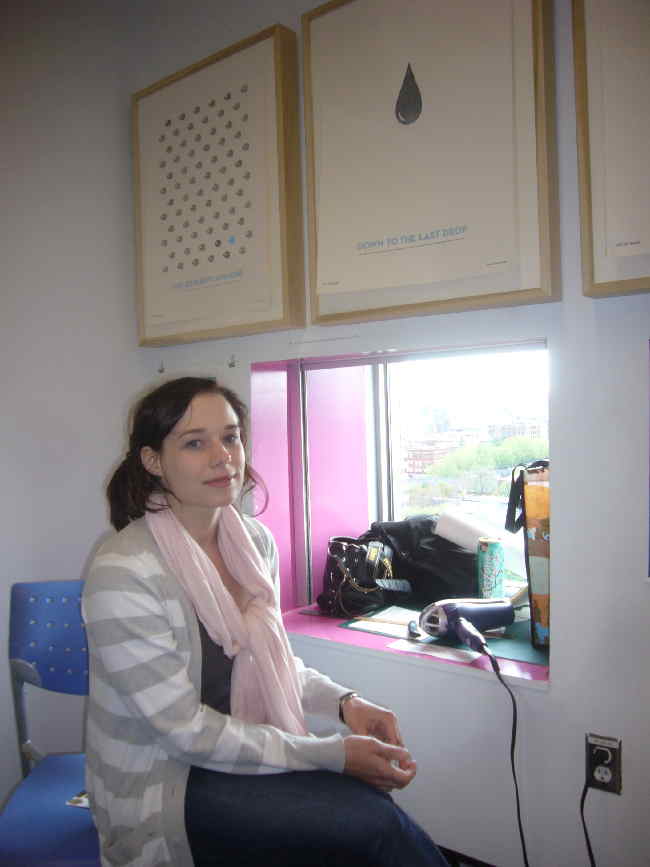
For this, the designer with the strongest grasp of history and prior art, Amanda’s method of Escaping from Flatland is invisible to the unaided eye. Amanda’s posters – she understands she works in the European poster tradition – are heat-sensitive machines that fade away when you hang them out in the sun or, as she gamely demonstrated for me, when you attack them with a hair dryer. The posters match their subjects, one of which was dwindling fish stocks.
Caley Tessier
Bubbly and buttoned-down at the same time, Caley has produced what really could be a winner of a product: Olde-tymey Chatelainey Don Harrony cookbooks.
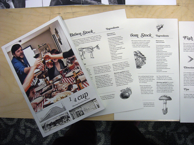
Though they rely on Bookman Swash just a tad too much, the desaturated, near-sepia photography and Victorian botanical illustrations immediately impart the sensibility. That’s how you build a publishing empire: Nice middle-class ladies with an education glance at the thing and know exactly what it is. Then they buy it. Then they get their mommyblogger girlfriends to buy it.
Another work on display is an uncorrected typography assignment for which an instructor dressed him down. (Deservedly, from the looks of the lousy spacing.) Caley left the post-facto corrections intact and framed the damned thing. I know graphic designers are not word people and are semiliterate to the point of dyslexia, but this is not a failing to be “neutralized” by flying its flag high. It’s a David Carson dick move. It’s typesetting an article you don’t like in Zapf Dingbats and calling yourself clever. How iconoclastic. How antiauthoritarian.
I want highly accurate work, not cutesy undermining of people who know better. Try becoming one of those people. But I’m not naïve; clever work that falls down in the details is in high demand in this burg.
Vicky Li
A smashing installation by Vicky: Stuck with a centre table unmoored to anything and no wallspace whatsoever, she makes lemonade by hanging a giant namecard from the ceiling. Clever.
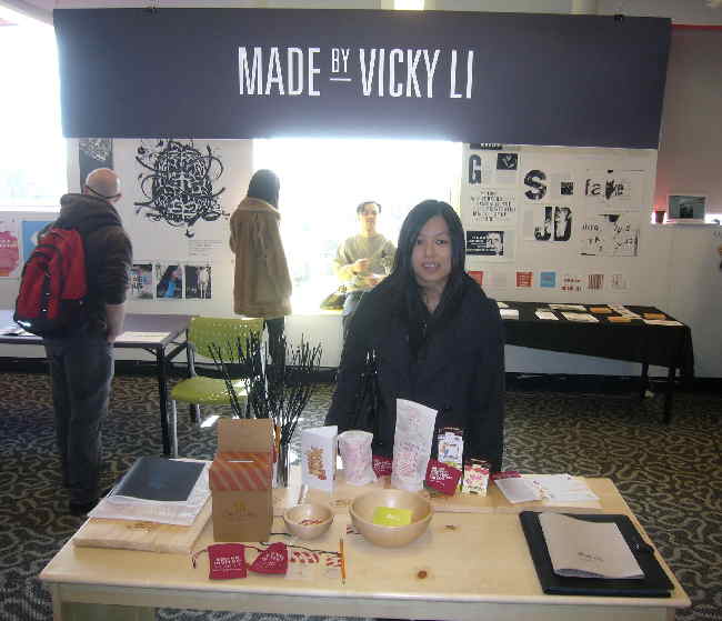
So’s her project – an educational campaign (yes, another one) for high-school students about the value of design. This got my hackles up right away, but I needn’t have worried. Vicky confirmed that this is not, in fact, one of those promotional campaigns in which “design” refers solely to darling and twee little objets. The purpose of this campaign is not to persuade you that Everyone Deserves a Really Nice Can Opener. Vicky accepts that “design” is not about lamps, chairs, tables, rugs. Design is not for rich æsthetes who, come the Revolution, couldn’t survive a day. (Gosh, what did these people do during the blackout of 2003? Where did they get their sun-dried tomatoes?)
Rather, Vicky is making the point that everything is designed, so why shouldn’t you do the designing? Of course this will mostly appeal to girls and a tiny number of very-well-turned-out straight boys, but the next generation of designer has to come from somewhere.
But here is the fun part. She’s got little cloth drawstring bags emblazoned with slogans like WITHOUT DESIGNERS THIS LOTION BOTTLE [or CELL PHONE] WOULD NOT EXIST. True! And, I told her, those little bags are just right for toting around your pot, or, for the small-town crowd, your crystal meth. These are high-schoolers we’re dealing with. She had a good laugh.
Vicky’s personal collateral and “branding,” I guess you’d call it, are quite evocative and advanced for someone her age. Plus – again – she’s got an entire product line all ready to go. When I was her age, I could barely tie my shoes.
Joel Derksen
This is another kid who’s gonna be running the industry at some point. And I’m not just saying that because he was thrilled to meet me. (Russian mob?) From what I can gather, he can write markup and do basic JavaScript programming, can carry out basic usability testing, knows typography disturbingly well, can create an entire case of related design objects, and burn his own wood.
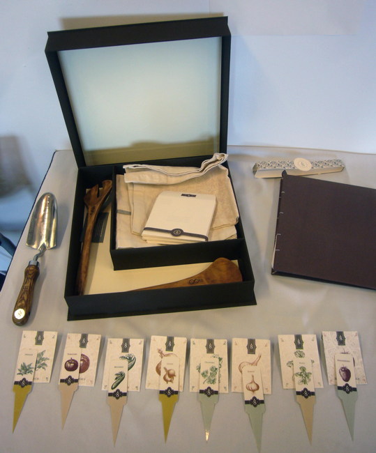
He’s got a ridiculously-well-thought-out product line for beginning gardeners who want to grow plants and herbs on windowsills. Too easy? Any number of starter kits on the market already? Sure, but none this nice. He’s got his own illustrated cards for each seed type, using fake Century Schoolbook small caps that he massaged till they look like real small caps. (He couldn’t find a cut with designed small caps. Neither can I. It took him half a minute to explain all the steps he went through to make the fake ones look real.)
So you’ve got all the gear to grow indoors. Now what? Now you need a social network. And of course he’s got Web-site mockups just for that all ready to go.
In Joel’s gardening kit, which I noted was of Martha Stewart calibre, you receive a pair of gardening tools that rekindle a hobby from before Joel was born – wood-burning. These oiled-wood tools resemble giant salad forks and could double as paddles at estate auctions.
Again: I never had my shit this together when I was Joel’s age.
Simon Truong
Well, this one’s near and dear to my heart: It’s a kind of TTC wayfinding system. (It was vaguely disturbing he didn’t know who I was, since Googling “TTC wayfinding” when not logged in has most of the first ten hits going to me.) He’s got an iApp planned, and the whole thing works on all seven subway lines, including the ones that were never built. I wouldn’t call that innovative, but I sure would call the next piece that.
Since you don’t know what’s going on at ground level while you’re in the subway (even if you know the neighbourhood, you may not know it’s raining), Simon proposes a kiosk downstairs with cameras upstairs pointing in the four compass directions. You can look and previsualize before you leave the station.
As such his timing is excellent, what with that awesome demonstration of augmented reality applied to the New York subway.
Simon’s presentation book could come in handy if you ever needed to slay a werewolf. It came complete with custom-printed acrylic covers that are thick enough to work as windows in a lunar module.
Oscar Patzan
Oscar Patzan designs type and knew I was coming. What? “Yeah. They said there was a guy walking around who really knew typography.” And look how much good it’s doing me.
Oscar? Oscar is trying. Even Christian Schwartz’s first typeface sucked. Oscar’s class assignment – apparently there is an actual type-design class, taught by whomever – was a constructed monoline sansserif that was just terrible. He took it well when I told him that, because he kind of agrees. But his display typefaces are interesting, if only because he’s working in a tradition he knew nothing about. I borrowed his iPhoné and showed him how his display faces, made up of little Mayan/Vetruvian circles and triangles nested inside distorted balloon-like outlines, are more in the genre of Baby Teeth, Sinaloa, and Sapphire, which he’d never heard of.
Another typeface borrows from Neurath’s ISOTYPE. In fact, Oscar developed his own pictograph series, unwittingly duplicating ISOTYPE in most respects, possibly because he’d actually seen it before without knowing, or just because ISOTYPE has influenced all pictographs ever since.
He’s got a great FRANKENSTEIN with letters made up of cutouts of Victorian anatomical illustrations. Oldschool, but so is everything in type design. Not everybody can be Evert Bloemsma.
Bartek Foltyn brewed his own beer
Why just make a poster?
Kyle Nielsen
Kyle designed the “identity” for the entire Enter OCAD weekend. Quite the coup. He’s got a mocked-up ad campaign for Cygnus that works just fine because it’s a standard trope – undersized all-caps type floating over vérité photographs, not all of which were actually licensed. Kyle executed a perfectly adequate variant of what’s already been done before and then some.
Other observations
-
All the students had to write, print, and bind books about their projects. Copy was terrible across the board, because these kids are functionally illiterate, but as objects they were stunning. Can we put them all together in the OCAD library for safekeeping? Enormous loving care went into them, presumably because what they are is objects. The project books themselves were an Escape from Flatland.
-
Kiel Perchinig had left his booth by the time I got there, but he too worked on TTC “wayfinding” using technology in a way I don’t completely understand.
-
There was a designer with a jewelry (as she wrote it, “jewellery”) line who gave the worst impression of the entire show. She sat, tired and bored, in her chair the whole time I talked to her, looking off to the side. She dodged two questions about which component of her Escape from Flatland she was proudest of, insisting everything be taken as a whole. (Then why are you selling individual jewelry pieces? Why can’t I buy your whole display case?) All smiles and the picture of patience, I cheerfully told her what her product line’s best feature is: Her dreamy original photography.
What’s her name? I don’t know. I didn’t take any pictures. I don’t have her card. I forgot everything about her except how badly she presented her work to the only person, the only person, who will ever write about it. Doomed to obscurity? No, because all her classmates know who she is, as do her instructors. She was like this all year, wasn’t she?
-
Fernando Ciccotosto (he’s got it phonetically written on the wall for the anglos) is a gingery Italian designer, which gives you three reasons right there why he’s so tidy and neat. Fernando’s Escape from Flatland is an information hub/social network called Handi-Info, which may or may not be hyphenated. Did you just find out your child has a disability? If so, where do you go next? You go to
HandiInfo.ca(the ii sequence is a problem). There you will find all the information you need about community supports; you will find out where to go to get the services or items you need; and you will be able to post messages and talk with other parents of children with disabilities.Fernando was just packing up as I got there, and was tired of people stealing his presentation books, perhaps innocently. But of course I asked: Well, if this is about accessibility, where does that come from? Is there somebody in your family who’s disabled? Yeah – my brother, Fernando said, introducing me to him as he stood nearby with their proud parents.
And actually, since I closed the show, as it were, I got to see a lot of kids packing up their displays with the help of their dads (rarely moms), nearly all of whom seemed to be immigrants. Now, depending on the country of origin, it may be mildly easier to explain your desire to work in graphic design than with other countries, but it’s never really going to be easy. The “anglos” I keep mentioning already don’t know what it is – and they speak the language and grew up here.
So the child student becomes the parent-teacher. Imagine how much effort goes into this, and over how long a period. I could never at all explain my interests to my mother, who in turn never supported them for even half a second.
You spend all this time at school. You put in all this effort. Maybe your parents are paying your way. But your friends outside school aren’t designers, and you have a hard time explaining to your own family what you do. What this makes you is self-made. You are making yourself while you are still young and unformed. You have to grow up real fast to be a design student in a city of immigrant parents (and uncomprehending-anglo parents).
These kids are growing up fast. They have left Flatland behind. They are designers, but they aren’t just making pretty things to look at. They’re making things. They will be making the things you buy tomorrow, and few of those things will be twee designer objets. This is a generation that makes, not just draws. Letters are things, not pictures of things; these are designers of things, not pictures of things. They’re barely literate and they don’t know their history, but the future? The future is no problem.
Where’s the other coverage?
Something else OCA propagandistrix Sarah Mulholland told me: “We have a few folks reviewing the show this year and welcome them, and you, of course, as always.”
Really? Where’s the other coverage of the 2010 OCAD grad show? Who else puts in the work? Nobody. I am the only writer who covers these events – somebody who knows what he’s talking about and says what he thinks. 5,500 words in, you know that isn’t idle boasting.