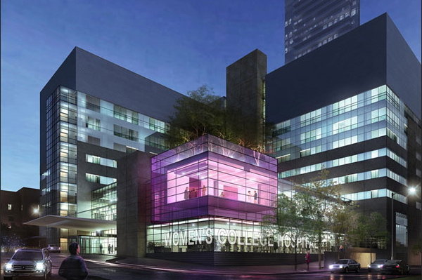
Here is an artist’s rendering of the proposed renovation of Women’s College Hospital, Toronto.
Which important feature has been completely bungled? Typography, of course. (Public typography in Toronto is a topic I gave myself a year to investigate – four years ago – and didn’t.)
In this drawing, architects, who insist they know everything about everything, very much including type and the written word, have banged out WOMEN'S COLLEGE HOSPITAL in Arial. With a neutral quotation mark. Splattered across the street-level windows, no less. I expect this sort of thing from a discount store (“GOING OUT FOR BUSINESS”), not a legitimate public institution.
There’s all sorts of time to fix this. Think it’ll actually get fixed?
Select a category to see additional posts. Add feed/ to a category to subscribe via RSS
The foregoing posting appeared on Joe Clark’s personal Weblog on 2010.09.07 13:44. This presentation was designed for printing and omits components that make sense only onscreen. (If you are seeing this on a screen, then the page stylesheet was not loaded or not loaded properly.) The permanent link is: https://blog.fawny.org/2010/09/07/womenscollegearial/
(Values you enter are stored and may be published)
Information
This personal Weblog is unlikely to be updated again until my next book comes out. (SeeBest postings)
Just add /year/month/day/ to the end of site’s URL, blog.fawny.org. You can add just /year/month/, or just /year/, if you wish. Years are four-digit, month and day two-digit (with padding zero below 10). For example: