Amerikanski Psycho, ≈18:30 (and now with 2021 update):
— Is that a gram?
— New card. What do you think?
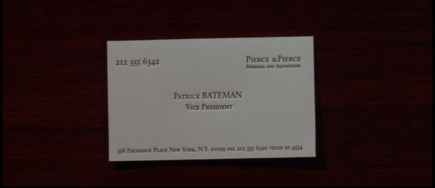
— Whoa. Very nice.
— Look at that.
— Picked them up from the printer’s yesterday.
— Good colouring.
— That’s bone. And the lettering is something called Silian Rail.
— That’s very cool, Bateman. But that’s nothing. Look at this.

— That is really nice.
— Eggshell with Romalian type. What do you think?
— Nice.
— Jesus. That is really super. How’d a nitwit like you get so tasteful?
— I can’t believe that Bryce prefers Van Patten’s card to mine.
— But wait. You ain’t seen nothin’ yet.
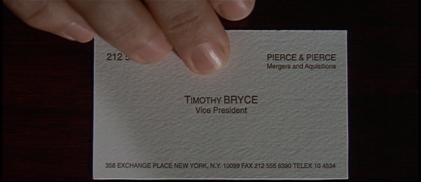
— Raised lettering, pale nimbus. White.
— Impressive. Very nice.
— Mm.
— Let’s see Paul Allen’s card.
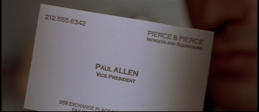
— Look at that subtle off-white colouring. The tasteful thickness of it. Oh, my God – it even has a watermark.
— Something wrong? Patrick? You’re sweating.
That last man is the quavering, foppish, bow-tied quisling of the picture, so of course his card would offer the gaucherie of colour.
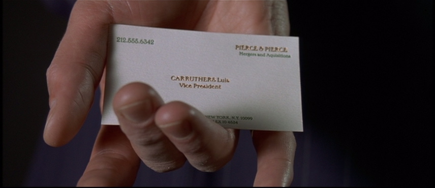
Doesn’t a card like that scream “Watch your back in the washroom”?
Update
(2021.07.11) From a YouTube parody by Bup (no relation):
-
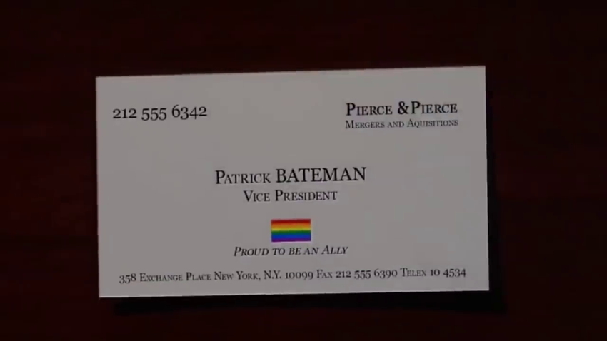
That’s Georgia and those are fake small caps. But the errant missing space after the ampersand is preserved.
-
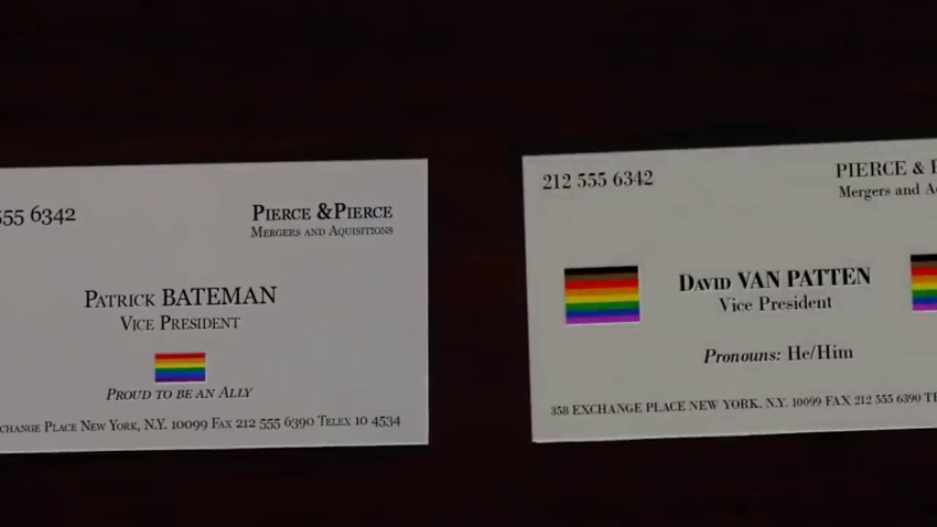
Offset-printed, this Bodoni is much too brilliantly clear. The sizes are wrong. But the restored space after the ampersand is rendered.
-
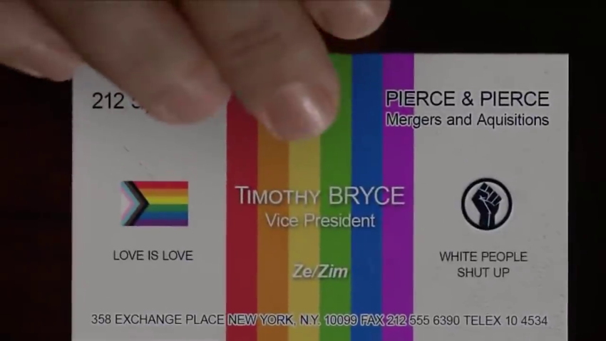
The original wasn’t really trying (no one in that echelon would have dared use a sansserif, let alone Helvetica; small caps are, as ever, fake), but this Arial monstrosity is an insult to the intelligence.
-
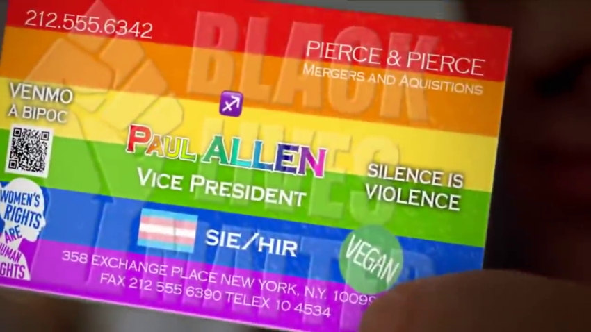
Bup (still no relation) even managed to include this design in the reveal of the card. Overall most authentic typography – readily contrasted against the dog’s-breakfast layout and ideologies.