Readability (q.v.) does what Instapaper does and offers a text-only view of a Web page. (More accurately, both apps remove navbars and chrome. Most inline and block-level images inside an article make it through.) By offering a dependable layout, this “reformatting” is meant to ensure “readability.”
But if your site is readable already, Readability makes things worse.
-
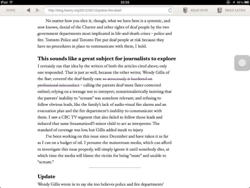
This site in a typical browser (here, Readability’s WebKit):
Controlled line lengths, no blank lines between grafs (a Microsoft Word atrocity), lots of lead, indents on paragraphs following paragraphs. (Headlines in cursive, a usage I defend.)
-
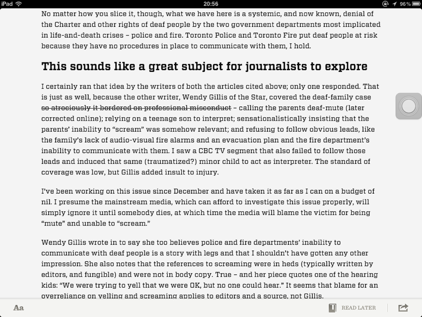
In Readability:
Much longer measure, blank lines added, indents removed, default leading.
Instapaper’s article “design” is almost the same, but it isn’t offensive in Instapaper’s context because that app did not arrive on the scene with hyperbolic promises of cool fonts and a total solution to reading on the Web. (Readability commits other unforced errors, like rendering print-only CSS and botching the BLOCKQUOTE element much worse even than Instapaper does.)
Even in a plain no-CSS view (as in Lynx), my site places fewer obstacles in the path of long-term reading, a fact I attribute to high-quality code.
It’s been a bad week for indented paragraphs: Kottke’s claim that his new design improves readability is vitiated by its resemblance to a Microsoft Word document banged out by a mid-level bureaucrat in a midwest U.S. state, or by a fonctionnaire in the Obama campaign. (Mr. SANTA MARIA dodged that bullet.)
I will further state that two of the five Hoefler fonts included in Readability – Sentinel and Vitesse – are unsuited to lengthy onscreen reading, no matter how well-tuned for LCDs they might be. (Listen to Jonathan Hoefler’s superb Ampersand Conference presentation.) I guess launching with “just three” H&FJ typefaces would have seemed picayune. In any event, the whole thing amounts to starfucking, especially considering how few Readability users (and, presumably, developers) can actually pronounce “Hoefler.” (We enjoyed Indian food in their office that time I visited Tobias and Jonathan.)
For Cyrillic and Greek copy, Readability acts dumb as a mule and sets it in Arial (with strange Ionic numerals).
I pick on Readability because of overblown claims poorly executed, inaccessible code, half-assed knowledge of typography, and a questionably ethical business model, and for one other reason.

