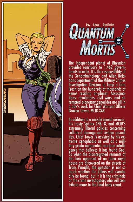
Here we have an excerpt from Quantum Mortis, which is not Quantum Morris but is impossible to remember correctly.
Editor Vox Day (no relation):
-
January 5: “We chose a slightly larger font to make sure it was legible.” He also talks about making sure colours “pop,” which is not actually what you want to happen with a luminous screen a few inches from your eyes.
I wrote, to no response:
Typeface choice and size are but two factors in legibility and readability, which are different things. Your Futura Condensed is questionable because it’s (a) a geometric sansserif and (b) condensed. But you’ve guaranteed that legibility will be impaired by using too little leading and turning on full justification (note rivers of hyphens – a near-unheard-of four in a row in ¶2).
If you were using a typeface that had been designed for onscreen legibility in, say, the current century, and had enough lead and didn’t justify your type, you might reasonably have produced legible pages.
The book Never Use Futura (the title is rather ironic) is superbly done and would make for interesting reading after you hired qualified typographers to make your type legible. As it stands now, it isn’t legible, hence also isn’t readable. You aren’t ready to publish.
-
Three days later: Released.
-
I also believe in winning by being objectively superior to the competition, regardless of what they happen to be, and by thinking beyond the conventional assumptions….
I don’t care about comic books. But I care deeply about… becoming the very best publisher of the best-written, most popular comic books and graphic novels in the comics industry. I expect excellence from everyone involved in the project, including myself. Sure, we fall short. Sure, we have no clue what we’re doing yet….
So what? I don’t need to know [various details]. I certainly don’t need to care. I just need to stay out of the way of the experts with whom I’m surrounding myself and to whom I’m handing over the responsibility to do it right.
“We’re breaking more than a few of the ‘rules’ of modern comics here” (January 5): I’ll say. As ever, conservatives cannot design and refuse to learn.
Update
(2018.06.04) An Italian translation of one of Vox Day’s house’s comic books is typographically described thus:
Tolleranza Zero is our first foreign-language translation, and it was an interesting challenge because we needed a different font that had all the necessary accents.
Every professionally designed face has the piddling few diacritics Italian needs. The “font” chosen is some amateur creation whose cap height was shrunk to fit the accents – the sort of thing you’d have seen on a VT220 terminal 30 years ago.
We also needed to make sure the various text strings fit inside the existing speech balloons. We ended up going with one that worked out so well that we will probably switch to it for future English editions.
Why limit the pain to Italians?
A man this dumb (his IQ is claimed to be 150), whom no one likes, obviously is not going to admit he’s wrong or has anything to learn as an editor and publisher.
SJWs always double down, Vox Day says. Not just them, apparently.