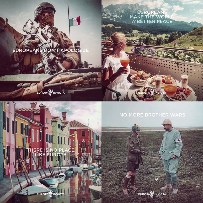
By which I mean the only non-progressives or anti-progressives with a brand: Europa Invicta (Flickr album thereof).
-
Conservatives still cannot design –

– but Europa Invicta has done well more than the bare minimum here:
-
Images from European or White antiquity
-
Consistent typography (Gotham – no doubt Jonathan Hoefler, our Whitest type designer, will be mortified), and indeed consistent translucency to such type
-
Square format that the kids prefer these days
-
-
Then Europa Invicta, who are not Identity Evropa (“Ev”ropa), go and spoil it all by doing something stupid with their best slogans.

-
Type and layout are wrong
-
Type is fundamentally incorrect in embarrassing ways (neutral apostrophes that collide with nearby letters)
-
Cannot decide whether linebreak, comma plus linebreak, or no apparent linebreak are meant to break up clauses
-
-
Then there’s using the wrong frigging quotation marks:
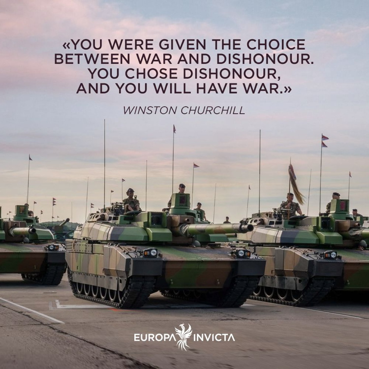
All told, though, wildly superior (these people are all about hierarchy) than Æsthetica Europa.
Next I will discuss the anti-progressive meme æsthetic of severely saturated red/green/blue gradients, reminiscent of the absolute greatest 1980s lighting and interiors (and indeed key to the Æsthetica Europa vocabulary).