Author archive
- Aqua (2006.01.06)
-
When did it become OK for consumer-grade pharmaceuticals like moisturizers to list the ingredient water (eau) bilingually, monolingually, or interlingually as aqua?
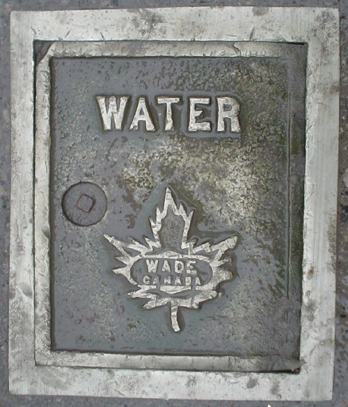
Presumably rather a long time after this grating was forged.
- Burnt orange (2006.01.05)
-
You need that much visibility when dappled with slush.
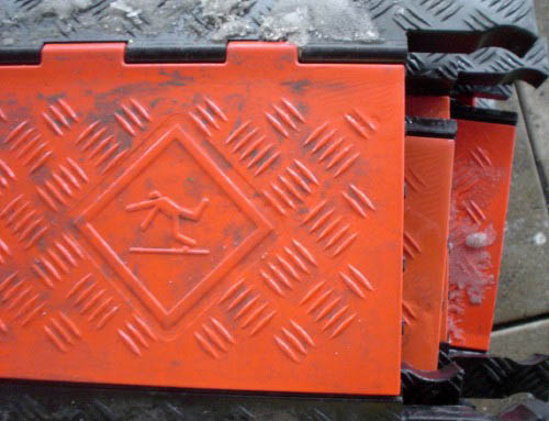
By the way, I know an Australian who almost walked right into a lake of slush in Boston, so unaccustomed to the substance was he.
- Failed Redesigns (2006.01.04)
-
Failed Redesigns of 2005: “Because You Should Have Known Better”
- Neville Brody in a can (2006.01.03)
-
Yes, that is indeed Insignia by Neville Brody (q.v.) debossed on a Chinese-made chocolate tin.

- 0 for 2 with the ponies (2006.01.02)
-
Wherein I blow yet another photo shoot
- Off to a great start (2006.01.01)
-
EuroCoryWatch, first instalment
- Full Stop (2005.12.30)
-
The line between the right and wrong kinds of tacky is too easily crossed with everyone’s favourite novelty font, Cooper Black.

But if it’s a “novelty” font, why does it continue to be used decades later, sometimes well? I actually like this sign.
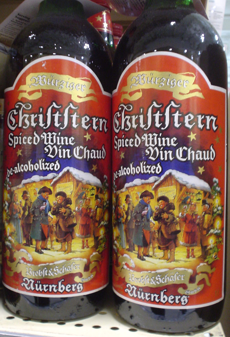
- Night of the long ſ (2005.12.27)
-
Using the German long s ſ to label dealcoholized wine is like using a yogh ȝ or a thorn þ to label an iPod.
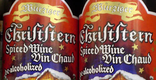
Great to look at nonetheless. I wonder what font they use for the barcode?
- Merry Christmas! (2005.12.25)
-
Merry Christmas (from me, Ian, and Rocket, not that we’re ‘together’)