Author archive
- Trifectaed (2005.09.28)
-
Type and the red-haired gay engineer
- Free advice to Chapters (2005.09.26)
-
Words of advice for anybody who wants to run Chapters Indigo’s Web site
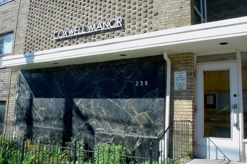
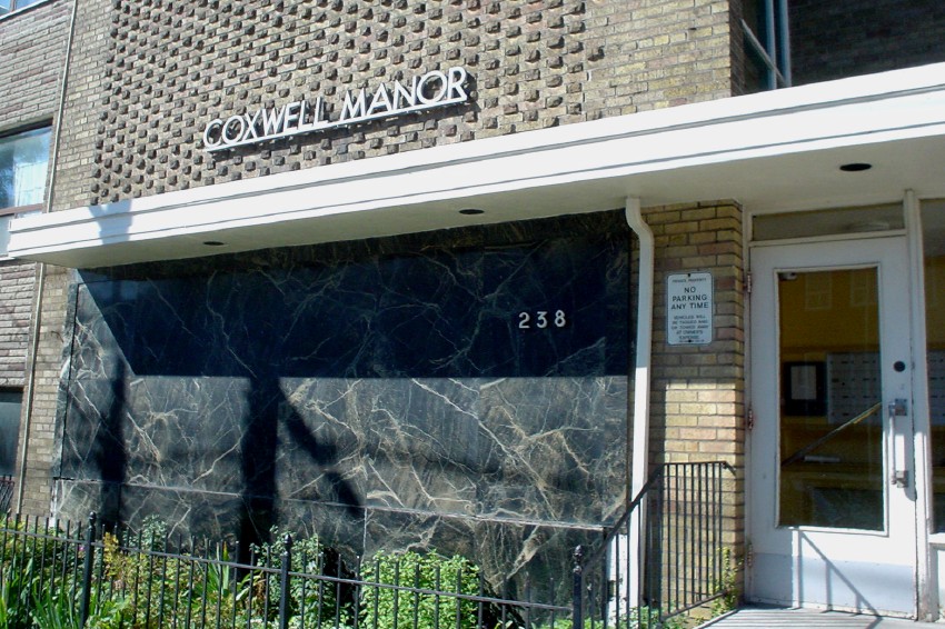
- Futura Manor (2005.09.22)
-
- MiniSmart (2005.09.22)
-
This is the best shot I could manage of the improbable conjunction of a 1976-era Austin Mini and a Smart Fourtwo. The latter is one-third taller than the former.
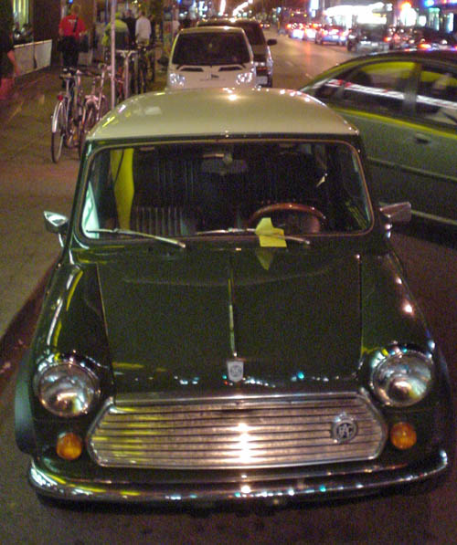
I already thought the Smart ran on toy tires with toy wheels, but you ain’t seen nothin’ yet till you’ve witnessed the shopping-cart wheels the Mini used.
- Electro-Lux (2005.09.22)
-
This label does indeed give an address in Nice, France.
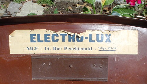
(Hyphen as in original.)

- Art Deco shipping and receiving (2005.09.22)
-
I find this sign a curiosity. Little giveaways make it look recently-created (“12 noon” with space but “1pm” without; and note well that they are using lower case), plus there’s the graffito and the sticker plunked onto it.
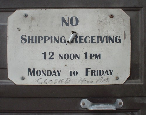
But then we have the Art Deco–inspired small caps. What to think?
- Line lengths when reading from a screen (2005.09.21)
-
A research review suggests that longer line lengths are read faster, even if people don’t like them
- Why is Don Knuth special? (2005.09.20)
-
I dunno. Because he designed a shitty font and has everybody address him as “Professor Knuth”?
- How not to test an accessible audiobook service (2005.09.20)
-
A test of downloadable audiobooks for the blind used an inaccessible Web site, inaccessible and unusable players, and DRM out the arse